## Line Chart: Positive and Negative Values Over Time
### Overview
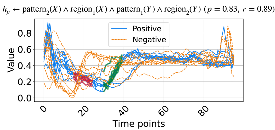
The image is a line chart displaying multiple time series data, differentiating between "Positive" and "Negative" values across "Time points". The chart includes a legend to distinguish between the two categories, and the plot shows fluctuations in value over time for each category. Some regions of the chart are highlighted with different colors (red and green) to emphasize specific patterns.
### Components/Axes
* **Title:** h\_p ← pattern₂(X) ∧ region₁(X) ∧ pattern₁(Y) ∧ region₂(Y) (p = 0.83, r = 0.89)
* **X-axis:**
* Label: Time points
* Scale: 0 to 80, with major ticks at 0, 20, 40, 60, and 80.
* **Y-axis:**
* Label: Value
* Scale: 0.0 to 0.8, with major ticks at 0.0, 0.2, 0.4, 0.6, and 0.8.
* **Legend:** Located in the top-right of the chart.
* Positive: Represented by solid blue lines.
* Negative: Represented by dashed orange lines.
* **Highlighted Regions:**
* Red: Located around time points 15-25.
* Green: Located around time points 30-40.
### Detailed Analysis
* **Positive (Blue Lines):**
* Trend: Initially high, decreases sharply until approximately time point 20, then gradually increases and stabilizes around a value of 0.5 between time points 40 and 80. There is a slight increase near time point 80.
* Values: Starts around 0.7-0.9 at time point 0, drops to approximately 0.1-0.3 around time point 20, and stabilizes around 0.5 from time point 40 onwards.
* **Negative (Dashed Orange Lines):**
* Trend: Starts high, decreases to a minimum around time point 20, then increases and fluctuates around a value of 0.4-0.5 between time points 40 and 80. There is a peak near time point 80.
* Values: Starts around 0.6-0.8 at time point 0, drops to approximately 0.2-0.3 around time point 20, and fluctuates around 0.4-0.5 from time point 40 onwards.
* **Highlighted Regions:**
* Red: The red region highlights a period where both positive and negative values are at their lowest.
* Green: The green region highlights a period where both positive and negative values are increasing.
### Key Observations
* The "Positive" and "Negative" values exhibit an inverse relationship initially, with both converging to similar values after time point 40.
* The highlighted regions (red and green) indicate specific time intervals where the values undergo significant changes.
* The title includes parameters p = 0.83 and r = 0.89, which likely represent statistical measures related to the data.
### Interpretation
The chart visualizes the temporal dynamics of "Positive" and "Negative" values, possibly representing different attributes or categories within a system. The initial divergence and subsequent convergence of these values suggest a shift in their relationship over time. The highlighted regions likely correspond to critical events or transitions within the system. The parameters p and r in the title likely quantify the statistical significance and correlation of the observed patterns. The data suggests that the system undergoes a period of instability or change between time points 0 and 40, after which it reaches a more stable state.