## Line Chart: R1-Llama | AIME25
### Overview
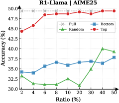
This is a line chart comparing the performance (Accuracy %) of four different data selection strategies ("Full", "Bottom", "Random", "Top") for a model referred to as "R1-Llama" on a benchmark or task labeled "AIME25". The chart plots Accuracy against an increasing "Ratio (%)", which likely represents the proportion of data used for training or selection.
### Components/Axes
* **Chart Title:** "R1-Llama | AIME25" (Top center)
* **Y-Axis:**
* **Label:** "Accuracy (%)" (Left side, vertical)
* **Scale:** Linear, ranging from 30.0 to 50.0, with major tick marks every 2.5 units (30.0, 32.5, 35.0, 37.5, 40.0, 42.5, 45.0, 47.5, 50.0).
* **X-Axis:**
* **Label:** "Ratio (%)" (Bottom center)
* **Scale:** Categorical/Logarithmic-like, with discrete points at 2, 4, 6, 8, 10, 20, 30, 40, 50.
* **Legend:** Positioned in the top-right corner of the chart area. It defines four data series:
1. **Full:** Gray dashed line with 'x' markers.
2. **Bottom:** Blue solid line with square markers.
3. **Random:** Green solid line with upward-pointing triangle markers.
4. **Top:** Red solid line with circle markers.
### Detailed Analysis
**Data Series Trends and Approximate Values:**
1. **Top (Red line, circle markers):**
* **Trend:** Shows a strong, consistent upward trend. Accuracy increases rapidly at low ratios and continues to improve steadily, approaching the performance of the "Full" baseline.
* **Data Points (Ratio%, Accuracy%):** (2, ~45.0), (4, ~47.5), (6, ~48.0), (8, ~48.5), (10, ~48.5), (20, ~49.0), (30, ~49.5), (40, ~49.5), (50, ~49.8).
2. **Bottom (Blue line, square markers):**
* **Trend:** Shows a gradual, modest upward trend. It starts lower than "Top" and "Random", dips slightly at Ratio 4, then slowly climbs.
* **Data Points (Ratio%, Accuracy%):** (2, ~34.0), (4, ~33.5), (6, ~35.0), (8, ~36.0), (10, ~35.5), (20, ~36.0), (30, ~36.0), (40, ~36.5), (50, ~37.5).
3. **Random (Green line, triangle markers):**
* **Trend:** Highly volatile. It starts near the "Bottom" series, drops significantly to a low point at Ratio 6, recovers, dips again at Ratio 20, and then shows a sharp increase in the final segments (Ratios 30-50).
* **Data Points (Ratio%, Accuracy%):** (2, ~34.0), (4, ~32.0), (6, ~31.0), (8, ~31.5), (10, ~32.0), (20, ~31.0), (30, ~36.0), (40, ~39.5), (50, ~39.0).
4. **Full (Gray dashed line, 'x' markers):**
* **Trend:** Perfectly flat horizontal line. This represents a constant baseline performance.
* **Data Points (Ratio%, Accuracy%):** Constant at ~48.5% across all Ratios.
### Key Observations
* **Performance Hierarchy:** The "Top" strategy consistently outperforms "Random" and "Bottom" at all data ratios. The "Full" dataset baseline is only matched by the "Top" strategy at very high data ratios (approaching 50%).
* **Volatility:** The "Random" selection strategy exhibits the most unstable performance, with significant drops and rises, suggesting high variance in the quality of randomly selected data subsets.
* **Convergence:** The "Top" strategy's accuracy curve converges toward the "Full" baseline, indicating that selecting the top-performing data points can achieve near-optimal results with a fraction (50%) of the total data.
* **Low-Ratio Efficacy:** Even at a very low data ratio of 2%, the "Top" strategy achieves ~45% accuracy, which is significantly higher than the other selective strategies and only ~3.5 percentage points below the full-data baseline.
### Interpretation
This chart demonstrates the critical importance of **data selection strategy** for the R1-Llama model on the AIME25 task. The data suggests:
1. **Quality over Quantity:** Selecting a small subset of high-quality ("Top") data is far more effective than using a larger subset of low-quality ("Bottom") or randomly selected data. The "Top" strategy achieves superior performance with just 2% of the data compared to what "Bottom" achieves with 50%.
2. **Diminishing Returns:** The "Top" curve shows diminishing returns; the largest accuracy gains occur when increasing the ratio from 2% to 10%, after which improvements become marginal. This implies the most informative data points are concentrated in a small "top" tier.
3. **Risk of Random Selection:** The erratic performance of the "Random" strategy highlights the risk and inefficiency of unguided data selection. Its final surge at high ratios may be an artifact of eventually including more "top-tier" points as the sample size grows.
4. **Baseline Context:** The "Full" line serves as an upper-bound reference. The fact that "Top" nearly reaches it at 50% ratio suggests the remaining 50% of the data (the "bottom" half) contributes very little additional value for this specific task and model.
**In essence, the chart provides strong evidence for a data pruning or curriculum learning approach: carefully curating a small, high-quality training set can yield model performance comparable to using the entire dataset, offering significant computational savings.**