\n
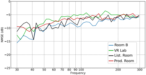
## Line Chart: NMSE vs. Frequency for Different Rooms
### Overview
The image presents a line chart comparing the Normalized Mean Squared Error (NMSE) in decibels (dB) across different rooms (Room B, VR Lab, List. Room, and Prod. Room) as a function of frequency, ranging from approximately 30 Hz to 300 Hz. The chart aims to visualize the performance of a system or measurement in each room based on frequency response.
### Components/Axes
* **X-axis:** Frequency (Hz), ranging from 30 to 300 Hz, with tick marks at 30, 40, 50, 60, 70, 80, 90, 100, 200, and 300 Hz.
* **Y-axis:** NMSE (dB), ranging from -25 dB to 0 dB, with tick marks at -25, -20, -15, -10, -5, and 0 dB.
* **Legend:** Located in the bottom-right corner, identifying the four data series:
* Room B (Blue line)
* VR Lab (Green line)
* List. Room (Black line)
* Prod. Room (Red line)
* **Grid:** A light gray grid is present, aiding in the readability of the chart.
### Detailed Analysis
The chart displays four distinct lines, each representing a room.
* **Room B (Blue):** Starts at approximately -16 dB at 30 Hz, dips to around -18 dB at 40 Hz, then fluctuates between -10 dB and -14 dB until approximately 150 Hz. After 150 Hz, it stabilizes around -8 dB, with minor fluctuations up to 300 Hz.
* **VR Lab (Green):** Begins at approximately -11 dB at 30 Hz, rises to a peak of around -4 dB at 60 Hz, then declines to approximately -8 dB at 100 Hz. It then fluctuates between -6 dB and -10 dB, reaching a peak of approximately -4 dB at 240 Hz before settling around -6 dB at 300 Hz.
* **List. Room (Black):** Starts at approximately -8 dB at 30 Hz, dips to around -12 dB at 40 Hz, then rises to approximately -6 dB at 80 Hz. It then fluctuates between -6 dB and -10 dB, with a slight upward trend towards -5 dB at 300 Hz.
* **Prod. Room (Red):** Begins at approximately -10 dB at 30 Hz, rises to around -5 dB at 60 Hz, then declines to approximately -8 dB at 100 Hz. It then fluctuates between -6 dB and -9 dB, settling around -6 dB at 300 Hz.
### Key Observations
* The VR Lab and Prod. Room exhibit similar trends, with a peak around 60 Hz and then a gradual decline and stabilization.
* Room B consistently shows the highest NMSE values (worst performance) across most of the frequency range.
* The List. Room generally performs better than Room B but worse than VR Lab and Prod. Room.
* All rooms show a general trend of decreasing NMSE (improving performance) as frequency increases, although with fluctuations.
* The VR Lab shows the lowest NMSE values (best performance) in the 60-100 Hz range.
### Interpretation
The chart suggests that the acoustic environment in Room B is the least favorable for the system being evaluated, as indicated by its consistently higher NMSE values. The VR Lab and Prod. Room offer similar performance, while the List. Room falls in between. The fluctuations in NMSE across frequencies indicate that the system's performance is frequency-dependent and varies depending on the room's acoustic characteristics. The decreasing trend of NMSE with increasing frequency could be due to the system's inherent limitations or the room's acoustic properties at higher frequencies. The data suggests that the choice of room significantly impacts the system's performance, and optimizing the acoustic environment could lead to improved results. The chart provides valuable insights for selecting the most suitable room for testing or deployment of the system.