\n
## 3D Surface Plots: Visualization of Functions
### Overview
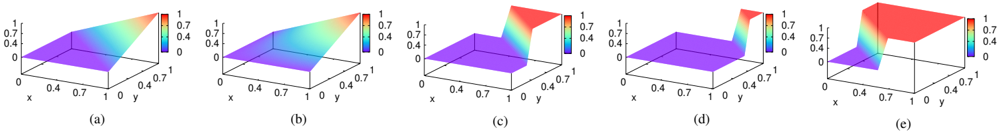
The image presents five 3D surface plots, labeled (a) through (e). Each plot visualizes a function of two variables, 'x' and 'y', with the surface height representing the function's value. The color gradient on each surface indicates the function's value, ranging from approximately 0 (blue/purple) to 1 (red/yellow). All plots share the same x and y axis scales, ranging from 0 to 1.
### Components/Axes
* **X-axis:** Labeled "x", ranging from 0 to 1.
* **Y-axis:** Labeled "y", ranging from 0 to 1.
* **Z-axis:** Implicitly represents the function value, ranging from 0 to 1.
* **Color Scale:** A gradient from blue/purple (low values, ~0) to red/yellow (high values, ~1).
* **Labels:** (a), (b), (c), (d), (e) identify each individual plot.
### Detailed Analysis or Content Details
**Plot (a):**
* The surface slopes upward from left to right and from bottom to top.
* The lowest values (blue/purple) are near x=0 and y=0.
* The highest values (red/yellow) are near x=1 and y=1.
* The surface appears to be a plane.
**Plot (b):**
* Similar to (a), the surface slopes upward from left to right and from bottom to top.
* The color distribution is similar to (a), with blue/purple at the origin and red/yellow at x=1, y=1.
* The surface appears to be a plane.
**Plot (c):**
* The surface is relatively flat, with a slight upward slope from left to right.
* The color is predominantly purple, indicating low function values.
* The highest values (red/yellow) are concentrated near x=1 and y=0.7.
**Plot (d):**
* The surface has a more pronounced upward slope from left to right.
* The color distribution is more varied than (c), with a larger area of purple and a significant region of red/yellow.
* The highest values (red/yellow) are concentrated near x=1 and y=0.7.
**Plot (e):**
* The surface exhibits a complex shape with a peak near x=0.4 and y=0.7.
* The color distribution is highly varied, with a clear peak of red/yellow and surrounding areas of blue/purple.
* The surface appears to have a saddle-like shape.
### Key Observations
* Plots (a) and (b) are very similar, suggesting they represent the same or very similar functions.
* Plot (c) represents a function with generally low values.
* Plot (d) is a variation of (c) with higher values.
* Plot (e) represents a more complex function with a distinct peak.
* All plots have a maximum value of approximately 1 and a minimum value of approximately 0.
### Interpretation
The image demonstrates the visualization of different functions of two variables using 3D surface plots. The color gradient provides an additional dimension of information, allowing for a quick assessment of the function's value at different points in the x-y plane. The varying shapes and color distributions suggest that the functions represented by each plot have different mathematical properties. The plots could be used to illustrate concepts in multivariable calculus, such as partial derivatives, gradients, and level curves. The differences between the plots suggest that small changes in the function's equation can lead to significant changes in its behavior. Without knowing the specific equations, it's difficult to provide a more detailed interpretation. However, the visual representation allows for a qualitative understanding of the functions' characteristics.