## Scatter Plot: MA vs C
### Overview
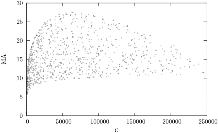
The image is a scatter plot showing the relationship between two variables, MA (on the y-axis) and C (on the x-axis). The plot consists of numerous data points scattered across the graph. The data points are concentrated at lower values of C and spread out as C increases.
### Components/Axes
* **X-axis:** Labeled "C". The scale ranges from 0 to 250000, with tick marks at 0, 50000, 100000, 150000, 200000, and 250000.
* **Y-axis:** Labeled "MA". The scale ranges from 0 to 30, with tick marks at 0, 5, 10, 15, 20, 25, and 30.
* **Data Points:** Each data point is represented by a small, unfilled diamond shape.
### Detailed Analysis
* **Trend:** The data points show a rapid increase in MA as C increases from 0 to approximately 20000. Beyond this point, the increase in MA slows down significantly, and the data points become more scattered.
* **Distribution:** At low values of C (0-20000), the data points are densely packed, indicating a strong correlation between C and MA. As C increases, the data points spread out vertically, suggesting a weaker correlation and a wider range of MA values for a given C value.
* **Specific Values:**
* At C = 0, MA ranges from approximately 0 to 10.
* At C = 50000, MA ranges from approximately 8 to 26.
* At C = 100000, MA ranges from approximately 10 to 28.
* At C = 150000, MA ranges from approximately 10 to 26.
* At C = 200000, MA ranges from approximately 10 to 24.
* At C = 250000, MA ranges from approximately 12 to 16.
### Key Observations
* The relationship between C and MA is non-linear.
* There is a saturation effect, where increasing C beyond a certain point does not lead to a significant increase in MA.
* The variability in MA increases with C.
### Interpretation
The scatter plot suggests that the variable C has a strong influence on MA at lower values, but its effect diminishes as C increases. The saturation effect indicates that there may be other factors limiting the value of MA at higher values of C. The increasing variability in MA with C suggests that other variables may be influencing MA, and their effects become more pronounced as C increases. The plot could represent a physical or computational system where C is an input parameter and MA is an output, and the system's response to C changes as C increases.