\n
## Scatter Plot: MA vs. C
### Overview
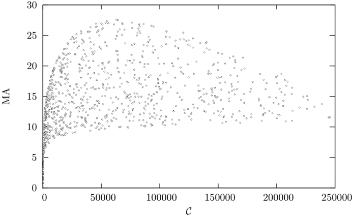
The image presents a scatter plot visualizing the relationship between two variables, labeled "MA" on the y-axis and "C" on the x-axis. The plot consists of a large number of data points, appearing as small gray dots, distributed across the chart area. There are no distinct data series or color-coding beyond the uniform gray color of all points.
### Components/Axes
* **X-axis:** Labeled "C", ranging from approximately 0 to 250,000. The scale is linear.
* **Y-axis:** Labeled "MA", ranging from approximately 0 to 30. The scale is linear.
* **Data Points:** Numerous gray dots representing individual data observations.
* **No Legend:** There is no legend present in the image.
### Detailed Analysis
The data points exhibit a clear pattern. Initially, as "C" increases from 0, "MA" also increases rapidly, forming a dense cluster of points. However, this upward trend plateaus around "MA" = 15. Beyond this point, the relationship becomes less defined, with points scattered more broadly across the range of "C" values.
Here's a breakdown of approximate data point distributions:
* **C = 0 to 10,000:** "MA" values range from approximately 5 to 25, with a concentration between 10 and 20.
* **C = 10,000 to 50,000:** "MA" values remain relatively stable, mostly between 12 and 20. The density of points decreases slightly.
* **C = 50,000 to 150,000:** "MA" values fluctuate between approximately 10 and 18, with a more even distribution.
* **C = 150,000 to 250,000:** "MA" values show a wider spread, ranging from approximately 8 to 25, but with a higher concentration around 12-15.
It's difficult to provide precise numerical values for individual points due to the density of the scatter plot. However, the overall trend is clearly visible.
### Key Observations
* **Positive Correlation (Initial Phase):** There's a positive correlation between "C" and "MA" for lower values of "C".
* **Saturation Effect:** The correlation weakens and appears to saturate around "MA" = 15. Further increases in "C" do not lead to significant increases in "MA".
* **Data Spread:** The spread of "MA" values increases as "C" increases, indicating greater variability in "MA" for higher "C" values.
* **No Outliers:** There are no immediately obvious outlier data points significantly distant from the main cluster.
### Interpretation
The scatter plot suggests a relationship where "MA" initially increases with "C", but this relationship reaches a limit. This could indicate a saturation point or a diminishing return effect. "C" might represent an input or independent variable, while "MA" represents an output or dependent variable. The saturation suggests that beyond a certain level of "C", increasing it further does not proportionally increase "MA".
The increasing spread of "MA" values at higher "C" values could indicate the influence of other factors not represented in this plot. These factors might introduce variability in the relationship between "C" and "MA".
Without knowing the context of "MA" and "C", it's difficult to provide a more specific interpretation. However, the plot clearly demonstrates a non-linear relationship with a saturation effect. Further investigation might involve exploring the influence of other variables or examining the underlying mechanisms driving this behavior.