## 3D Bar Chart: Anomaly Detection in Channel-Token Data
### Overview
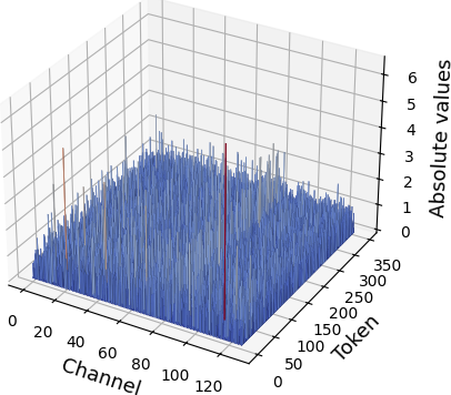
The image depicts a 3D bar chart visualizing absolute values across three dimensions: **Channel** (x-axis), **Token** (y-axis), and **Absolute values** (z-axis). The chart highlights anomalies (red bars) and normal data points (blue/green bars) in a dataset spanning 120 channels and 350 tokens. A legend in the top-right corner distinguishes "Anomaly" (red) and "Normal" (green) categories.
---
### Components/Axes
- **X-axis (Channel)**: Labeled "Channel," ranging from 0 to 120 in increments of 20.
- **Y-axis (Token)**: Labeled "Token," ranging from 0 to 350 in increments of 50.
- **Z-axis (Absolute values)**: Labeled "Absolute values," ranging from 0 to 6 in increments of 1.
- **Legend**: Located in the top-right corner, with:
- **Red**: "Anomaly"
- **Green**: "Normal"
- **Bars**:
- Majority are blue (unlabeled, assumed "Normal").
- Two highlighted bars:
- **Red**: Channel 80, Token 200, Absolute value ~5.
- **Green**: Channel 40, Token 150, Absolute value ~4.
---
### Detailed Analysis
- **Anomaly (Red Bar)**:
- Positioned at **Channel 80**, **Token 200**.
- Absolute value: ~5 (highest in the dataset).
- Spatial grounding: Center-right of the chart, elevated above the majority of bars.
- **Normal (Green Bar)**:
- Positioned at **Channel 40**, **Token 150**.
- Absolute value: ~4 (moderate compared to anomalies).
- Spatial grounding: Left-middle of the chart, slightly elevated.
- **Normal (Blue Bars)**:
- Distributed across all channels and tokens.
- Absolute values: Clustered between 1–4, with occasional peaks up to ~3.5.
- Spatial grounding: Dense, low-to-mid elevation across the entire grid.
---
### Key Observations
1. **Anomaly Outliers**: The red bar at (80, 200) is the only outlier, significantly exceeding the z-axis range of most data points.
2. **Normal Distribution**: Blue bars dominate, with values concentrated in the lower half of the z-axis (1–3.5).
3. **Token-Channel Correlation**: No clear trend between channel and token values; anomalies appear isolated.
4. **Legend Consistency**: Red and green bars match the legend labels exactly.
---
### Interpretation
- **Data Significance**: The chart likely represents a machine learning model's performance, where "Absolute values" could indicate error magnitudes (e.g., prediction errors) or feature importance scores.
- **Anomaly Implications**: The red bar at (80, 200) suggests a critical error or outlier in the dataset, potentially requiring investigation into data quality or model behavior at that specific channel-token combination.
- **Normal Behavior**: The prevalence of blue/green bars indicates the model generally performs within expected ranges, with most data points falling below the anomaly threshold.
- **Spatial Patterns**: The lack of clustering in anomalies suggests errors are sporadic rather than systematic, pointing to possible random noise or isolated data corruption.
---
### Final Notes
The chart provides a clear visual distinction between normal and anomalous data points. The red bar's prominence underscores its importance as a potential focal point for further analysis. No textual content or additional languages are present in the image.