\n
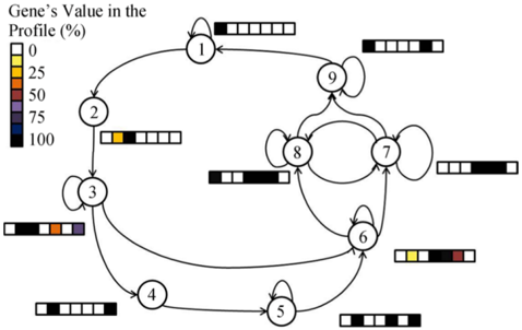
## Diagram: Gene Value Profile Flow
### Overview
The image depicts a directed graph representing a flow or process with nine nodes (numbered 1 through 9). Each node is associated with a visual representation of a "Gene's Value in the Profile (%)" using a color-coded bar. The diagram illustrates transitions between these nodes, indicated by arrows.
### Components/Axes
* **Nodes:** Numbered 1-9, represented as circles.
* **Arrows:** Indicate the direction of flow between nodes.
* **Legend:** Located in the top-left corner, defining the color scale for "Gene's Value in the Profile (%)":
* White: 0%
* Light Yellow: 25%
* Orange: 50%
* Dark Blue: 75%
* Darkest Blue: 100%
* **Gene Value Bars:** Horizontal bars associated with each node, representing the gene value percentage.
### Detailed Analysis or Content Details
Let's analyze each node and its associated gene value:
* **Node 1:** The bar is mostly white with a small dark section. Approximately 10-15% value.
* **Node 2:** The bar is predominantly light yellow with a small orange section. Approximately 30-40% value.
* **Node 3:** The bar is a mix of dark blue, orange, and light yellow. Approximately 70-80% value.
* **Node 4:** The bar is mostly white with a few dark sections. Approximately 10-20% value.
* **Node 5:** The bar is mostly dark gray with a few white sections. Approximately 20-30% value.
* **Node 6:** The bar is a mix of light yellow and dark red. Approximately 30-40% value.
* **Node 7:** The bar is mostly white with a few dark sections. Approximately 10-20% value.
* **Node 8:** The bar is mostly dark gray with a few white sections. Approximately 20-30% value.
* **Node 9:** The bar is mostly white with a few dark sections. Approximately 10-20% value.
**Flow Analysis:**
* Node 1 flows to Node 9.
* Node 1 flows to Node 2.
* Node 2 flows to Node 3.
* Node 3 flows to Node 4.
* Node 4 flows to Node 5.
* Node 5 flows to Node 6.
* Node 6 flows to Node 7 and Node 8.
* Node 7 flows to Node 9.
* Node 8 flows to Node 9.
### Key Observations
* The gene values vary significantly between nodes.
* Node 3 has the highest gene value (approximately 70-80%).
* Nodes 1, 4, 5, 7, 8, and 9 have relatively low gene values (approximately 10-30%).
* The flow converges at Node 9, suggesting a final state or outcome.
* Node 6 splits the flow into two paths, leading to Nodes 7 and 8.
### Interpretation
This diagram likely represents a biological pathway or a state transition diagram for a gene expression process. The nodes represent different states or stages in the process, and the arrows indicate the transitions between these states. The "Gene's Value in the Profile (%)" represents the expression level of a particular gene at each stage.
The high value at Node 3 suggests a key regulatory step or a point of significant gene expression. The convergence at Node 9 indicates a final outcome or a stable state. The split at Node 6 suggests a branching point where the process can follow different paths depending on certain conditions.
The varying gene values suggest that the gene expression is dynamically regulated throughout the process. The diagram provides a visual representation of this regulation and the flow of information within the system. The diagram does not provide any quantitative data beyond the approximate percentages indicated by the color bars. It is a qualitative representation of a process.