## Scatter Plot: Accuracy vs. Time-to-Answer
### Overview
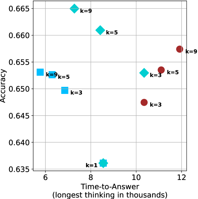
The image is a scatter plot showing the relationship between "Accuracy" and "Time-to-Answer" (longest thinking in thousands). The plot displays data points for different values of 'k' (1, 3, 5, and 9), represented by different shapes and colors. The x-axis represents the time taken to answer, and the y-axis represents the accuracy.
### Components/Axes
* **X-axis:** "Time-to-Answer (longest thinking in thousands)". The scale ranges from approximately 5 to 12, with gridlines at integer values.
* **Y-axis:** "Accuracy". The scale ranges from 0.635 to 0.665, with gridlines at intervals of 0.005.
* **Data Points:**
* Cyan Squares: k=3, k=5, k=9
* Cyan Diamonds: k=3, k=5, k=9
* Cyan Star: k=1
* Maroon Circles: k=3, k=5, k=9
### Detailed Analysis
* **Cyan Squares:**
* k=9: Located at approximately (5.8, 0.653)
* k=5: Located at approximately (6.2, 0.652)
* k=3: Located at approximately (6.5, 0.650)
* Trend: As k decreases, the time-to-answer increases slightly, and the accuracy decreases slightly.
* **Cyan Diamonds:**
* k=9: Located at approximately (8.5, 0.665)
* k=5: Located at approximately (9.2, 0.661)
* k=3: Located at approximately (10.2, 0.653)
* Trend: As k decreases, the time-to-answer increases, and the accuracy decreases.
* **Cyan Star:**
* k=1: Located at approximately (8.0, 0.636)
* **Maroon Circles:**
* k=9: Located at approximately (11.8, 0.657)
* k=5: Located at approximately (11.5, 0.653)
* k=3: Located at approximately (10.8, 0.647)
* Trend: As k decreases, the time-to-answer decreases, and the accuracy decreases.
### Key Observations
* The cyan squares are clustered in the top-left corner of the plot, indicating shorter time-to-answer and relatively high accuracy.
* The cyan diamonds are more spread out, with a general trend of decreasing accuracy as time-to-answer increases.
* The maroon circles are located in the top-right to center-right of the plot, indicating longer time-to-answer.
* The cyan star (k=1) has the lowest accuracy and a moderate time-to-answer.
### Interpretation
The scatter plot visualizes the trade-off between accuracy and time-to-answer for different values of 'k'. The data suggests that:
* There is no clear optimal value of 'k' that maximizes both accuracy and minimizes time-to-answer.
* Lower values of 'k' (like k=1) result in the lowest accuracy.
* The choice of 'k' depends on the specific application and the relative importance of accuracy and speed.
* The cyan squares are the most efficient, but the cyan diamonds have the highest accuracy.
* The maroon circles have the longest time-to-answer.