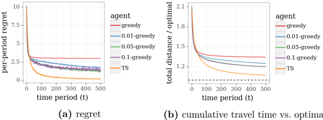
## Charts: Regret and Cumulative Travel Time vs. Optimal
### Overview
The image presents two line charts, labeled (a) "regret" and (b) "cumulative travel time vs. optimal". Both charts compare the performance of several agents (greedy, 0.01-greedy, 0.05-greedy, 0.1-greedy, and TS) over time periods from 0 to 500. The x-axis represents time period (t), while the y-axis in (a) represents per-period regret, and in (b) represents total distance divided by the optimal distance.
### Components/Axes
* **Chart (a): Regret**
* X-axis: time period (t), ranging from 0 to 500.
* Y-axis: per-period regret, ranging from 0 to 10.
* Legend: "agent" with the following categories:
* greedy (red)
* 0.01-greedy (orange)
* 0.05-greedy (green)
* 0.1-greedy (purple)
* TS (gray)
* **Chart (b): Cumulative Travel Time vs. Optimal**
* X-axis: time period (t), ranging from 0 to 500.
* Y-axis: total distance / optimal, ranging from 1.1 to 2.1.
* Legend: "agent" with the following categories:
* greedy (red)
* 0.01-greedy (orange)
* 0.05-greedy (green)
* 0.1-greedy (purple)
* TS (gray)
* Dotted line at x=100, y=1.25
### Detailed Analysis or Content Details
**Chart (a): Regret**
* **greedy (red):** Starts at approximately 6.5 and remains relatively constant around 3.5-4.0 throughout the time period.
* **0.01-greedy (orange):** Starts at approximately 1.5 and decreases rapidly to around 0.2 by t=100, then continues to decrease slowly, reaching approximately 0.05 by t=500.
* **0.05-greedy (green):** Starts at approximately 2.0 and decreases rapidly to around 0.1 by t=100, then continues to decrease slowly, reaching approximately 0.05 by t=500.
* **0.1-greedy (purple):** Starts at approximately 2.5 and decreases rapidly to around 0.1 by t=100, then continues to decrease slowly, reaching approximately 0.05 by t=500.
* **TS (gray):** Starts at approximately 2.5 and decreases rapidly to around 0.1 by t=100, then continues to decrease slowly, reaching approximately 0.05 by t=500.
**Chart (b): Cumulative Travel Time vs. Optimal**
* **greedy (red):** Starts at approximately 1.9 and decreases rapidly to around 1.25 by t=100, then continues to decrease slowly, reaching approximately 1.15 by t=500.
* **0.01-greedy (orange):** Starts at approximately 1.8 and decreases rapidly to around 1.2 by t=100, then continues to decrease slowly, reaching approximately 1.15 by t=500.
* **0.05-greedy (green):** Starts at approximately 1.8 and decreases rapidly to around 1.2 by t=100, then continues to decrease slowly, reaching approximately 1.15 by t=500.
* **0.1-greedy (purple):** Starts at approximately 1.8 and decreases rapidly to around 1.2 by t=100, then continues to decrease slowly, reaching approximately 1.15 by t=500.
* **TS (gray):** Starts at approximately 1.8 and decreases rapidly to around 1.2 by t=100, then continues to decrease slowly, reaching approximately 1.15 by t=500.
### Key Observations
* In both charts, the "greedy" agent consistently performs worse than the other agents, exhibiting higher regret and a larger ratio of total distance to optimal distance.
* The agents "0.01-greedy", "0.05-greedy", "0.1-greedy", and "TS" exhibit very similar performance in both charts, converging to similar values as time increases.
* The initial drop in both charts is most pronounced between t=0 and t=100.
* The dotted line in chart (b) at x=100, y=1.25 may indicate a benchmark or threshold.
### Interpretation
The data suggests that the "greedy" agent, while simple, is suboptimal in this scenario, consistently incurring higher regret and longer travel times relative to the optimal solution. The other agents, which incorporate some degree of exploration or learning (indicated by the "greedy" coefficient and "TS" for Thompson Sampling), converge to a similar level of performance, suggesting that a small amount of exploration significantly improves results. The rapid initial improvement (between t=0 and t=100) indicates a quick learning phase where the agents adapt to the environment. The convergence of the non-greedy agents suggests diminishing returns from further exploration after a certain point. The dotted line in chart (b) could represent a target performance level, and the agents' convergence towards this level indicates successful adaptation. The charts demonstrate the trade-off between exploration and exploitation in reinforcement learning or decision-making processes.