## Horizontal Stacked Bar Chart: Trust Scores by Explanation Type and Condition
### Overview
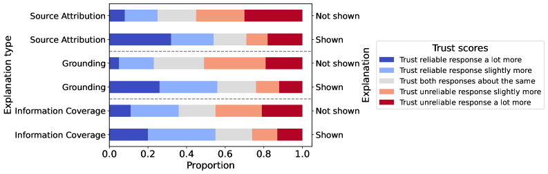
This image displays a horizontal stacked bar chart comparing "Trust scores" across three different "Explanation types" (Source Attribution, Grounding, Information Coverage). Each explanation type is evaluated under two conditions: "Shown" and "Not shown". The chart visualizes the proportion of respondents' trust in a reliable versus an unreliable response.
### Components/Axes
* **Y-Axis (Vertical):** Labeled "Explanation type". It lists three main categories, each split into two sub-categories:
1. Source Attribution - Not shown
2. Source Attribution - Shown
3. Grounding - Not shown
4. Grounding - Shown
5. Information Coverage - Not shown
6. Information Coverage - Shown
* **X-Axis (Horizontal):** Labeled "Proportion". It has a linear scale from 0.0 to 1.0, with major tick marks at 0.0, 0.2, 0.4, 0.6, 0.8, and 1.0.
* **Legend:** Positioned to the right of the chart, titled "Trust scores". It defines five color-coded categories:
* Dark Blue: "Trust reliable response a lot more"
* Light Blue: "Trust reliable response slightly more"
* Grey: "Trust both responses about the same"
* Light Orange/Peach: "Trust unreliable response slightly more"
* Dark Red: "Trust unreliable response a lot more"
* **Condition Labels:** The text "Not shown" and "Shown" appears to the right of each corresponding bar, aligned with the y-axis categories.
### Detailed Analysis
The chart consists of six horizontal bars, each representing 100% (proportion 1.0) of responses for that condition. The bars are segmented by color according to the legend.
**1. Source Attribution - Not shown:**
* **Trend:** The bar is dominated by the grey ("same") and red ("unreliable a lot more") segments, with smaller blue segments.
* **Approximate Proportions (from left to right):**
* Dark Blue (Reliable a lot more): ~0.08
* Light Blue (Reliable slightly more): ~0.17 (cumulative ~0.25)
* Grey (Same): ~0.25 (cumulative ~0.50)
* Light Orange (Unreliable slightly more): ~0.25 (cumulative ~0.75)
* Dark Red (Unreliable a lot more): ~0.25 (cumulative 1.00)
**2. Source Attribution - Shown:**
* **Trend:** A significant shift towards the blue ("reliable") segments compared to the "Not shown" condition.
* **Approximate Proportions:**
* Dark Blue: ~0.30
* Light Blue: ~0.25 (cumulative ~0.55)
* Grey: ~0.20 (cumulative ~0.75)
* Light Orange: ~0.10 (cumulative ~0.85)
* Dark Red: ~0.15 (cumulative 1.00)
**3. Grounding - Not shown:**
* **Trend:** Similar pattern to "Source Attribution - Not shown", with large grey and red segments.
* **Approximate Proportions:**
* Dark Blue: ~0.05
* Light Blue: ~0.20 (cumulative ~0.25)
* Grey: ~0.25 (cumulative ~0.50)
* Light Orange: ~0.30 (cumulative ~0.80)
* Dark Red: ~0.20 (cumulative 1.00)
**4. Grounding - Shown:**
* **Trend:** Marked increase in the blue segments, particularly the dark blue.
* **Approximate Proportions:**
* Dark Blue: ~0.25
* Light Blue: ~0.25 (cumulative ~0.50)
* Grey: ~0.25 (cumulative ~0.75)
* Light Orange: ~0.10 (cumulative ~0.85)
* Dark Red: ~0.15 (cumulative 1.00)
**5. Information Coverage - Not shown:**
* **Trend:** This bar has the largest dark red segment among all "Not shown" conditions.
* **Approximate Proportions:**
* Dark Blue: ~0.10
* Light Blue: ~0.25 (cumulative ~0.35)
* Grey: ~0.20 (cumulative ~0.55)
* Light Orange: ~0.25 (cumulative ~0.80)
* Dark Red: ~0.20 (cumulative 1.00)
**6. Information Coverage - Shown:**
* **Trend:** Shows the most balanced distribution between trust in reliable and unreliable responses among the "Shown" conditions.
* **Approximate Proportions:**
* Dark Blue: ~0.20
* Light Blue: ~0.35 (cumulative ~0.55)
* Grey: ~0.20 (cumulative ~0.75)
* Light Orange: ~0.10 (cumulative ~0.85)
* Dark Red: ~0.15 (cumulative 1.00)
### Key Observations
1. **Consistent "Shown" Effect:** For all three explanation types, the "Shown" condition results in a substantially larger combined proportion of the two blue segments (trusting the reliable response more) compared to the "Not shown" condition.
2. **Reduction in Extreme Distrust:** The dark red segment ("Trust unreliable response a lot more") is consistently smaller in the "Shown" bars than in their corresponding "Not shown" bars.
3. **Grey Segment Stability:** The grey segment ("Trust both responses about the same") remains relatively stable in size (around 0.20-0.25) across all six bars.
4. **Most Impactful Shift:** The "Source Attribution" type appears to show the most dramatic visual shift from "Not shown" to "Shown", with the dark blue segment roughly tripling in size.
### Interpretation
This chart demonstrates the **positive impact of providing explanations** on user trust calibration. When explanations (Source Attribution, Grounding, or Information Coverage) are shown, users are significantly more likely to appropriately trust a reliable response over an unreliable one. Conversely, when no explanation is shown, a larger proportion of users inappropriately trust the unreliable response more, or are unable to distinguish between them.
The data suggests that **explanations act as a critical signal for reliability**. The consistent pattern across all three types implies this is a general effect of transparency, not specific to one explanation method. The persistence of the grey segment indicates a subset of users remains uncertain regardless of explanation, highlighting a potential area for improving explanation clarity or user education. From a Peircean perspective, the "Shown" conditions provide a clearer **indexical sign** (the explanation) linking the AI's response to its underlying process, thereby allowing users to make a more informed **abductive inference** about which response to trust. This has major implications for designing trustworthy AI systems: providing explanations is not just a feature but a fundamental requirement for enabling users to make sound judgments.