\n
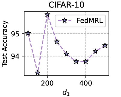
## Line Chart: CIFAR-10 Test Accuracy vs. Parameter d₁
### Overview
The image is a line chart displaying the performance of a method called "FedMRL" on the CIFAR-10 dataset. It plots "Test Accuracy" against a parameter labeled "d₁". The chart shows a non-monotonic relationship, with accuracy fluctuating significantly as d₁ increases.
### Components/Axes
* **Chart Title:** "CIFAR-10" (centered at the top).
* **Y-Axis:** Labeled "Test Accuracy". The visible scale has major tick marks at 94 and 95. The axis extends slightly below 94 and above 95.
* **X-Axis:** Labeled "d₁". The visible scale has major tick marks at 200 and 400. The axis starts before 200 and ends after 400.
* **Legend:** Located in the top-right corner of the plot area. It contains one entry:
* A purple dashed line with a star marker, labeled "FedMRL".
* **Data Series:** A single series represented by a purple dashed line connecting star-shaped markers.
### Detailed Analysis
The data series "FedMRL" consists of 9 distinct points. The approximate values, read from the chart, are as follows (listed in order of increasing d₁):
1. **Point 1 (d₁ ≈ 100):** Test Accuracy ≈ 95.0
2. **Point 2 (d₁ ≈ 150):** Test Accuracy ≈ 93.3 (This is the lowest point on the chart).
3. **Point 3 (d₁ ≈ 200):** Test Accuracy ≈ 95.8 (This is the highest point on the chart).
4. **Point 4 (d₁ ≈ 250):** Test Accuracy ≈ 94.7
5. **Point 5 (d₁ ≈ 300):** Test Accuracy ≈ 94.1
6. **Point 6 (d₁ ≈ 350):** Test Accuracy ≈ 93.8
7. **Point 7 (d₁ ≈ 400):** Test Accuracy ≈ 93.8
8. **Point 8 (d₁ ≈ 450):** Test Accuracy ≈ 94.2
9. **Point 9 (d₁ ≈ 500):** Test Accuracy ≈ 94.5
**Trend Verification:** The line does not follow a simple linear trend. It begins high, dips sharply to a minimum, spikes to a maximum, then follows a general downward trend with a slight recovery at the end.
### Key Observations
1. **High Volatility:** The most notable feature is the extreme volatility in the lower range of d₁ (100-200), where accuracy swings from ~95.0 down to ~93.3 and then up to ~95.8.
2. **Peak Performance:** The optimal performance for FedMRL on this task, according to this chart, occurs at d₁ ≈ 200.
3. **General Decline Post-Peak:** After the peak at d₁=200, there is a general, though not perfectly smooth, decline in test accuracy as d₁ increases to 400.
4. **Late-Stage Recovery:** There is a modest recovery in accuracy as d₁ increases from 400 to 500.
5. **Legend Placement:** The legend is positioned in the top-right, overlapping slightly with the grid lines but not obscuring any data points.
### Interpretation
This chart demonstrates the sensitivity of the FedMRL algorithm's performance on the CIFAR-10 benchmark to the hyperparameter `d₁`. The data suggests that `d₁` is a critical parameter with a narrow optimal range.
* **The sharp dip and peak** between d₁=100 and d₁=200 indicate a highly non-linear response. This could imply a phase transition in the model's behavior or optimization landscape within this parameter range.
* **The peak at d₁=200** represents the "sweet spot" for this configuration. Values significantly lower or higher lead to worse performance.
* **The gradual decline from 200 to 400** suggests that increasing `d₁` beyond the optimum generally harms generalization (test accuracy), possibly due to overfitting, increased communication overhead in a federated setting, or a mismatch with the underlying data distribution.
* **The slight uptick at the end (450-500)** is interesting but minor. It could be noise, or it might hint at a more complex, multi-modal relationship where very high values of `d₁` begin to confer some benefit again, though not reaching the peak.
In summary, the chart provides a clear empirical argument for carefully tuning `d₁` when using FedMRL, as its value has a dramatic and non-intuitive impact on final model accuracy. The optimal setting is not at the extremes of the tested range but at a specific intermediate value.