\n
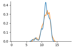
## Line Chart: Distribution Comparison
### Overview
The image presents a line chart comparing two distributions. The chart displays values on the y-axis ranging from 0.0 to 0.4, and values on the x-axis ranging from 0 to 15. Two lines, one blue and one orange, represent the distributions.
### Components/Axes
* **X-axis:** Ranges from 0 to 15, with no explicit label.
* **Y-axis:** Ranges from 0.0 to 0.4, with no explicit label.
* **Line 1:** Blue line.
* **Line 2:** Orange line.
* **Legend:** No explicit legend is present, but the lines are visually distinguishable.
### Detailed Analysis
The blue line starts at approximately 0 at x=0, gradually increases, reaches a peak around x=11 with a value of approximately 0.42, and then decreases back to approximately 0 by x=15. There is a slight oscillation before the peak.
The orange line also starts at approximately 0 at x=0, increases, reaches a peak around x=11.5 with a value of approximately 0.32, and then decreases to approximately 0 by x=15. The orange line appears smoother than the blue line.
Here's a breakdown of approximate data points:
**Blue Line:**
* x=0: y=0.0
* x=5: y=0.02
* x=8: y=0.15
* x=10: y=0.35
* x=11: y=0.42
* x=12: y=0.30
* x=14: y=0.05
* x=15: y=0.0
**Orange Line:**
* x=0: y=0.0
* x=5: y=0.01
* x=8: y=0.10
* x=10: y=0.25
* x=11.5: y=0.32
* x=12: y=0.20
* x=14: y=0.03
* x=15: y=0.0
### Key Observations
* Both distributions are unimodal, peaking around x=11.
* The blue line has a higher peak value than the orange line.
* The blue line exhibits more fluctuations than the orange line.
* Both lines converge towards 0 as x approaches 0 and 15.
### Interpretation
The chart likely represents the distribution of some continuous variable. The two lines could represent distributions from two different groups or conditions. The higher peak of the blue line suggests that values around x=11 are more frequent in the blue distribution compared to the orange distribution. The smoother nature of the orange line might indicate a larger sample size or less variability within that distribution. Without knowing what the x and y axes represent, it's difficult to draw more specific conclusions. The chart demonstrates a comparison of two distributions, highlighting differences in their central tendency and variability.