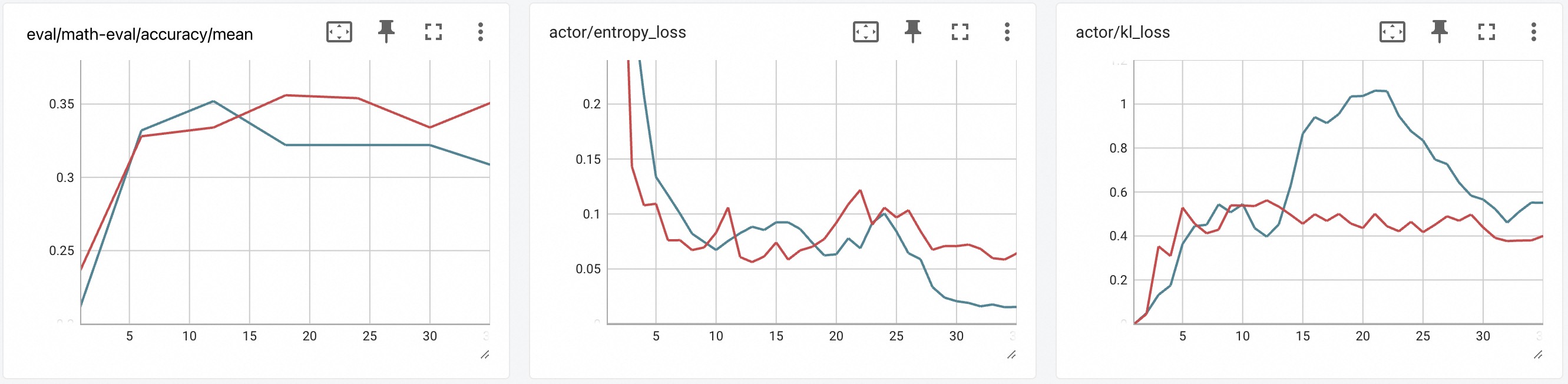
## Line Charts: Training Metrics
### Overview
The image presents three line charts displaying training metrics. Each chart plots the progression of two different metrics over a series of training steps. The x-axis represents the training steps, ranging from approximately 0 to 33. The y-axis represents the metric value. The charts are: eval/math-eval/accuracy/mean, actor/entropy_loss, and actor/kl_loss. Each chart contains two data series, represented by a red and a blue line.
### Components/Axes
**Chart 1: eval/math-eval/accuracy/mean**
* **Title:** eval/math-eval/accuracy/mean
* **X-axis:** Training steps, labeled approximately 5, 10, 15, 20, 25, 30.
* **Y-axis:** Accuracy/Mean, with values ranging from 0.25 to 0.35.
* **Data Series:** Two lines, one red and one blue. No legend is provided, so the meaning of the colors is unknown.
**Chart 2: actor/entropy_loss**
* **Title:** actor/entropy_loss
* **X-axis:** Training steps, labeled approximately 5, 10, 15, 20, 25, 30.
* **Y-axis:** Entropy Loss, with values ranging from 0.05 to 0.2.
* **Data Series:** Two lines, one red and one blue. No legend is provided, so the meaning of the colors is unknown.
**Chart 3: actor/kl_loss**
* **Title:** actor/kl_loss
* **X-axis:** Training steps, labeled approximately 5, 10, 15, 20, 25, 30.
* **Y-axis:** KL Loss, with values ranging from 0.2 to 1.
* **Data Series:** Two lines, one red and one blue. No legend is provided, so the meaning of the colors is unknown.
### Detailed Analysis
**Chart 1: eval/math-eval/accuracy/mean**
* **Red Line:** Starts at approximately 0.23, increases to approximately 0.33 by step 5, then increases to approximately 0.36 by step 15, remains relatively stable until step 25, then decreases to approximately 0.33 by step 33.
* **Blue Line:** Starts at approximately 0.22, increases to approximately 0.32 by step 5, then increases to approximately 0.35 by step 10, remains relatively stable until step 20, then decreases to approximately 0.32 by step 33.
**Chart 2: actor/entropy_loss**
* **Red Line:** Starts at approximately 0.15, decreases to approximately 0.07 by step 5, then fluctuates between 0.06 and 0.12 until step 33.
* **Blue Line:** Starts at approximately 0.23, decreases to approximately 0.12 by step 5, then decreases to approximately 0.02 by step 25, then remains relatively stable until step 33.
**Chart 3: actor/kl_loss**
* **Red Line:** Starts at approximately 0.0, increases to approximately 0.3 by step 5, then fluctuates between 0.4 and 0.6 until step 33.
* **Blue Line:** Starts at approximately 0.0, increases to approximately 0.5 by step 5, then increases to approximately 1.0 by step 15, then decreases to approximately 0.5 by step 33.
### Key Observations
* In the first chart, the red line shows a slightly higher accuracy/mean than the blue line after step 15.
* In the second chart, the blue line shows a more significant decrease in entropy loss than the red line.
* In the third chart, the blue line shows a peak in KL loss around step 15, while the red line remains relatively stable.
### Interpretation
The charts illustrate the training progress of a model, showing the evolution of accuracy and loss metrics. The different trends in the red and blue lines suggest that they represent different aspects of the training process, possibly different components of the model or different training strategies. Without a legend, it is difficult to determine the exact meaning of each line. The fluctuations in the loss metrics indicate that the model is still learning and adapting during the training process. The peak in KL loss in the third chart may indicate a period of instability or exploration during training.