TECHNICAL ASSET FINGERPRINT
8f2e227d657385456058d901
Click to view fullscreen
Press ESC or click to close
FOUND IN PAPERS
EXPERT: healer-alpha-free VERSION 1
RUNTIME: free/openrouter/healer-alpha
INTEL_VERIFIED
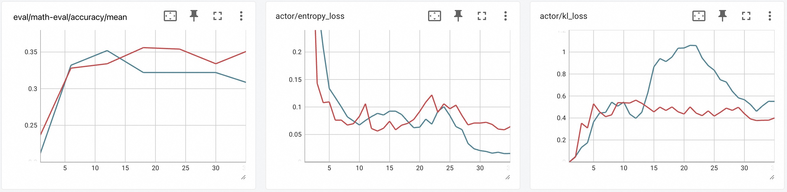
## Line Charts: Training Metrics Dashboard
### Overview
The image displays a dashboard containing three separate line charts arranged horizontally. Each chart tracks a different metric over what appears to be training steps or epochs (x-axis, ranging from 0 to 30). Each chart contains two data series, represented by a red line and a blue line. The charts are presented in a clean, grid-based interface with light gray grid lines and minimal UI controls (pin, expand, and menu icons) in the top-right corner of each panel.
### Components/Axes
**Common Elements:**
* **X-Axis (All Charts):** Labeled with numerical markers at intervals of 5: `0, 5, 10, 15, 20, 25, 30`. The axis likely represents training steps, epochs, or iterations. No explicit axis title (e.g., "Steps") is visible.
* **Data Series:** Two lines per chart: one **red** and one **blue**. No legend is present within the chart areas. The color assignment is consistent across all three charts.
* **Grid:** A light gray grid is present in the background of each chart.
**Chart 1 (Left):**
* **Title:** `eval/math-eval/accuracy/mean` (Top-left corner).
* **Y-Axis:** Numerical scale from approximately `0.25` to `0.35`, with major ticks at `0.25, 0.3, 0.35`.
**Chart 2 (Center):**
* **Title:** `actor/entropy_loss` (Top-left corner).
* **Y-Axis:** Numerical scale from `0` to `0.2`, with major ticks at `0, 0.05, 0.1, 0.15, 0.2`.
**Chart 3 (Right):**
* **Title:** `actor/kl_loss` (Top-left corner).
* **Y-Axis:** Numerical scale from `0` to `1.2`, with major ticks at `0, 0.2, 0.4, 0.6, 0.8, 1, 1.2`.
### Detailed Analysis
**Chart 1: eval/math-eval/accuracy/mean**
* **Trend Verification:** Both lines show an initial sharp increase, followed by a plateau or slower growth.
* **Blue Line:** Starts near `0.22` at step 0. Rises steeply to ~`0.33` by step 5. Peaks at ~`0.35` around step 12. Then declines slightly and plateaus at ~`0.32` from step 15 to 25, ending at ~`0.31` at step 30.
* **Red Line:** Starts near `0.24` at step 0. Rises steeply to ~`0.325` by step 5. Continues a steadier climb, surpassing the blue line around step 15. Reaches a peak of ~`0.355` around step 20, dips slightly to ~`0.33` at step 25, and ends at ~`0.35` at step 30.
* **Key Data Points (Approximate):**
* Step 5: Blue ~0.33, Red ~0.325
* Step 15: Blue ~0.32, Red ~0.34
* Step 20: Blue ~0.32, Red ~0.355
* Step 30: Blue ~0.31, Red ~0.35
**Chart 2: actor/entropy_loss**
* **Trend Verification:** Both lines show a general downward trend, indicating decreasing entropy loss over time.
* **Blue Line:** Starts very high (off-chart, >`0.2`) at step 0. Drops sharply to ~`0.13` by step 5. Continues a fluctuating decline, reaching ~`0.07` by step 10. Shows a minor rise to ~`0.09` around step 15, then a steady decline to its lowest point of ~`0.02` at step 30.
* **Red Line:** Also starts high (off-chart). Drops to ~`0.11` by step 5. Fluctuates between ~`0.06` and `0.11` from steps 5 to 25, with a notable peak of ~`0.12` around step 22. Ends at ~`0.06` at step 30.
* **Key Data Points (Approximate):**
* Step 5: Blue ~0.13, Red ~0.11
* Step 15: Blue ~0.09, Red ~0.07
* Step 22: Blue ~0.07, Red ~0.12 (peak)
* Step 30: Blue ~0.02, Red ~0.06
**Chart 3: actor/kl_loss**
* **Trend Verification:** The blue line shows a large, pronounced hump-shaped trend. The red line shows a much smaller, flatter increase and plateau.
* **Blue Line:** Starts near `0` at step 0. Rises steadily to ~`0.5` by step 10. Accelerates sharply, peaking at ~`1.05` around step 20. Then declines steadily to ~`0.55` at step 30.
* **Red Line:** Starts near `0`. Rises to ~`0.5` by step 5. Fluctuates in a narrow band between ~`0.4` and `0.6` for the remainder of the chart, ending at ~`0.4` at step 30.
* **Key Data Points (Approximate):**
* Step 5: Blue ~0.2, Red ~0.5
* Step 10: Blue ~0.5, Red ~0.55
* Step 20: Blue ~1.05 (peak), Red ~0.45
* Step 30: Blue ~0.55, Red ~0.4
### Key Observations
1. **Performance Divergence (Chart 1):** The red line achieves a higher final accuracy (~0.35) than the blue line (~0.31), despite the blue line having an early lead.
2. **Entropy Loss Behavior (Chart 2):** The blue line's entropy loss decreases more consistently and reaches a much lower final value (~0.02) than the red line (~0.06), suggesting the policy associated with the blue line becomes more deterministic.
3. **KL Loss Anomaly (Chart 3):** The blue line exhibits a dramatic, temporary surge in KL loss, peaking at over 1.0, while the red line's KL loss remains relatively stable below 0.6. This indicates a period of significant policy divergence for the blue line's agent.
4. **Correlation of Trends:** The period of highest KL loss for the blue line (steps 15-25) corresponds roughly to the period where its accuracy (Chart 1) plateaus and its entropy loss (Chart 2) reaches its lowest values.
### Interpretation
This dashboard likely compares the training performance of two different agents, models, or hyperparameter settings (Red vs. Blue) in a reinforcement learning or fine-tuning context, possibly for a math reasoning task.
* **What the data suggests:** The **Red** configuration appears to yield better final task performance (higher accuracy) and maintains a more stable policy (lower, stable KL loss). The **Blue** configuration learns a more deterministic policy (very low final entropy loss) but experiences a large, destabilizing shift in its policy mid-training (high KL loss peak), which may have hindered its final accuracy.
* **Relationship between elements:** The charts together tell a story of trade-offs. Maximizing policy certainty (low entropy, Blue line) does not guarantee better task performance and may come at the cost of training stability (high KL divergence). The Red line's approach, maintaining slightly higher entropy and very controlled KL change, resulted in better final outcomes.
* **Notable anomalies:** The massive spike in KL loss for the Blue line is the most significant anomaly. It suggests a potential instability in the training process for that configuration, such as an aggressive learning rate, a problematic batch of data, or an inherent instability in the algorithm being used. The fact that accuracy plateaus during this spike reinforces the idea that this policy shift was detrimental to learning the task.
DECODING INTELLIGENCE...