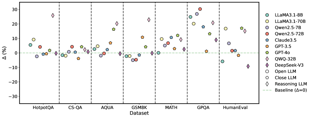
## Scatter Plot: LLM Performance on Various Datasets
### Overview
The image is a scatter plot comparing the performance of various Large Language Models (LLMs) on different datasets. The y-axis represents the percentage difference (Δ (%)), and the x-axis represents the datasets. Each LLM is represented by a unique color and marker. A horizontal dashed line indicates the baseline performance (Δ = 0).
### Components/Axes
* **X-axis:** Datasets: HotpotQA, CS-QA, AQUA, GSM8K, MATH, GPQA, HumanEval.
* **Y-axis:** Δ (%) - Percentage difference, ranging from -30 to 30 with increments of 10.
* **Legend:** Located on the right side of the plot, associating each LLM with a specific color and marker.
* LLaMA3.1-8B (light teal circle)
* LLaMA3.1-70B (light yellow circle)
* Qwen2.5-7B (light purple circle)
* Qwen2.5-72B (red circle)
* Claude3.5 (teal pentagon)
* GPT-3.5 (orange pentagon)
* GPT-4o (light green pentagon)
* QWQ-32B (light teal diamond)
* DeepSeek-V3 (purple diamond)
* Open LLM (white circle)
* Close LLM (white pentagon)
* Reasoning LLM (white diamond)
* Baseline (light green dashed line)
### Detailed Analysis
**Dataset: HotpotQA**
* LLaMA3.1-8B (light teal circle): ~5%
* LLaMA3.1-70B (light yellow circle): ~3%
* Qwen2.5-7B (light purple circle): ~-1%
* Qwen2.5-72B (red circle): ~5%
* Claude3.5 (teal pentagon): ~6%
* GPT-3.5 (orange pentagon): ~1%
* GPT-4o (light green pentagon): ~5%
* QWQ-32B (light teal diamond): ~2%
* DeepSeek-V3 (purple diamond): ~-1%
**Dataset: CS-QA**
* LLaMA3.1-8B (light teal circle): ~-1%
* LLaMA3.1-70B (light yellow circle): ~-1%
* Qwen2.5-7B (light purple circle): ~-2%
* Qwen2.5-72B (red circle): ~3%
* Claude3.5 (teal pentagon): ~2%
* GPT-3.5 (orange pentagon): ~-1%
* GPT-4o (light green pentagon): ~1%
* QWQ-32B (light teal diamond): ~1%
* DeepSeek-V3 (purple diamond): ~-1%
**Dataset: AQUA**
* LLaMA3.1-8B (light teal circle): ~5%
* LLaMA3.1-70B (light yellow circle): ~6%
* Qwen2.5-7B (light purple circle): ~-1%
* Qwen2.5-72B (red circle): ~-1%
* Claude3.5 (teal pentagon): ~7%
* GPT-3.5 (orange pentagon): ~5%
* GPT-4o (light green pentagon): ~6%
* QWQ-32B (light teal diamond): ~1%
* DeepSeek-V3 (purple diamond): ~2%
**Dataset: GSM8K**
* LLaMA3.1-8B (light teal circle): ~-1%
* LLaMA3.1-70B (light yellow circle): ~-1%
* Qwen2.5-7B (light purple circle): ~-4%
* Qwen2.5-72B (red circle): ~-3%
* Claude3.5 (teal pentagon): ~-1%
* GPT-3.5 (orange pentagon): ~-5%
* GPT-4o (light green pentagon): ~0%
* QWQ-32B (light teal diamond): ~0%
* DeepSeek-V3 (purple diamond): ~-4%
**Dataset: MATH**
* LLaMA3.1-8B (light teal circle): ~10%
* LLaMA3.1-70B (light yellow circle): ~11%
* Qwen2.5-7B (light purple circle): ~6%
* Qwen2.5-72B (red circle): ~10%
* Claude3.5 (teal pentagon): ~7%
* GPT-3.5 (orange pentagon): ~4%
* GPT-4o (light green pentagon): ~10%
* QWQ-32B (light teal diamond): ~11%
* DeepSeek-V3 (purple diamond): ~3%
**Dataset: GPQA**
* LLaMA3.1-8B (light teal circle): ~20%
* LLaMA3.1-70B (light yellow circle): ~22%
* Qwen2.5-7B (light purple circle): ~18%
* Qwen2.5-72B (red circle): ~29%
* Claude3.5 (teal pentagon): ~2%
* GPT-3.5 (orange pentagon): ~-3%
* GPT-4o (light green pentagon): ~14%
* QWQ-32B (light teal diamond): ~27%
* DeepSeek-V3 (purple diamond): ~3%
**Dataset: HumanEval**
* LLaMA3.1-8B (light teal circle): ~-6%
* LLaMA3.1-70B (light yellow circle): ~-1%
* Qwen2.5-7B (light purple circle): ~-2%
* Qwen2.5-72B (red circle): ~5%
* Claude3.5 (teal pentagon): ~1%
* GPT-3.5 (orange pentagon): ~-3%
* GPT-4o (light green pentagon): ~1%
* QWQ-32B (light teal diamond): ~16%
* DeepSeek-V3 (purple diamond): ~-9%
### Key Observations
* The performance of the LLMs varies significantly across different datasets.
* Some models (e.g., QWQ-32B) show high variance in performance, excelling in some datasets (GPQA) but underperforming in others (HumanEval).
* The baseline (Δ = 0) serves as a reference point, with some models consistently outperforming it while others fluctuate around it.
* MATH and GPQA datasets seem to be more challenging, with a wider range of performance differences among the models.
* GSM8K shows generally negative performance differences for most models.
### Interpretation
The scatter plot provides a comparative analysis of LLM performance across various datasets. The data suggests that the choice of LLM can significantly impact performance depending on the specific task or dataset. The variability in performance highlights the importance of selecting the appropriate model for a given application. The positive and negative percentage differences indicate whether a model is performing better or worse than a certain baseline (likely another model or a previous version). The datasets themselves likely represent different types of tasks or challenges, which explains the varying performance of the LLMs. The plot also reveals potential strengths and weaknesses of each model, which can inform future development and optimization efforts.