## Line Chart: MathVista Accuracy vs. Number of Solutions per Problem
### Overview
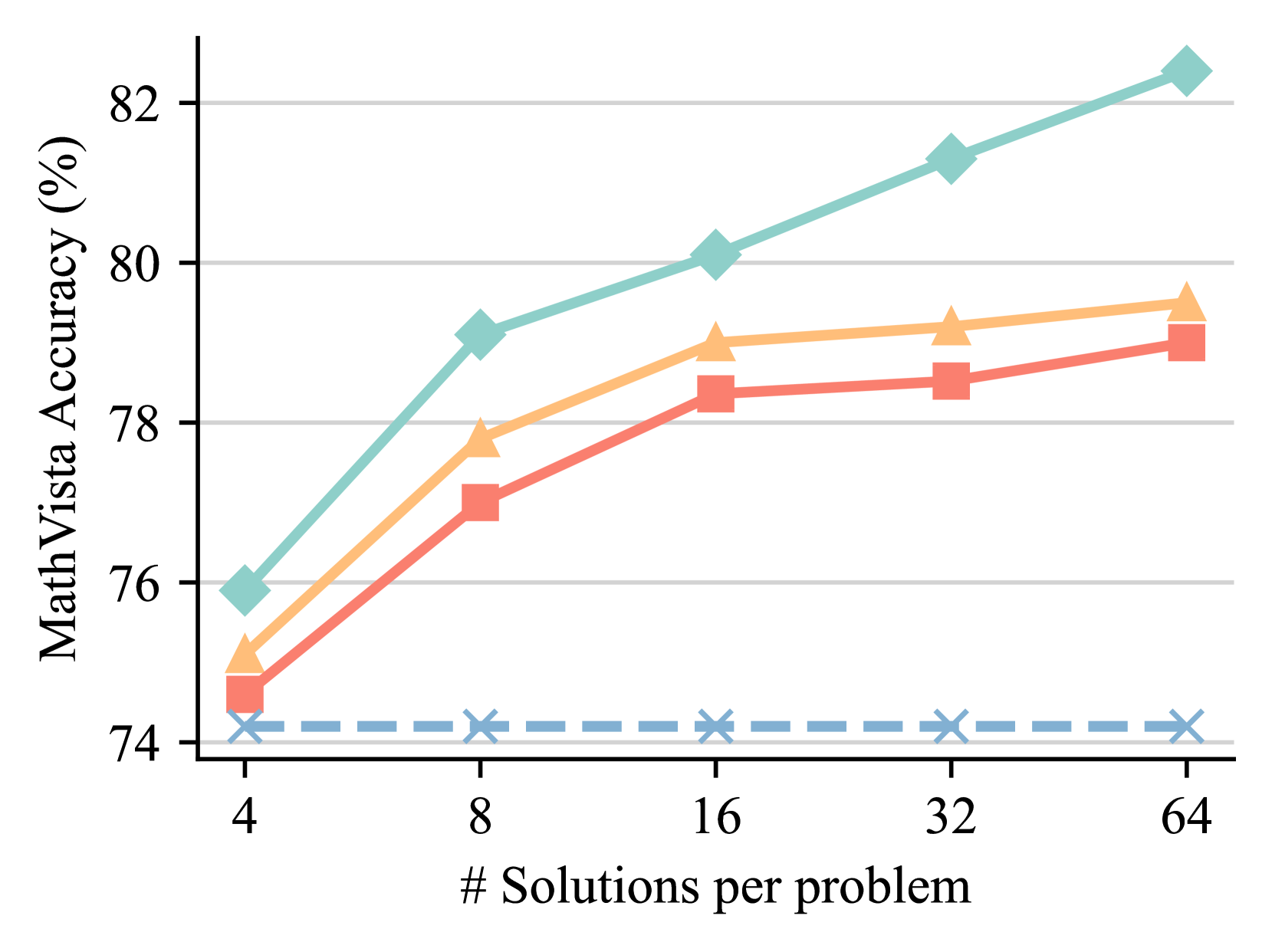
The image is a line chart displaying the relationship between the number of solutions generated per problem (x-axis) and the resulting accuracy percentage on the MathVista benchmark (y-axis). It compares the performance of four distinct methods or models, each represented by a unique line color and marker style. The chart demonstrates a clear positive correlation between increased computational effort (more solutions) and improved accuracy for three of the four methods.
### Components/Axes
* **Y-Axis (Vertical):**
* **Label:** "MathVista Accuracy (%)"
* **Scale:** Linear scale ranging from 74 to 82.
* **Major Ticks:** 74, 76, 78, 80, 82.
* **Grid Lines:** Horizontal grid lines are present at each major tick mark.
* **X-Axis (Horizontal):**
* **Label:** "# Solutions per problem"
* **Scale:** Logarithmic scale (base 2), with values doubling at each step.
* **Major Ticks:** 4, 8, 16, 32, 64.
* **Data Series (Lines):** There are four distinct lines. **Note:** The chart does not contain a legend to explicitly label what each line represents. The analysis below describes them by their visual properties.
1. **Teal Line with Diamond Markers:** Solid line, teal color (#7FC8B8 approx.), diamond-shaped markers.
2. **Orange Line with Triangle Markers:** Solid line, light orange color (#F5C28A approx.), upward-pointing triangle markers.
3. **Red Line with Square Markers:** Solid line, salmon/red color (#E88A7A approx.), square markers.
4. **Blue Dashed Line with 'X' Markers:** Dashed line, light blue color (#8CB4D8 approx.), 'X' shaped markers.
### Detailed Analysis
**Trend Verification & Data Point Extraction (Approximate Values):**
* **Teal Line (Diamonds):** Shows a strong, consistent upward trend. Accuracy increases significantly with more solutions.
* At 4 solutions: ~76.0%
* At 8 solutions: ~79.1%
* At 16 solutions: ~80.1%
* At 32 solutions: ~81.3%
* At 64 solutions: ~82.4%
* **Orange Line (Triangles):** Shows a clear upward trend that begins to plateau after 16 solutions.
* At 4 solutions: ~75.1%
* At 8 solutions: ~77.8%
* At 16 solutions: ~79.0%
* At 32 solutions: ~79.2%
* At 64 solutions: ~79.5%
* **Red Line (Squares):** Shows a steady upward trend, consistently performing slightly below the orange line.
* At 4 solutions: ~74.6%
* At 8 solutions: ~77.0%
* At 16 solutions: ~78.4%
* At 32 solutions: ~78.6%
* At 64 solutions: ~79.1%
* **Blue Dashed Line ('X's):** Shows a flat, horizontal trend. Accuracy remains essentially constant regardless of the number of solutions.
* At 4 solutions: ~74.2%
* At 8 solutions: ~74.2%
* At 16 solutions: ~74.2%
* At 32 solutions: ~74.2%
* At 64 solutions: ~74.2%
### Key Observations
1. **Performance Hierarchy:** There is a clear and consistent performance ranking across all tested solution counts: Teal (best) > Orange > Red > Blue (worst).
2. **Diminishing Returns:** The orange and red lines show signs of diminishing returns. The accuracy gain from 32 to 64 solutions is much smaller than the gain from 4 to 8 solutions.
3. **Baseline Performance:** The blue dashed line acts as a baseline, showing no improvement from increased solution generation. This suggests it represents a method that does not benefit from this scaling technique (e.g., a single-solution baseline or a different approach).
4. **Scaling Efficacy:** The teal line demonstrates the most effective scaling, maintaining a strong positive slope even at higher solution counts (32 to 64), suggesting its underlying method benefits most robustly from increased computational resources.
### Interpretation
This chart illustrates the impact of a "best-of-N" or similar sampling strategy on model accuracy for a visual math reasoning benchmark (MathVista). The core finding is that generating multiple candidate solutions and selecting among them (presumably via a verifier or voting mechanism) generally improves performance.
* **What the data suggests:** Three of the four methods (Teal, Orange, Red) benefit from this scaling approach, with accuracy improving as more solutions are sampled. The magnitude of improvement varies, indicating differences in the quality or diversity of the generated solution pools or the effectiveness of the selection mechanism.
* **How elements relate:** The x-axis represents increased computational cost (generating more solutions). The y-axis represents the payoff in accuracy. The diverging lines show that not all methods scale equally well with this added cost.
* **Notable outliers/trends:** The flat blue line is the critical outlier. It establishes that the improvement seen in the other lines is not automatic and is a property of the specific methods being tested. The teal line's continued strong upward trend at 64 solutions is notable, as it suggests the performance ceiling for that method has not yet been reached within the tested range.
* **Underlying implication:** The results argue for the value of scaling inference-time computation for complex reasoning tasks. However, the plateauing of the orange and red lines indicates that simply generating more solutions is not infinitely effective; the quality of the base model and the verification process are crucial limiting factors. The chart likely comes from a research paper comparing different model architectures or inference strategies for multimodal mathematical reasoning.