## Bar Chart: F1 and BLEU-13 Scores vs. k Values
### Overview
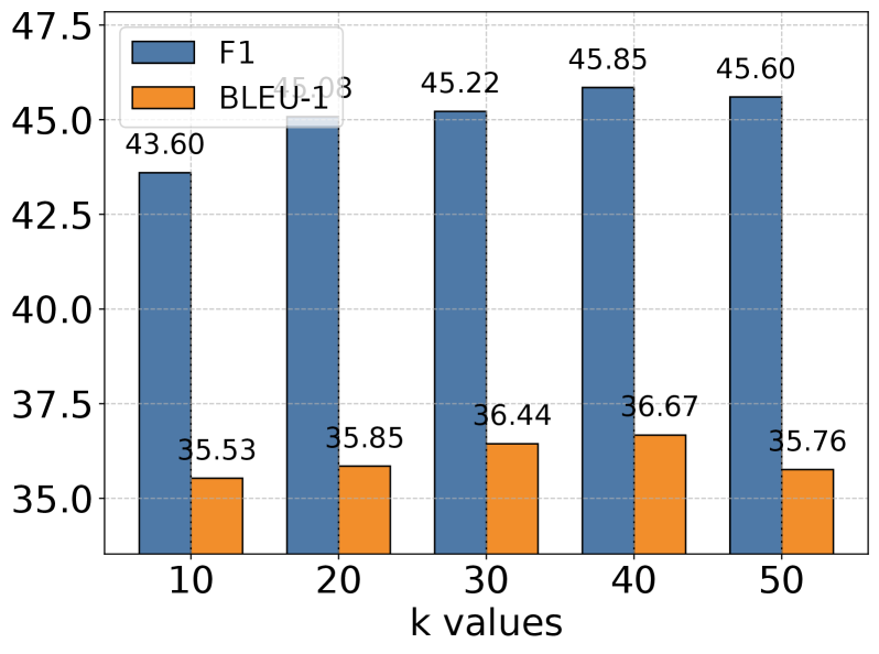
The image is a bar chart comparing F1 and BLEU-13 scores for different values of 'k'. The chart displays two sets of vertical bars for each 'k' value, one representing the F1 score (blue) and the other representing the BLEU-13 score (orange). The x-axis represents 'k values', and the y-axis represents the scores.
### Components/Axes
* **Title:** There is no explicit title on the chart.
* **X-axis:**
* Label: "k values"
* Values: 10, 20, 30, 40, 50
* **Y-axis:**
* Scale: 35.0 to 47.5, incrementing by 2.5
* **Legend:** Located in the top-left corner.
* Blue bar: "F1"
* Orange bar: "BLEU-13"
* **Grid:** The chart has a light gray grid in the background.
### Detailed Analysis
The chart presents F1 and BLEU-13 scores for k values of 10, 20, 30, 40, and 50.
**F1 Scores (Blue Bars):**
* k = 10: 43.60
* k = 20: 45.03
* k = 30: 45.22
* k = 40: 45.85
* k = 50: 45.60
Trend: The F1 score generally increases from k=10 to k=40, then slightly decreases at k=50.
**BLEU-13 Scores (Orange Bars):**
* k = 10: 35.53
* k = 20: 35.85
* k = 30: 36.44
* k = 40: 36.67
* k = 50: 35.76
Trend: The BLEU-13 score increases from k=10 to k=40, then decreases at k=50.
### Key Observations
* The F1 scores are consistently higher than the BLEU-13 scores for all 'k' values.
* Both F1 and BLEU-13 scores peak around k=40.
* The F1 score shows a more pronounced increase from k=10 to k=20 compared to the other intervals.
### Interpretation
The chart suggests that increasing the 'k' value initially improves both F1 and BLEU-13 scores, indicating better performance up to a certain point. The slight decrease in scores at k=50 suggests that there might be a point of diminishing returns or even a negative impact on performance with excessively high 'k' values. The F1 score, being consistently higher, might be a more robust metric in this context compared to BLEU-13. The optimal 'k' value appears to be around 40, where both metrics achieve relatively high scores.