\n
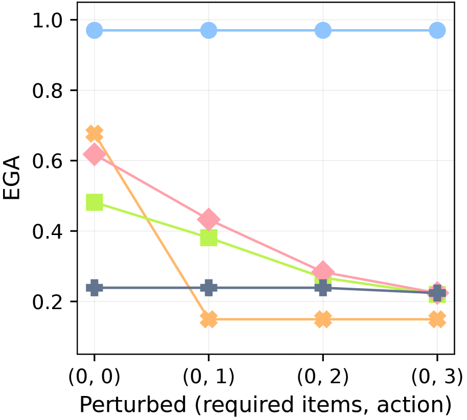
## Line Chart: EGA vs. Perturbation Level
### Overview
This is a line chart plotting a metric called "EGA" against four discrete perturbation levels, represented as tuples. The chart compares the performance of five distinct methods or models (represented by different colored lines) as the perturbation increases. The overall trend shows that most methods degrade in performance with increased perturbation, except for one method that remains stable at a high level.
### Components/Axes
* **Chart Type:** Multi-series line chart with markers.
* **Y-Axis:**
* **Label:** "EGA"
* **Scale:** Linear, ranging from 0.0 to 1.0.
* **Major Ticks:** 0.0, 0.2, 0.4, 0.6, 0.8, 1.0.
* **X-Axis:**
* **Label:** "Perturbed (required items, action)"
* **Categories (from left to right):** `(0, 0)`, `(0, 1)`, `(0, 2)`, `(0, 3)`. These appear to represent increasing levels of a perturbation applied to a system, defined by two parameters.
* **Legend:**
* **Position:** Top-right corner of the plot area.
* **Series (from top to bottom in legend order):**
1. **Blue line with circle markers:** Label not visible in the provided crop. Represents a method with consistently high EGA.
2. **Orange line with 'X' (cross) markers:** Label not visible. Shows a sharp initial drop.
3. **Pink line with diamond markers:** Label not visible. Shows a steady decline.
4. **Green line with square markers:** Label not visible. Shows a steady decline.
5. **Gray line with plus ('+') markers:** Label not visible. Shows consistently low EGA.
### Detailed Analysis
**Data Series Trends and Approximate Values:**
1. **Blue Line (Circle Markers):**
* **Trend:** Nearly perfectly horizontal, indicating no sensitivity to the perturbation.
* **Values:** Consistently at approximately **EGA = 0.97** across all four x-axis points: `(0,0)`, `(0,1)`, `(0,2)`, `(0,3)`.
2. **Orange Line ('X' Markers):**
* **Trend:** Sharp, significant decline between the first two points, then plateaus at a low level.
* **Values:**
* At `(0,0)`: **EGA ≈ 0.68**
* At `(0,1)`: **EGA ≈ 0.15** (a drop of ~0.53)
* At `(0,2)`: **EGA ≈ 0.15**
* At `(0,3)`: **EGA ≈ 0.15**
3. **Pink Line (Diamond Markers):**
* **Trend:** Steady, approximately linear decline across all perturbation levels.
* **Values:**
* At `(0,0)`: **EGA ≈ 0.62**
* At `(0,1)`: **EGA ≈ 0.43**
* At `(0,2)`: **EGA ≈ 0.28**
* At `(0,3)`: **EGA ≈ 0.22**
4. **Green Line (Square Markers):**
* **Trend:** Steady, approximately linear decline, parallel to but slightly below the pink line.
* **Values:**
* At `(0,0)`: **EGA ≈ 0.48**
* At `(0,1)`: **EGA ≈ 0.38**
* At `(0,2)`: **EGA ≈ 0.26**
* At `(0,3)`: **EGA ≈ 0.21**
5. **Gray Line ('+' Markers):**
* **Trend:** Nearly horizontal, indicating stable but low performance.
* **Values:** Consistently at approximately **EGA = 0.23** across all four x-axis points.
### Key Observations
* **Performance Hierarchy:** At the baseline `(0,0)`, the methods rank from highest to lowest EGA: Blue > Orange > Pink > Green > Gray.
* **Sensitivity Divergence:** The methods exhibit dramatically different sensitivities to perturbation. The Blue method is completely robust, the Gray method is consistently poor, and the Orange method is extremely fragile, collapsing after the first perturbation step.
* **Convergence:** At the highest perturbation level `(0,3)`, the Pink, Green, and Gray methods converge to a similar low EGA range (~0.21-0.23), while the Orange method is slightly lower (~0.15).
* **Anomaly:** The Orange line's behavior is an outlier—it starts as the second-best performer but becomes the worst after the first perturbation.
### Interpretation
This chart likely evaluates the robustness of different AI models, algorithms, or system configurations against a specific type of adversarial or environmental perturbation. The "EGA" metric is probably a performance measure (e.g., accuracy, success rate).
* The **Blue method** demonstrates exceptional robustness, maintaining near-perfect performance regardless of the perturbation level applied. This suggests it has learned a fundamentally invariant representation or employs a highly effective defense mechanism.
* The **Orange method** appears to be a brittle, "overfitted" solution. It performs well on clean data `(0,0)` but fails catastrophically with even minimal perturbation `(0,1)`, indicating it relies on superficial features easily disrupted by the perturbation.
* The **Pink and Green methods** show a predictable, graceful degradation. Their parallel decline suggests they share a similar underlying vulnerability to the perturbation, with Green being slightly less effective overall.
* The **Gray method** serves as a low-performance baseline, possibly representing a naive or random approach that is unaffected by the perturbation because it never performs well.
The x-axis tuples `(required items, action)` hint that the perturbation involves manipulating the number of required items and the action in a task. The chart answers a critical question: "How does increasing task complexity or adversarial manipulation affect different solutions?" The data strongly argues for the superiority of the Blue method in non-stationary or adversarial environments.