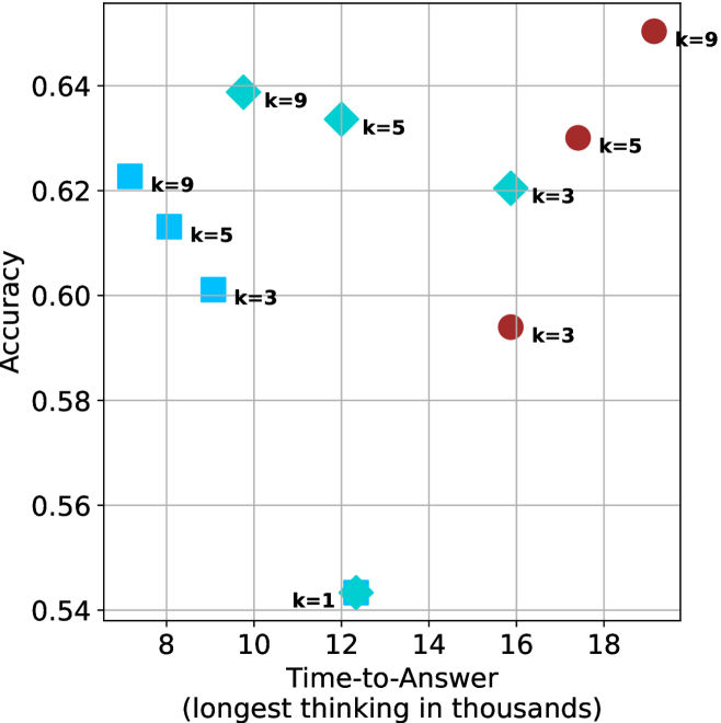
## Scatter Plot: Accuracy vs. Time-to-Answer
### Overview
The image is a scatter plot showing the relationship between "Accuracy" and "Time-to-Answer" (longest thinking in thousands). The plot displays data points for different values of 'k' (1, 3, 5, and 9), represented by different shapes and colors. The x-axis represents time in thousands, and the y-axis represents accuracy.
### Components/Axes
* **X-axis:** "Time-to-Answer (longest thinking in thousands)". The axis ranges from approximately 7 to 19, with gridlines at integer values.
* **Y-axis:** "Accuracy". The axis ranges from 0.54 to 0.64, with gridlines at intervals of 0.02.
* **Data Points:**
* Cyan Squares: k=3, k=5, k=9
* Cyan Diamonds: k=3, k=5, k=9
* Cyan Star: k=1
* Red Circles: k=3, k=5, k=9
### Detailed Analysis
**Cyan Squares (k=3, k=5, k=9):**
* k=3: Time-to-Answer ≈ 9, Accuracy ≈ 0.60
* k=5: Time-to-Answer ≈ 8, Accuracy ≈ 0.62
* k=9: Time-to-Answer ≈ 7.5, Accuracy ≈ 0.62
**Cyan Diamonds (k=3, k=5, k=9):**
* k=3: Time-to-Answer ≈ 16, Accuracy ≈ 0.62
* k=5: Time-to-Answer ≈ 13, Accuracy ≈ 0.63
* k=9: Time-to-Answer ≈ 10, Accuracy ≈ 0.64
**Cyan Star (k=1):**
* k=1: Time-to-Answer ≈ 12, Accuracy ≈ 0.54
**Red Circles (k=3, k=5, k=9):**
* k=3: Time-to-Answer ≈ 16, Accuracy ≈ 0.59
* k=5: Time-to-Answer ≈ 17, Accuracy ≈ 0.63
* k=9: Time-to-Answer ≈ 19, Accuracy ≈ 0.65
### Key Observations
* For the cyan squares, as 'k' increases from 3 to 9, the time-to-answer decreases slightly, while the accuracy increases slightly.
* For the cyan diamonds, as 'k' increases from 3 to 9, both the time-to-answer and accuracy decrease.
* The cyan star (k=1) has the lowest accuracy and a moderate time-to-answer.
* For the red circles, as 'k' increases from 3 to 9, both the time-to-answer and accuracy increase.
### Interpretation
The scatter plot visualizes the trade-off between accuracy and time-to-answer for different values of 'k'. The data suggests that increasing 'k' does not always lead to higher accuracy or lower time-to-answer. The optimal value of 'k' depends on the specific application and the relative importance of accuracy and speed. The red circles show a clear positive correlation between time-to-answer and accuracy, suggesting that for this particular configuration, spending more time on the answer leads to better results. The cyan shapes show a more complex relationship, possibly indicating different algorithmic behaviors or data characteristics. The single point for k=1 is a clear outlier, indicating that this value of k is significantly worse than the others in terms of accuracy.