## Scatter Plot: Accuracy vs. Time-to-Answer
### Overview
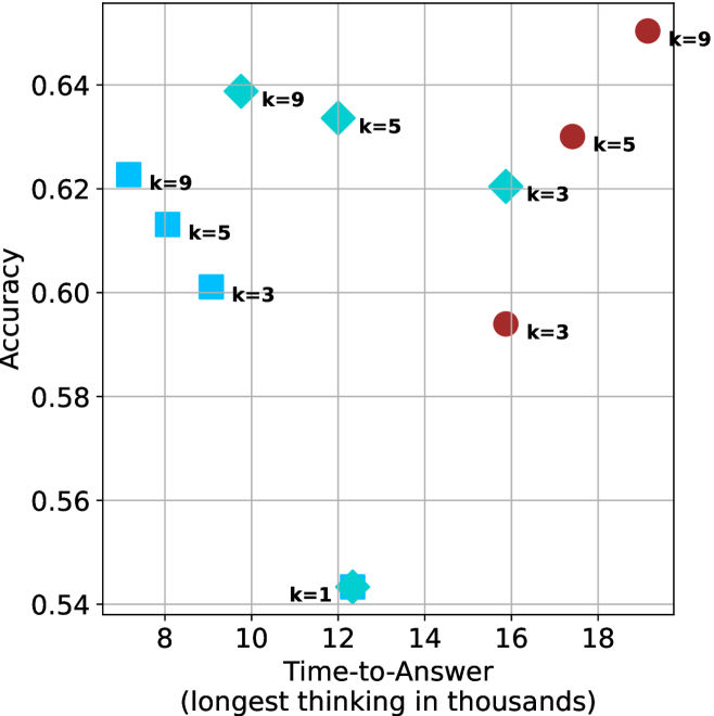
This image is a scatter plot visualizing the performance of different configurations (represented by shapes and "k" values) based on two metrics: "Time-to-Answer" (x-axis) and "Accuracy" (y-axis). The plot uses four distinct marker shapes—squares, diamonds, circles, and a star—to categorize data points, with each point labeled with a "k" value (k=1, 3, 5, or 9).
### Components/Axes
* **X-Axis:** Labeled "Time-to-Answer (longest thinking in thousands)". The scale ranges from 8 to 18, with major grid lines at intervals of 2.
* **Y-Axis:** Labeled "Accuracy". The scale ranges from 0.54 to 0.64, with major grid lines at intervals of 0.02.
* **Data Markers:**
* **Light Blue Squares:** Located in the left region of the chart.
* **Medium Blue Diamonds:** Located in the center-left to center region.
* **Dark Red Circles:** Located in the right region of the chart.
* **Cyan Star:** Located in the bottom-center region.
* **Labels:** Each marker is annotated with a "k=" value, indicating a specific parameter setting.
### Detailed Analysis
The following data points are estimated based on their position relative to the grid lines.
**1. Light Blue Squares (Left Region)**
* **Trend:** As the "k" value decreases from 9 to 3, both the time-to-answer and accuracy decrease.
* **k=9:** Positioned at approximately x=7.2, y=0.623.
* **k=5:** Positioned at approximately x=8.2, y=0.613.
* **k=3:** Positioned at approximately x=9.2, y=0.601.
**2. Medium Blue Diamonds (Center-Left to Center Region)**
* **Trend:** As the "k" value decreases from 9 to 3, the time-to-answer increases while accuracy decreases.
* **k=9:** Positioned at approximately x=9.8, y=0.639.
* **k=5:** Positioned at approximately x=12.5, y=0.634.
* **k=3:** Positioned at approximately x=15.8, y=0.620.
**3. Dark Red Circles (Right Region)**
* **Trend:** As the "k" value decreases from 9 to 3, the time-to-answer decreases significantly, and accuracy drops sharply.
* **k=9:** Positioned at approximately x=19.2, y=0.650 (Highest accuracy and highest time-to-answer on the chart).
* **k=5:** Positioned at approximately x=17.5, y=0.630.
* **k=3:** Positioned at approximately x=15.8, y=0.594.
**4. Cyan Star (Bottom-Center Region)**
* **k=1:** Positioned at approximately x=12.4, y=0.544 (Lowest accuracy on the chart).
### Key Observations
* **Shared X-Coordinates:** The Medium Blue Diamond (k=3) and the Dark Red Circle (k=3) are vertically aligned at approximately x=15.8, though they have significantly different accuracy levels (0.620 vs 0.594).
* **Performance Extremes:** The Dark Red Circle (k=9) represents the highest accuracy (0.650) but requires the longest time (19.2). The Cyan Star (k=1) represents the lowest accuracy (0.544) with a moderate time-to-answer (12.4).
* **Clustering:** The data is grouped into three distinct clusters based on shape/color, suggesting these represent three different model architectures or prompting strategies, with the "k" value acting as a variable parameter within those groups.
### Interpretation
This chart illustrates a performance trade-off analysis, likely for an Artificial Intelligence model (such as an LLM). The "k" parameter appears to control a mechanism—possibly "k-shot" prompting, "top-k" sampling, or a number of reasoning steps—that directly influences both the computational cost (Time-to-Answer) and the output quality (Accuracy).
The data suggests that for the "Dark Red" and "Light Blue" strategies, increasing "k" yields higher accuracy at the cost of higher time. However, the "Medium Blue" strategy shows an inverse relationship where increasing "k" actually *decreases* the time-to-answer while maintaining relatively high accuracy, suggesting it might be the most efficient configuration among the high-performing options. The "Cyan Star" (k=1) is a significant outlier, performing poorly in accuracy compared to all other configurations.