## Heatmap & Scatter Plot: Topic Dynamics Over Time
### Overview
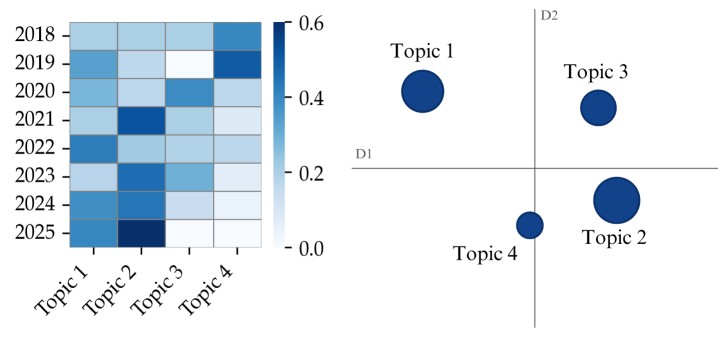
The image presents two visualizations: a heatmap on the left showing the intensity of four topics (Topic 1, Topic 2, Topic 3, Topic 4) over the years 2018-2025, and a scatter plot on the right representing the topics in a two-dimensional space defined by dimensions D1 and D2. The heatmap uses a blue color gradient to indicate intensity, with darker blues representing higher values. The scatter plot uses circle size to represent relative importance or magnitude.
### Components/Axes
**Heatmap:**
* **X-axis:** Topics - Topic 1, Topic 2, Topic 3, Topic 4
* **Y-axis:** Years - 2018, 2019, 2020, 2021, 2022, 2023, 2024, 2025
* **Color Scale:** Ranges from 0.0 (lightest blue) to 0.6 (darkest blue).
* **Data Values:** Represent the intensity or prevalence of each topic in each year.
**Scatter Plot:**
* **X-axis:** Dimension D1
* **Y-axis:** Dimension D2
* **Points:** Represent Topics 1, 2, 3, and 4. The size of the circle appears to be proportional to some value.
* **Labels:** Topic 1, Topic 2, Topic 3, Topic 4 are labeled next to their respective points.
### Detailed Analysis or Content Details
**Heatmap Data (Approximate Values):**
| Year | Topic 1 | Topic 2 | Topic 3 | Topic 4 |
|---|---|---|---|---|
| 2018 | 0.5 | 0.3 | 0.2 | 0.4 |
| 2019 | 0.5 | 0.3 | 0.3 | 0.4 |
| 2020 | 0.4 | 0.4 | 0.3 | 0.3 |
| 2021 | 0.3 | 0.5 | 0.4 | 0.2 |
| 2022 | 0.2 | 0.4 | 0.5 | 0.2 |
| 2023 | 0.2 | 0.3 | 0.6 | 0.2 |
| 2024 | 0.2 | 0.2 | 0.5 | 0.3 |
| 2025 | 0.2 | 0.1 | 0.4 | 0.3 |
**Trends in Heatmap:**
* **Topic 1:** Declines steadily from 0.5 in 2018 to 0.2 in 2025.
* **Topic 2:** Initially stable, then declines from 0.4 in 2021 to 0.1 in 2025.
* **Topic 3:** Increases from 0.2 in 2018 to a peak of 0.6 in 2023, then decreases to 0.4 in 2025.
* **Topic 4:** Remains relatively low and stable around 0.2-0.4 throughout the period.
**Scatter Plot Data (Approximate):**
* **Topic 1:** Located at approximately (0.2, 0.5). Medium circle size.
* **Topic 2:** Located at approximately (0.1, -0.3). Largest circle size.
* **Topic 3:** Located at approximately (0.4, 0.4). Medium circle size.
* **Topic 4:** Located at approximately (0.0, -0.1). Smallest circle size.
### Key Observations
* Topic 1 and Topic 2 show a clear decreasing trend in prevalence over time.
* Topic 3 experiences a rise in prevalence, peaking in 2023, then declining.
* Topic 4 remains consistently low in prevalence.
* In the scatter plot, Topic 2 has the largest circle, suggesting it is the most significant or prominent topic based on the dimensions D1 and D2. Topic 4 has the smallest circle.
* Topic 1 and Topic 3 are positioned in the positive quadrant of the scatter plot, while Topic 2 and Topic 4 are in the negative quadrant.
### Interpretation
The visualizations suggest a dynamic shift in topic prevalence over the years 2018-2025. Topics 1 and 2 are losing relevance, while Topic 3 gains prominence before experiencing a decline. Topic 4 remains a minor topic throughout the period.
The scatter plot provides a different perspective, showing the relationships between the topics based on dimensions D1 and D2. These dimensions could represent various characteristics, such as sentiment, complexity, or source. The positioning of the topics suggests that Topic 2 and Topic 4 are distinct from Topic 1 and Topic 3. The circle sizes indicate that Topic 2 is the most significant topic based on these dimensions.
The combination of the heatmap and scatter plot provides a comprehensive view of the topic dynamics. The heatmap shows *how* the topics change over time, while the scatter plot shows *where* they stand in relation to each other. The peak in Topic 3 around 2023 could represent a significant event or trend that drove its increased prevalence. The decline of Topic 1 and Topic 2 could be due to changing interests or the emergence of new topics. The dimensions D1 and D2 likely represent underlying factors that influence the relationships between the topics.