## Scatter Plot: MA vs C
### Overview
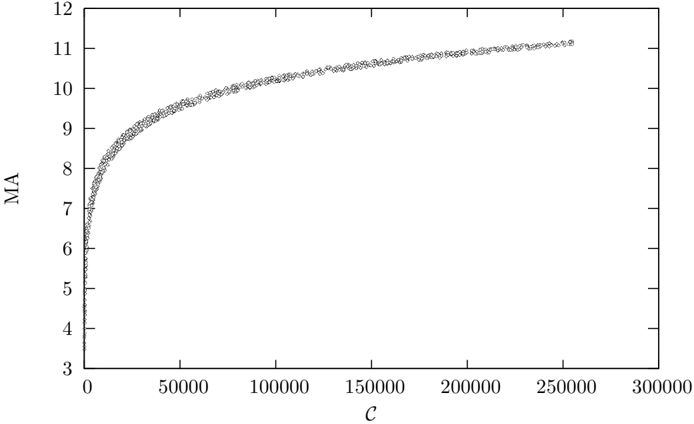
The image is a scatter plot showing the relationship between two variables, MA (on the y-axis) and C (on the x-axis). The plot shows a non-linear relationship where MA increases rapidly with C at lower values of C, and then the rate of increase slows down as C increases.
### Components/Axes
* **X-axis:** Labeled "C". The scale ranges from 0 to 300000, with tick marks at 0, 50000, 100000, 150000, 200000, 250000, and 300000.
* **Y-axis:** Labeled "MA". The scale ranges from 3 to 12, with tick marks at each integer value.
* **Data Points:** The data points are represented by small circles.
### Detailed Analysis
The data points form a curve that starts at approximately (0, 4) and rises sharply.
* **Initial Rise:** From C = 0 to C = 50000, MA increases rapidly from approximately 4 to 9.
* **Slowing Increase:** From C = 50000 to C = 150000, the rate of increase of MA slows down. MA increases from approximately 9 to 10.
* **Plateau:** From C = 150000 to C = 250000, the curve begins to flatten out, with MA increasing only slightly.
* **Final Value:** At C = 250000, MA is approximately 11.
### Key Observations
* The relationship between MA and C is non-linear.
* The rate of increase of MA decreases as C increases.
* The curve appears to be approaching a horizontal asymptote.
### Interpretation
The scatter plot suggests that there is a diminishing return on MA as C increases. Initially, a small increase in C results in a large increase in MA. However, as C continues to increase, the corresponding increase in MA becomes smaller and smaller. This could indicate that there is a saturation point for MA, beyond which further increases in C have little effect. The data suggests that the relationship between MA and C is not linear, and that there may be an upper limit to the value of MA.