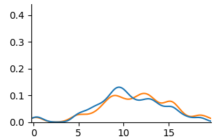
## Line Chart: Dual Series Distribution Plot
### Overview
The image displays a 2D line chart with two data series plotted against a common x-axis. The chart appears to show two probability distributions or density estimates over a continuous variable. There are no titles, axis labels, or a legend present in the image.
### Components/Axes
* **X-Axis:** A horizontal axis with numerical markers at intervals of 5, labeled: `0`, `5`, `10`, `15`. The axis extends slightly beyond 15, suggesting a range from approximately 0 to 18.
* **Y-Axis:** A vertical axis with numerical markers at intervals of 0.1, labeled: `0.0`, `0.1`, `0.2`, `0.3`, `0.4`. The axis range is from 0.0 to just above 0.4.
* **Data Series:** Two continuous lines are plotted.
* **Series 1 (Blue Line):** A smooth, solid blue line.
* **Series 2 (Orange Line):** A smooth, solid orange line.
* **Legend:** No legend is present in the image. The series are distinguished solely by color.
### Detailed Analysis
**Spatial Layout:** The chart area is centered. The axes form a standard L-shape on the left and bottom. The two data lines occupy the central plotting area, primarily between y=0.0 and y=0.15.
**Trend Verification & Data Points:**
* **Blue Line Trend:** Starts near y=0 at x=0, rises to a single prominent peak, then declines back towards zero.
* At x=0: y ≈ 0.01
* Rises gradually, crossing y=0.05 around x=6.
* **Peak:** Reaches its maximum at approximately x=10, with a y-value of ≈ 0.13.
* Declines steadily after the peak.
* At x=15: y ≈ 0.04
* Ends near y=0 at x=18.
* **Orange Line Trend:** Follows a similar overall pattern to the blue line but with a slightly different shape and more minor fluctuations.
* At x=0: y ≈ 0.01 (similar to blue).
* Rises, staying slightly below the blue line until around x=8.
* **Primary Peak:** Reaches its maximum at approximately x=11, with a y-value of ≈ 0.10. This peak is lower and slightly to the right of the blue line's peak.
* Shows a noticeable secondary, smaller peak or plateau around x=14 (y ≈ 0.08).
* Declines after x=14.
* At x=15: y ≈ 0.06 (higher than the blue line at this point).
* Ends near y=0 at x=18.
### Key Observations
1. **Correlated Shape:** Both distributions are unimodal (single-peaked) and right-skewed, with a long tail extending to the right (higher x-values).
2. **Peak Discrepancy:** The blue line's peak is higher (≈0.13 vs. ≈0.10) and occurs earlier (x≈10 vs. x≈11) than the orange line's peak.
3. **Mid-Range Divergence:** Between x=12 and x=16, the orange line consistently maintains a higher value than the blue line, indicating a heavier tail or secondary mode in that region for the orange series.
4. **Convergence at Extremes:** Both lines start and end at nearly identical, very low values near y=0.
### Interpretation
This chart likely compares two related probability distributions or signal densities over the same domain (x-axis). The blue series represents a distribution with a higher, sharper concentration of probability around x=10. The orange series represents a slightly more dispersed distribution, with its central tendency shifted to a higher x-value (x=11) and a more pronounced "shoulder" or secondary concentration of probability between x=13 and x=15.
Without axis labels, the context is ambiguous. The x-axis could represent time, a physical measurement, or a model parameter. The y-axis, given its scale (0 to 0.4), is consistent with probability density, normalized frequency, or a similar proportional measure. The key takeaway is that while both phenomena follow a similar overall pattern, the process generating the orange data has a slightly delayed peak and a greater likelihood of producing values in the x=12-16 range compared to the process generating the blue data.