\n
## Line Chart: Distribution Comparison
### Overview
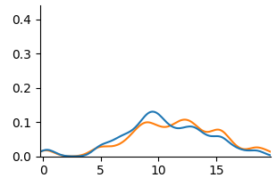
The image presents a line chart comparing two distributions. The chart displays values on the y-axis ranging from 0.0 to 0.4, plotted against values on the x-axis ranging from 0 to 20. Two lines, one blue and one orange, represent the distributions.
### Components/Axes
* **X-axis:** Ranges from 0 to approximately 20, with tick marks at intervals of 5. The axis is not explicitly labeled.
* **Y-axis:** Ranges from 0.0 to 0.4, with tick marks at intervals of 0.1. The axis is not explicitly labeled.
* **Line 1:** Blue line.
* **Line 2:** Orange line.
* **Legend:** There is no explicit legend.
### Detailed Analysis
* **Blue Line:** The blue line starts at approximately 0.01 at x=0, gradually increases, reaching a peak of approximately 0.12 at x=8. It then declines, crossing back to approximately 0.01 at x=18. The line exhibits a roughly symmetrical bell-shaped curve.
* **Orange Line:** The orange line starts at approximately 0.01 at x=0, increases more rapidly than the blue line, peaking at approximately 0.14 at x=9. It then declines, crossing back to approximately 0.01 at x=17. This line also exhibits a roughly symmetrical bell-shaped curve, but is slightly shifted to the right and has a higher peak than the blue line.
### Key Observations
* Both lines show similar distributions, peaking around x=8-9.
* The orange line has a slightly higher peak than the blue line.
* The orange line's peak is slightly shifted to the right compared to the blue line.
* Both lines return to near-zero values around x=17-18.
### Interpretation
The chart likely represents the distribution of some continuous variable. The two lines could represent different groups or conditions. The slight shift and higher peak of the orange line suggest that the variable tends to have slightly higher values for the group represented by the orange line, or that the distribution is more concentrated around a slightly higher value. Without knowing what the x and y axes represent, it's difficult to draw more specific conclusions. The symmetrical shape of both curves suggests a normal or near-normal distribution. The fact that both lines converge to zero at both ends suggests that extreme values are rare.