## Scatter Plots: RT60 and Angle Distributions
### Overview
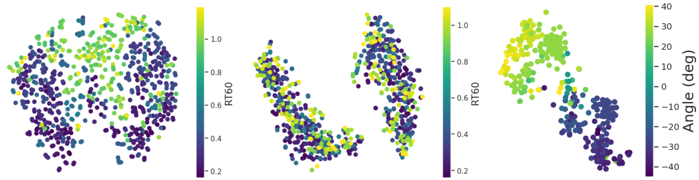
The image presents three scatter plots. The first two plots show the distribution of data points colored by RT60 values, while the third plot shows the distribution colored by Angle (degrees). Each plot displays a cluster of points, with color indicating the magnitude of the respective variable.
### Components/Axes
* **Plot 1 & 2 Color Legend:** Located to the right of the first two plots.
* **Label:** RT60
* **Scale:** Ranges from 0.2 (dark purple) to 1.0 (yellow).
* **Plot 3 Color Legend:** Located to the right of the third plot.
* **Label:** Angle (deg)
* **Scale:** Ranges from -40 (dark purple) to 40 (yellow).
### Detailed Analysis
**Plot 1: RT60 Distribution**
* The data points form a roughly circular cluster.
* Points with lower RT60 values (dark purple) are concentrated in the bottom and right regions of the cluster.
* Points with higher RT60 values (yellow) are concentrated in the top and left regions of the cluster.
* The RT60 values appear to transition smoothly across the cluster.
**Plot 2: RT60 Distribution**
* The data points are split into two distinct clusters.
* In both clusters, points with lower RT60 values (dark purple) are located towards the bottom.
* Points with higher RT60 values (yellow) are located towards the top.
* There is a clear separation between the high and low RT60 value regions within each cluster.
**Plot 3: Angle Distribution**
* The data points are clustered in a non-uniform shape.
* Points with negative angle values (dark purple) are concentrated in the bottom region.
* Points with positive angle values (yellow) are concentrated in the top region.
* The angle values transition from negative to positive in a roughly vertical direction.
### Key Observations
* The RT60 values in the first plot show a gradient distribution, while in the second plot, they are clustered into distinct regions.
* The angle values in the third plot show a clear separation between positive and negative values.
* The color gradients in each plot provide a visual representation of the distribution of RT60 and angle values.
### Interpretation
The plots visualize the distribution of RT60 and angle values across a dataset. The clustering and color gradients suggest potential relationships or patterns within the data. The first plot indicates a continuous variation of RT60, while the second plot suggests distinct groups with different RT60 characteristics. The third plot shows a clear separation between positive and negative angle values, which could indicate different states or conditions within the system being analyzed. Further analysis would be needed to understand the underlying factors driving these distributions and their significance.