## Line Chart: Pattern and Region Analysis
### Overview
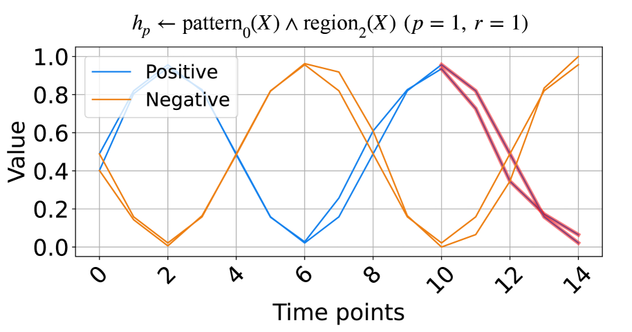
The image is a line chart comparing "Positive" and "Negative" values over time points. The chart visualizes the relationship between these two categories, showing their fluctuations and intersections across the time points. The chart also includes a formula at the top: "hp ← pattern0(X) ∧ region2(X) (p = 1, r = 1)".
### Components/Axes
* **Title:** hp ← pattern0(X) ∧ region2(X) (p = 1, r = 1)
* **X-axis:** "Time points" with markers at 0, 2, 4, 6, 8, 10, 12, and 14.
* **Y-axis:** "Value" with markers at 0.0, 0.2, 0.4, 0.6, 0.8, and 1.0.
* **Legend:** Located in the top-left corner.
* "Positive" - represented by a blue line.
* "Negative" - represented by an orange line.
### Detailed Analysis
* **Positive (Blue Line):**
* Trend: The line generally oscillates, showing a wave-like pattern.
* Data Points:
* Time point 0: Value ≈ 0.5
* Time point 2: Value ≈ 0.1
* Time point 6: Value ≈ 0.0
* Time point 10: Value ≈ 0.9
* Time point 14: Value ≈ 0.1
* **Negative (Orange Line):**
* Trend: The line also oscillates, showing a wave-like pattern, but generally inverse to the "Positive" line.
* Data Points:
* Time point 0: Value ≈ 0.4
* Time point 2: Value ≈ 0.0
* Time point 6: Value ≈ 0.9
* Time point 10: Value ≈ 0.0
* Time point 14: Value ≈ 1.0
### Key Observations
* The "Positive" and "Negative" lines exhibit an inverse relationship, with one generally increasing when the other is decreasing.
* Both lines show a periodic pattern, suggesting a cyclical behavior over time.
* Around time point 10, the "Positive" line transitions to a darker red/purple color, and the "Negative" line continues as orange.
### Interpretation
The chart visualizes the interplay between "Positive" and "Negative" values over time. The oscillating patterns suggest a dynamic relationship, possibly representing opposing forces or alternating states. The formula at the top indicates that these patterns are related to specific regions and patterns identified by the variables X, p, and r. The change in color of the "Positive" line around time point 10 could indicate a shift in the underlying process or a change in the data being represented. The data suggests a system where positive and negative attributes fluctuate in a somewhat predictable, inverse manner, potentially driven by underlying patterns and regional characteristics.