\n
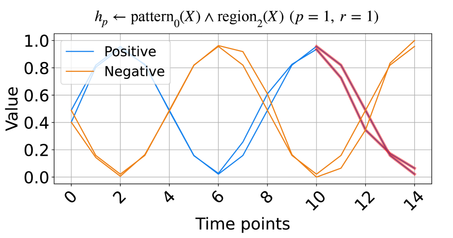
## Line Chart: Pattern and Region Logical Operation
### Overview
The image displays a line chart plotting two primary data series ("Positive" and "Negative") over a series of time points. A third, unlabeled line in a pinkish-red color appears in the latter portion of the chart. The chart's title is a formal logical expression, suggesting it originates from a technical or academic context, likely related to pattern recognition, signal processing, or formal logic.
### Components/Axes
* **Title:** `h_p ← pattern_0(X) ∧ region_2(X) (p = 1, r = 1)`
* This is a logical assignment statement. `h_p` is assigned the result of a logical AND (`∧`) between `pattern_0(X)` and `region_2(X)`. Parameters `p` and `r` are both set to 1.
* **Y-Axis:**
* **Label:** "Value"
* **Scale:** Linear, ranging from 0.0 to 1.0.
* **Ticks:** 0.0, 0.2, 0.4, 0.6, 0.8, 1.0.
* **X-Axis:**
* **Label:** "Time points"
* **Scale:** Linear, integer steps.
* **Ticks:** 0, 2, 4, 6, 8, 10, 12, 14.
* **Legend:**
* **Position:** Top-left corner of the chart area.
* **Entries:**
* **Blue Line:** "Positive"
* **Orange Line:** "Negative"
* **Data Series:**
1. **Positive (Blue Line):** A continuous line.
2. **Negative (Orange Line):** A continuous line.
3. **Unlabeled (Pinkish-Red Line):** A line that appears to start at Time point 10 and continues to Time point 14. It is not identified in the legend.
### Detailed Analysis
**Trend Verification & Data Point Extraction:**
* **Positive (Blue) Series Trend:** The line exhibits a wave-like pattern with two peaks and a trough. It starts mid-range, rises to a peak, falls to a minimum, rises to a second peak, and then declines.
* Time 0: ~0.5
* Time 2: ~0.95 (First Peak)
* Time 6: ~0.05 (Trough)
* Time 10: ~0.95 (Second Peak)
* Time 14: ~0.1
* **Negative (Orange) Series Trend:** This line shows an inverse wave-like pattern relative to the Positive line. It starts lower, dips to a minimum, rises to a peak, falls to a minimum, and then rises sharply.
* Time 0: ~0.4
* Time 2: ~0.0 (Minimum)
* Time 6: ~0.95 (Peak)
* Time 10: ~0.0 (Minimum)
* Time 14: ~0.95
* **Unlabeled (Pinkish-Red) Series Trend:** This line appears to diverge from the Positive (Blue) line at its second peak.
* Time 10: ~0.95 (appears to share the same point as the Blue line)
* Time 12: ~0.4
* Time 14: ~0.05
**Spatial Grounding:** The legend is anchored in the top-left quadrant of the plot area. The two main data series (Blue/Positive and Orange/Negative) are present across the entire x-axis. The unlabeled Pinkish-Red line is confined to the rightmost segment of the chart, from x=10 to x=14.
### Key Observations
1. **Inverse Correlation:** The "Positive" and "Negative" series are strongly inversely correlated. When one is near its maximum (~1.0), the other is near its minimum (~0.0), and vice-versa. Their peaks and troughs are perfectly staggered.
2. **Symmetry:** The patterns are roughly symmetrical around the midpoint of the time axis (around Time point 7-8).
3. **Unlabeled Element:** The presence of the third, pinkish-red line is a significant anomaly. It is not defined in the legend, creating ambiguity. It visually splits from the Positive line at Time point 10 and follows a steep downward trajectory.
4. **Mathematical Context:** The title implies the plotted values represent the output (`h_p`) of a logical operation between a pattern detector and a region detector over time. The "Positive" and "Negative" labels may refer to the truth value or activation strength of this operation under different conditions.
### Interpretation
This chart likely visualizes the output of a computational model or logical system over discrete time steps. The core insight is the demonstration of a perfect or near-perfect inverse relationship between two states or conditions labeled "Positive" and "Negative." This could represent:
* The activation of two mutually exclusive rules or patterns.
* The confidence scores for two opposing classifications.
* The result of a logical function where one input (`pattern_0`) and another (`region_2`) oscillate in opposition.
The unlabeled pinkish-red line is critical. Its divergence from the "Positive" line at Time point 10 suggests a **point of intervention, a fault, or the introduction of a new variable**. It may represent:
* A "ground truth" or reference signal that the "Positive" line was following until t=10.
* The output of a modified version of the system (e.g., with a different parameter `r`).
* An error signal or a different logical operation taking precedence.
The chart's primary message is not just the inverse relationship, but the **event at Time point 10** that causes a divergence, highlighting a change in the system's behavior or a comparison between two different system responses. The formal title grounds this in a framework of logical pattern-region conjunction, making it a technical diagnostic or result plot from a research experiment.