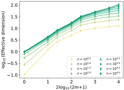
## Chart: Effective Dimension vs. Sample Size
### Overview
The image presents a line chart illustrating the relationship between the logarithm base 10 of the effective dimension and the logarithm base 10 of (2m+1), where 'm' likely represents the number of samples. The chart displays multiple lines, each representing a different value of 'n', which appears to be a sample size parameter. Error bars are present on each data point, indicating the variability or uncertainty in the measurements.
### Components/Axes
* **X-axis Title:** 2log₁₀(2m+1)
* **X-axis Scale:** Ranges from approximately 0 to 4, with tick marks at 0, 1, 2, 3, and 4.
* **Y-axis Title:** log₁₀(Effective dimension)
* **Y-axis Scale:** Ranges from approximately -1.1 to 2.0, with tick marks at -0.5, 0, 0.5, 1.0, 1.5, and 2.0.
* **Legend:** Located in the top-right corner of the chart.
* n = 10⁰.⁵ (Yellow)
* n = 10¹.⁰ (Orange)
* n = 10¹.⁵ (Light Green)
* n = 10².⁰ (Dark Green)
* n = 10².⁵ (Teal)
* n = 10³.⁰ (Blue)
* n = 10³.⁵ (Dark Blue)
* n = 10⁴.⁰ (Purple)
### Detailed Analysis
The chart contains seven lines, each representing a different value of 'n'. Each line has multiple data points with error bars.
* **n = 10⁰.⁵ (Yellow):** This line starts at approximately (0, -0.8) and increases slowly, reaching approximately (4, 1.3). The line is relatively flat.
* **n = 10¹.⁰ (Orange):** This line starts at approximately (0, -0.3) and increases at a moderate rate, reaching approximately (4, 1.6).
* **n = 10¹.⁵ (Light Green):** This line starts at approximately (0, 0.2) and increases at a moderate rate, reaching approximately (4, 1.8).
* **n = 10².⁰ (Dark Green):** This line starts at approximately (0, 0.5) and increases at a moderate rate, reaching approximately (4, 1.9).
* **n = 10².⁵ (Teal):** This line starts at approximately (0, 0.8) and increases at a moderate rate, reaching approximately (4, 2.0).
* **n = 10³.⁰ (Blue):** This line starts at approximately (0, 1.1) and increases at a moderate rate, reaching approximately (4, 2.0).
* **n = 10³.⁵ (Dark Blue):** This line starts at approximately (0, 1.4) and increases at a moderate rate, reaching approximately (4, 2.0).
* **n = 10⁴.⁰ (Purple):** This line starts at approximately (0, 1.6) and increases at a moderate rate, reaching approximately (4, 2.0).
All lines exhibit a generally upward trend, indicating that as 2log₁₀(2m+1) increases, the log₁₀(Effective dimension) also increases. The lines representing larger values of 'n' (10².⁵ and above) tend to converge towards the upper end of the y-axis scale. The error bars are relatively small, suggesting a reasonable degree of confidence in the measurements.
### Key Observations
* The lines representing larger values of 'n' have higher effective dimensions for a given value of 2log₁₀(2m+1).
* The rate of increase in effective dimension appears to slow down as 2log₁₀(2m+1) increases, particularly for the lines with larger 'n' values.
* The lines converge at higher values of 2log₁₀(2m+1), suggesting that the effective dimension plateaus for large sample sizes.
### Interpretation
The chart demonstrates the relationship between sample size ('m') and the effective dimension of a dataset, parameterized by 'n'. The effective dimension represents the number of independent variables needed to explain the variance in the data. As the sample size increases (as indicated by the x-axis), the effective dimension also increases, but at a decreasing rate. This suggests that with larger datasets, the information content grows, but the rate of new information gained diminishes.
The different lines, each representing a different value of 'n', likely represent different scenarios or conditions under which the effective dimension is being measured. The fact that lines with larger 'n' values have higher effective dimensions suggests that 'n' is a parameter that influences the complexity or richness of the data. The convergence of the lines at higher values of 2log₁₀(2m+1) indicates that the effective dimension is ultimately limited by the parameter 'n', regardless of how large the sample size becomes.
This type of analysis is common in fields like machine learning and dimensionality reduction, where understanding the effective dimension of a dataset is crucial for selecting appropriate algorithms and models. The chart provides insights into how sample size and other parameters affect the complexity and information content of a dataset.