## Grouped Bar Chart: Error Rate Distribution by Level
### Overview
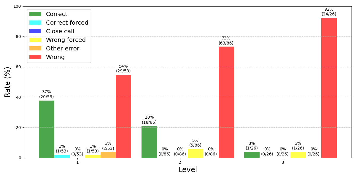
This image displays a grouped bar chart illustrating the percentage distribution of six different outcome categories across three distinct levels (1, 2, and 3). The chart quantifies performance or error rates, showing a clear trend where the "Wrong" outcome becomes increasingly dominant as the level number increases.
### Components/Axes
* **Chart Type:** Grouped bar chart.
* **X-Axis:** Labeled "Level". It has three categorical tick marks: `1`, `2`, and `3`.
* **Y-Axis:** Labeled "Rate (%)". It is a linear scale ranging from 0 to 100, with major gridlines at intervals of 20 (0, 20, 40, 60, 80, 100).
* **Legend:** Positioned in the top-left corner of the chart area. It defines six color-coded categories:
* **Green:** Correct
* **Cyan:** Correct forced
* **Blue:** Close call
* **Yellow:** Wrong forced
* **Orange:** Other error
* **Red:** Wrong
* **Data Labels:** Each bar is annotated with a percentage value and, in parentheses, the raw fraction (e.g., `37% (20/53)`).
### Detailed Analysis
The data is presented for each level, with bars grouped side-by-side. The total sample size (denominator) differs per level: Level 1 (n=53), Level 2 (n=86), Level 3 (n=26).
**Level 1:**
* **Correct (Green):** 37% (20/53). This is the highest rate for a non-"Wrong" category at this level.
* **Correct forced (Cyan):** 1% (1/53).
* **Close call (Blue):** 0% (0/53).
* **Wrong forced (Yellow):** 1% (1/53).
* **Other error (Orange):** 3% (2/53).
* **Wrong (Red):** 54% (29/53). This is the dominant category at Level 1.
**Level 2:**
* **Correct (Green):** 20% (18/86). A significant decrease from Level 1.
* **Correct forced (Cyan):** 0% (0/86).
* **Close call (Blue):** 0% (0/86).
* **Wrong forced (Yellow):** 5% (5/86). A slight increase from Level 1.
* **Other error (Orange):** 0% (0/86).
* **Wrong (Red):** 73% (63/86). A substantial increase, becoming overwhelmingly dominant.
**Level 3:**
* **Correct (Green):** 3% (1/26). A dramatic drop to near zero.
* **Correct forced (Cyan):** 0% (0/26).
* **Close call (Blue):** 0% (0/26).
* **Wrong forced (Yellow):** 3% (1/26).
* **Other error (Orange):** 0% (0/26).
* **Wrong (Red):** 92% (24/26). The vast majority of outcomes at this level.
### Key Observations
1. **Dominant Trend:** There is a strong, inverse relationship between the "Correct" and "Wrong" rates as the level increases. "Correct" rates plummet from 37% to 3%, while "Wrong" rates surge from 54% to 92%.
2. **Minimal Other Categories:** The categories "Correct forced," "Close call," and "Other error" are negligible or zero across all levels, indicating they are rare outcomes.
3. **"Wrong Forced" Persistence:** The "Wrong forced" category, while small, is the only non-"Wrong" category present at all three levels (1%, 5%, 3%).
4. **Sample Size Variation:** The denominator changes per level (53, 86, 26), which should be considered when comparing absolute counts, though the percentages are normalized.
### Interpretation
The data strongly suggests that the task or assessment becomes progressively more difficult from Level 1 to Level 3. The near-total dominance of the "Wrong" category at Level 3 (92%) indicates that this level may be beyond the capability threshold for the subjects being tested, or that the task design at this level is fundamentally different.
The virtual absence of "Close call" and "Other error" outcomes implies a binary or near-binary scoring system where responses are classified as either definitively correct or definitively wrong, with "forced" choices representing a specific, constrained condition. The persistence of "Wrong forced" errors, even at the highest difficulty, may point to a specific, recurring flaw in reasoning or a consistent trap within the task design.
From a Peircean perspective, this chart is an *index*—it points directly to a causal relationship between level difficulty and error rate. The trend is not merely correlational; the systematic increase in "Wrong" responses with each level strongly implies that the level variable is the *cause* of the performance degradation. The chart serves as a diagnostic tool, highlighting Level 3 as a critical point of failure and suggesting that investigation should focus on the specific challenges introduced at that stage.