## Line Chart: Execution Time vs. Max Region Size
### Overview
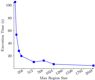
The image is a line chart showing the relationship between "Execution Time (s)" on the y-axis and "Max Region Size" on the x-axis. The chart illustrates how execution time decreases as the maximum region size increases.
### Components/Axes
* **X-axis:** "Max Region Size" with values at: 256, 512, 768, 1024, 1280, 1536, 1792, 2048.
* **Y-axis:** "Execution Time (s)" with values ranging from 0 to 100.
* **Data Series:** A single blue line with square markers representing the data points.
### Detailed Analysis
The blue line represents the execution time as a function of the maximum region size.
* **Trend:** The line shows a decreasing trend. Initially, the execution time drops sharply as the maximum region size increases from 256 to 512. The rate of decrease slows down as the maximum region size increases further.
* **Data Points:**
* At Max Region Size 256, Execution Time is approximately 54 seconds.
* At Max Region Size 512, Execution Time is approximately 11 seconds.
* At Max Region Size 768, Execution Time is approximately 13 seconds.
* At Max Region Size 1024, Execution Time is approximately 8 seconds.
* At Max Region Size 2048, Execution Time is approximately 5 seconds.
### Key Observations
* The most significant drop in execution time occurs between Max Region Sizes 256 and 512.
* Beyond a Max Region Size of 1024, the execution time decreases at a much slower rate.
### Interpretation
The chart suggests that increasing the maximum region size initially leads to a substantial reduction in execution time. However, the benefits of increasing the maximum region size diminish as the size becomes larger. This implies that there may be an optimal maximum region size beyond which further increases do not significantly improve performance. The initial sharp decline indicates that smaller region sizes result in significantly longer execution times, possibly due to increased overhead or less efficient processing.