## Line Chart: Attention over Values, a=8
### Overview
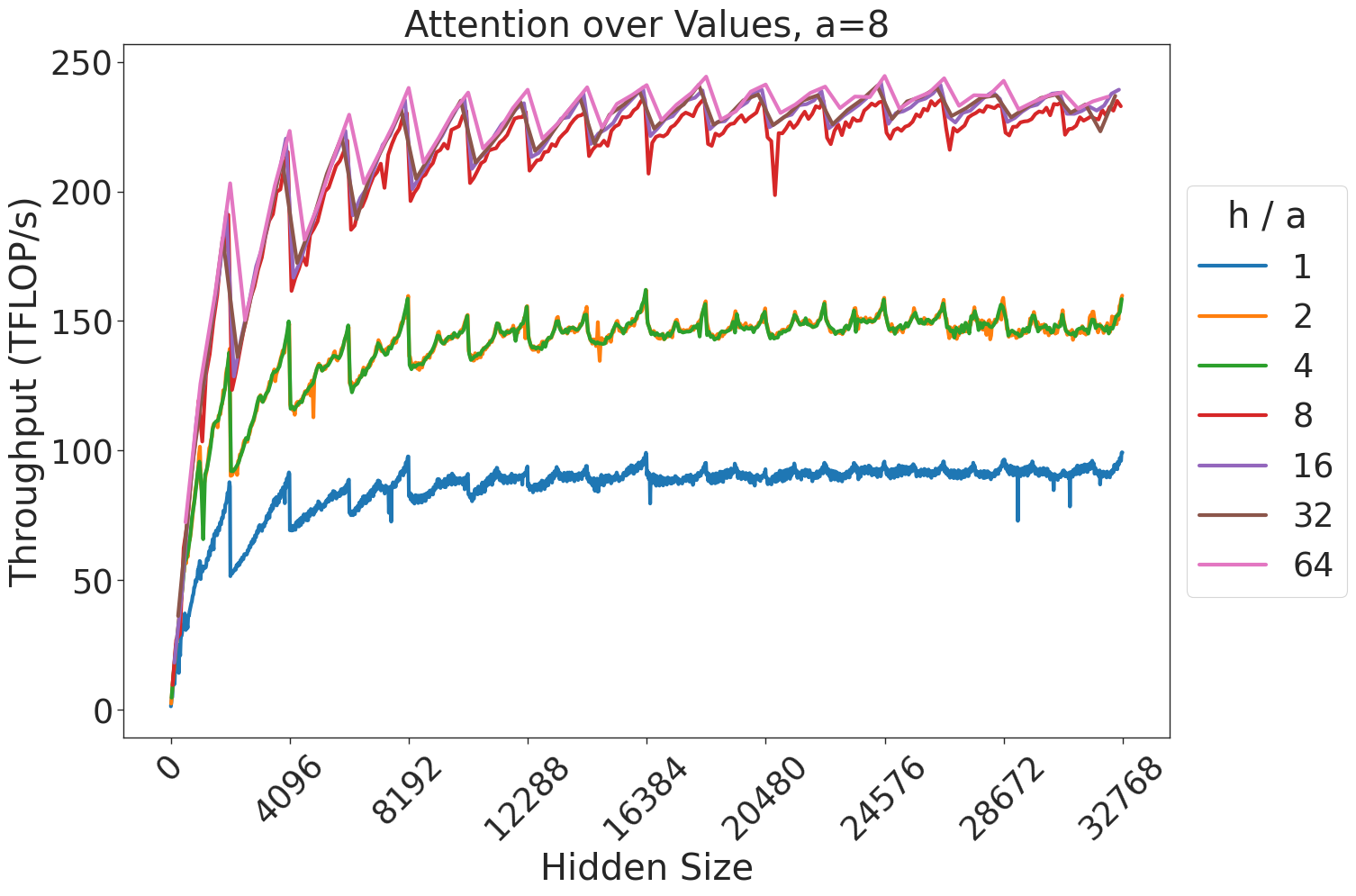
This image displays a line chart illustrating the relationship between "Hidden Size" (x-axis) and "Throughput (TFLOP/s)" (y-axis) for different "h / a" ratios. The chart demonstrates how computational throughput scales as the hidden size increases, with distinct performance tiers based on the "h / a" ratio.
### Components/Axes
* **Title:** "Attention over Values, a=8" (Centered at the top).
* **Y-Axis:** "Throughput (TFLOP/s)". The scale ranges from 0 to 250, with major tick marks every 50 units.
* **X-Axis:** "Hidden Size". The scale ranges from 0 to 32768, with major tick marks every 4096 units.
* **Legend:** Located on the right side of the chart. It defines the "h / a" ratio using color-coded lines:
* **Blue:** 1
* **Orange:** 2
* **Green:** 4
* **Red:** 8
* **Purple:** 16
* **Brown:** 32
* **Pink:** 64
### Detailed Analysis
#### Trend Verification
* **General Trend:** All data series exhibit a steep, near-linear increase in throughput at low hidden sizes (0 to ~4096), followed by a logarithmic-style plateau as hidden size increases toward 32768.
* **Periodic Pattern:** Every data series exhibits a consistent "sawtooth" pattern. This consists of a sharp, sudden drop in throughput followed by a gradual recovery/increase. This pattern repeats frequently across the x-axis.
* **Clustering:** The data series are grouped into three distinct performance tiers:
1. **Low Tier (Blue):** Consistently the lowest throughput.
2. **Mid Tier:** (Remaining lines)