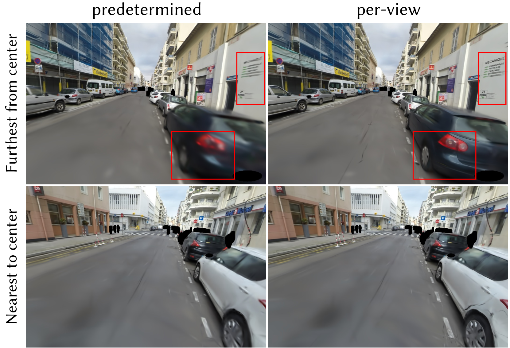
## [Image Comparison]: Predetermined vs. Per-View Image Processing
### Overview
The image is a 2x2 grid comparing two image processing or rendering methods, labeled "predetermined" and "per-view," applied to two different street scene captures. The comparison focuses on the clarity and detail of specific regions within the images, highlighted by red bounding boxes. The overall purpose appears to be a qualitative assessment of how each method handles image fidelity, particularly in areas away from the image center.
### Components/Axes
* **Layout:** A 2x2 grid.
* **Column Headers (Top):**
* Left Column: `predetermined`
* Right Column: `per-view`
* **Row Labels (Left Side, Rotated 90°):**
* Top Row: `Furthest from center`
* Bottom Row: `Nearest to center`
* **Visual Elements:** Each of the four panels contains a photographic street scene. Red rectangular bounding boxes are used to isolate and draw attention to specific regions within each image for comparison.
### Detailed Analysis
The analysis is segmented by row and column, focusing on the content within the red bounding boxes.
| Row / Column | `predetermined` | `per-view` |
| :--- | :--- | :--- |
| **Top Row: "Furthest from center" Scene** <br> *Scene Description:* A narrow urban street with parked cars on both sides. Buildings with shops line the street. A dark-colored car is prominent in the right foreground. | **Red Box 1 (Upper Right):** Highlights a white sign on a building facade. The text is significantly blurred and illegible. Only vague horizontal lines suggesting text are visible.<br>**Red Box 2 (Lower Center):** Highlights the rear taillight and bumper area of the dark car. The image is motion-blurred, making the taillight shape indistinct and the bumper details smeared. | **Red Box 1 (Upper Right):** Highlights the same white sign. The text is now legible. The sign reads:<br>* **Primary Text (Large, Bold):** `MECANIQUE`<br>* **Secondary Text (List below):**<br> * `ENTRETIEN`<br> * `REPARATION`<br> * `CARROSSERIE`<br> * `DEPANNAGE`<br>* **Additional Detail:** The number `41` is visible at the bottom left of the sign.<br>**Red Box 2 (Lower Center):** Highlights the same car taillight and bumper. The image is sharp. The taillight's internal structure and red color are clear, and the bumper's contour and reflection are well-defined. |
| **Bottom Row: "Nearest to center" Scene** <br> *Scene Description:* A wider street intersection or plaza. Several parked cars are visible on the right. A crosswalk and traffic signs are present. Buildings, including one with a "Banque Populaire" sign, are in the background. | **Red Box 1 (Center):** Highlights a section of the road surface and the lower part of a parked car. The road markings and texture are somewhat soft.<br>**Red Box 2 (Right):** Highlights a building facade and a sign. The text on the sign is partially visible but blurry. | **Red Box 1 (Center):** Highlights the same road section. The asphalt texture and road markings appear slightly sharper and more defined compared to the "predetermined" version.<br>**Red Box 2 (Right):** Highlights the same building sign. The text clarity is marginally improved, but it remains difficult to read completely. The overall edge definition of the building appears slightly enhanced. |
### Key Observations
1. **Clarity Disparity:** The most significant difference is in the top row ("Furthest from center"). The "per-view" method dramatically improves the legibility of text and the sharpness of object details (car taillight) in these peripheral regions compared to the heavily blurred "predetermined" output.
2. **Spatial Dependency:** The improvement offered by the "per-view" method is most pronounced for elements located far from the image center, as indicated by the row label. The difference in the "Nearest to center" row is more subtle.
3. **Text Extraction:** The only fully legible text extracted from the highlighted regions is from the sign in the top-right panel: `MECANIQUE`, `ENTRETIEN`, `REPARATION`, `CARROSSERIE`, `DEPANNAGE`, and `41`.
4. **Other Visible Text (Not Highlighted):** Other signs in the scenes include `STEERWELL` (yellow sign, top row) and `Banque Populaire` (blue sign, bottom row).
### Interpretation
This comparison likely evaluates a view-dependent or foveated rendering/processing technique against a uniform ("predetermined") one. The data suggests:
* **The "per-view" method is superior for preserving high-frequency detail (text, edges) in peripheral areas of the image.** This is critical for applications like autonomous driving, surveillance, or virtual reality, where information at the edges of the field of view can be just as important as the center.
* The "predetermined" method appears to apply a uniform level of processing or compression that disproportionately degrades quality away from the center, resulting in significant blur.
* The **"Nearest to center"** comparison shows less dramatic improvement, implying that the baseline "predetermined" method may already allocate more resources or higher fidelity to the central region, leaving less room for improvement by the "per-view" technique.
* The **outlier** is the extreme blur in the top-left panel's highlighted regions, which serves as a strong visual argument for the necessity of the "per-view" approach when peripheral detail is a requirement.
**Conclusion:** The image provides visual evidence that a "per-view" processing strategy effectively mitigates the loss of detail in non-central image regions, which is a clear weakness of the "predetermined" approach shown. The primary informational gain is the restoration of legible text and sharp object boundaries in the periphery.