\n
## Charts: FEM Kernel and Solution Comparison
### Overview
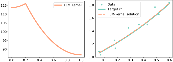
The image presents two charts side-by-side. The left chart displays a single line representing a "FEM Kernel" plotted against an unspecified x-axis ranging from 0.0 to 1.0. The right chart shows a scatter plot of "Data" points and a line representing a "Target f*" and a dashed line representing a "FEM-kernel solution" plotted against an x-axis ranging from approximately 0.05 to 0.6. Both charts appear to be evaluating the performance of a Finite Element Method (FEM) kernel.
### Components/Axes
**Left Chart:**
* **Title:** Not explicitly present, but implied to be "FEM Kernel" based on the legend.
* **X-axis:** Ranges from 0.0 to 1.0, unlabeled.
* **Y-axis:** Ranges from approximately 90 to 115, unlabeled.
* **Legend:** Located in the top-right corner.
* "FEM Kernel" - represented by a solid orange line.
**Right Chart:**
* **Title:** Not explicitly present.
* **X-axis:** Ranges from approximately 0.05 to 0.6, unlabeled.
* **Y-axis:** Ranges from approximately 1.0 to 1.8, unlabeled.
* **Legend:** Located in the top-left corner.
* "Data" - represented by teal circles.
* "Target f*" - represented by a solid teal line.
* "FEM-kernel solution" - represented by a dashed orange line.
### Detailed Analysis or Content Details
**Left Chart:**
The "FEM Kernel" line starts at approximately 114 at x=0.0, rises to a peak of approximately 117 at x=0.2, and then decreases steadily to approximately 90 at x=1.0. The trend is initially increasing, then sharply decreasing.
**Right Chart:**
* **Data:** The scatter plot shows approximately 10 data points. The points are distributed roughly along a curve. Approximate coordinates:
* (0.07, 1.03)
* (0.11, 1.12)
* (0.15, 1.21)
* (0.20, 1.30)
* (0.25, 1.40)
* (0.30, 1.48)
* (0.35, 1.56)
* (0.40, 1.64)
* (0.50, 1.78)
* (0.55, 1.83)
* **Target f*:** The solid teal line starts at approximately 1.0 at x=0.05 and increases to approximately 1.83 at x=0.55. The line appears to follow a roughly quadratic trend.
* **FEM-kernel solution:** The dashed orange line starts at approximately 1.0 at x=0.05 and increases to approximately 1.8 at x=0.55. The line closely follows the "Target f*" line.
### Key Observations
* The left chart shows a kernel function that initially increases and then decreases, suggesting a peak sensitivity or influence at around x=0.2.
* The right chart demonstrates that the "FEM-kernel solution" closely approximates the "Target f*" function, as indicated by the overlapping lines.
* The "Data" points appear to be used to define or validate the "Target f*" function.
* The x-axis labels are missing, making it difficult to interpret the meaning of the x-values.
### Interpretation
The charts likely represent a validation of a Finite Element Method (FEM) kernel. The left chart shows the shape of the kernel function itself, which is a key component in FEM calculations. The right chart demonstrates how well the FEM kernel can approximate a known target function ("Target f*") using available data. The close agreement between the "FEM-kernel solution" and the "Target f*" suggests that the FEM kernel is performing accurately. The data points are likely used to define the target function or to assess the accuracy of the FEM solution. The missing x-axis labels limit a deeper understanding of the context and physical meaning of the results. The initial rise and subsequent fall of the FEM Kernel suggests a localized influence or sensitivity within the domain being modeled.