\n
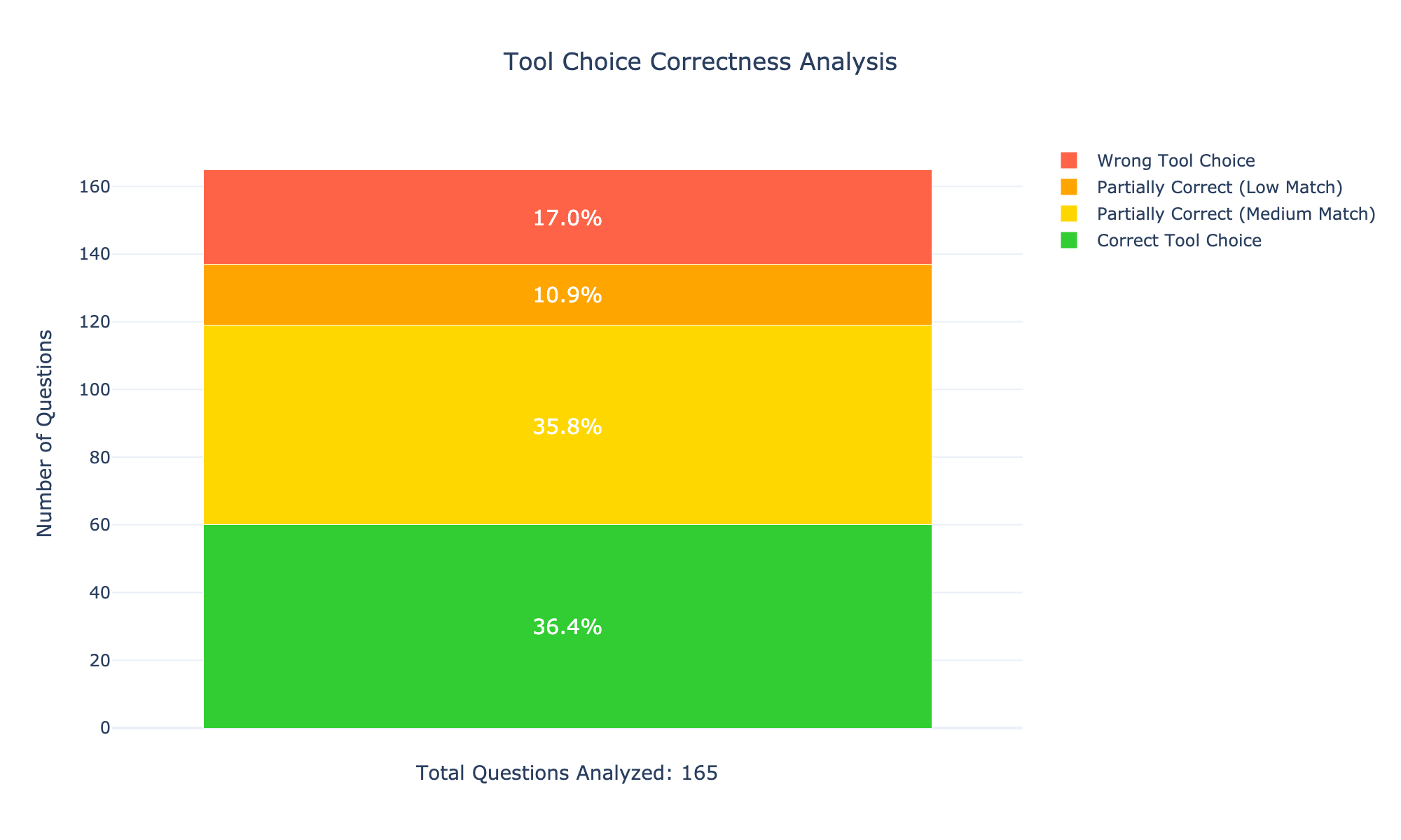
## Stacked Bar Chart: Tool Choice Correctness Analysis
### Overview
The image presents a stacked bar chart visualizing the correctness of tool choices, likely in response to a set of questions. The chart displays the distribution of "Wrong Tool Choice", "Partially Correct (Low Match)", "Partially Correct (Medium Match)", and "Correct Tool Choice" across a total of 165 questions analyzed. The chart is horizontally oriented, with the y-axis representing the number of questions and the x-axis implicitly representing the categories of correctness.
### Components/Axes
* **Title:** "Tool Choice Correctness Analysis" (centered at the top)
* **Y-axis Label:** "Number of Questions" (left side)
* **X-axis:** Implicitly represents the categories of tool choice correctness.
* **Legend:** Located in the top-right corner, with the following entries:
* Red: "Wrong Tool Choice"
* Yellow: "Partially Correct (Low Match)"
* Orange: "Partially Correct (Medium Match)"
* Green: "Correct Tool Choice"
* **Total Questions Analyzed:** "Total Questions Analyzed: 165" (bottom center)
* **Percentage Labels:** Displayed within each segment of the stacked bar, indicating the percentage of questions falling into each category.
### Detailed Analysis
The chart is composed of four stacked segments, each representing a category of tool choice correctness. The segments are stacked vertically, starting from the bottom with "Correct Tool Choice" and moving upwards through "Partially Correct (Medium Match)", "Partially Correct (Low Match)", and finally "Wrong Tool Choice".
* **Correct Tool Choice (Green):** The green segment occupies the bottom portion of the chart. It represents 36.4% of the total questions, which corresponds to approximately 60 questions (0.364 * 165 ≈ 60).
* **Partially Correct (Medium Match) (Orange):** The orange segment sits above the green segment. It represents 35.8% of the total questions, which corresponds to approximately 59 questions (0.358 * 165 ≈ 59).
* **Partially Correct (Low Match) (Yellow):** The yellow segment is above the orange segment. It represents 10.9% of the total questions, which corresponds to approximately 18 questions (0.109 * 165 ≈ 18).
* **Wrong Tool Choice (Red):** The red segment is at the top of the chart. It represents 17.0% of the total questions, which corresponds to approximately 28 questions (0.170 * 165 ≈ 28).
The sum of the percentages is 36.4% + 35.8% + 10.9% + 17.0% = 100.1%, which is slightly off due to rounding.
### Key Observations
* The largest proportion of questions (36.4%) resulted in a "Correct Tool Choice".
* "Partially Correct (Medium Match)" is very close to "Correct Tool Choice" at 35.8%.
* "Wrong Tool Choice" represents the smallest proportion of questions (17.0%).
* "Partially Correct (Low Match)" represents a relatively small proportion of questions (10.9%).
### Interpretation
The data suggests that, overall, tool choices are reasonably accurate, with a majority of questions resulting in either a correct or partially correct response. The close proximity of "Correct Tool Choice" and "Partially Correct (Medium Match)" indicates that while many choices are fully appropriate, a significant number are almost suitable, suggesting a potential for refinement or further training. The relatively low percentage of "Wrong Tool Choice" is encouraging, but still warrants attention to identify the root causes of these errors. The distinction between "Low Match" and "Medium Match" partial correctness suggests a graded scale of appropriateness, which could be valuable for targeted improvement efforts. The total number of questions analyzed (165) provides a reasonable sample size for drawing conclusions, but further analysis with a larger dataset could strengthen the findings. The chart provides a clear visual representation of the distribution of tool choice correctness, facilitating quick identification of areas for improvement.