## Stacked Bar Chart: Tool Choice Correctness Analysis
### Overview
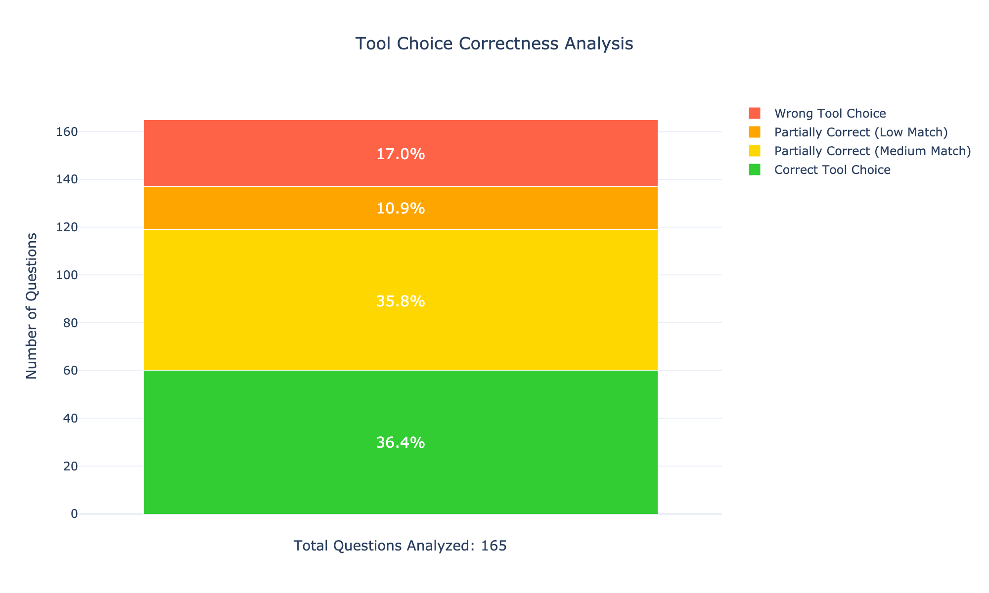
The image displays a single stacked bar chart titled "Tool Choice Correctness Analysis." It visualizes the distribution of correctness outcomes for tool selection across a set of analyzed questions. The chart is designed to show the proportion of each outcome category relative to the total number of questions.
### Components/Axes
* **Title:** "Tool Choice Correctness Analysis" (centered at the top).
* **Y-Axis:** Labeled "Number of Questions." The scale runs from 0 to 160, with major gridlines at intervals of 20 (0, 20, 40, 60, 80, 100, 120, 140, 160).
* **X-Axis:** Not explicitly labeled. It contains a single, wide stacked bar representing the entire dataset.
* **Legend:** Positioned to the right of the bar. It lists four categories with corresponding color swatches:
* **Red Square:** Wrong Tool Choice
* **Orange Square:** Partially Correct (Low Match)
* **Yellow Square:** Partially Correct (Medium Match)
* **Green Square:** Correct Tool Choice
* **Data Labels:** White percentage values are centered within each colored segment of the bar.
* **Footer Text:** "Total Questions Analyzed: 165" is centered below the x-axis.
### Detailed Analysis
The single bar is segmented from bottom to top as follows:
1. **Bottom Segment (Green - Correct Tool Choice):**
* **Percentage:** 36.4%
* **Approximate Count:** 36.4% of 165 ≈ **60 questions**.
* **Visual Trend:** This is the largest segment, forming the base of the bar. It extends from the 0 line to approximately the 60 mark on the y-axis.
2. **Second Segment (Yellow - Partially Correct (Medium Match)):**
* **Percentage:** 35.8%
* **Approximate Count:** 35.8% of 165 ≈ **59 questions**.
* **Visual Trend:** This segment is nearly equal in size to the green segment. It sits directly on top of the green segment, extending from ~60 to ~119 on the y-axis.
3. **Third Segment (Orange - Partially Correct (Low Match)):**
* **Percentage:** 10.9%
* **Approximate Count:** 10.9% of 165 ≈ **18 questions**.
* **Visual Trend:** This is a significantly smaller segment. It sits atop the yellow segment, extending from ~119 to ~137 on the y-axis.
4. **Top Segment (Red - Wrong Tool Choice):**
* **Percentage:** 17.0%
* **Approximate Count:** 17.0% of 165 ≈ **28 questions**.
* **Visual Trend:** This segment is larger than the orange one but smaller than the green and yellow ones. It forms the top of the bar, extending from ~137 to the bar's total height at approximately 165 on the y-axis.
**Sum Check:** 36.4% + 35.8% + 10.9% + 17.0% = 100.1%. The minor discrepancy is attributable to rounding in the displayed percentages.
### Key Observations
* **Dominant Categories:** The "Correct Tool Choice" (36.4%) and "Partially Correct (Medium Match)" (35.8%) categories are the most frequent, together accounting for over 72% of all questions.
* **Significant Error Rate:** The "Wrong Tool Choice" category represents a substantial 17.0% of cases, indicating a notable failure rate.
* **Partial Correctness Split:** Partial correctness is divided into two tiers. The "Medium Match" tier (35.8%) is more than three times as common as the "Low Match" tier (10.9%).
* **Total Volume:** The analysis is based on a dataset of 165 questions.
### Interpretation
This chart provides a performance snapshot for an AI or system tasked with selecting appropriate tools to answer questions. The data suggests a generally positive but imperfect performance:
* **Strength:** The system demonstrates a solid baseline of competence, with over a third of its choices being fully correct and another third being largely correct (medium match). This indicates the underlying logic for tool selection is functional for a majority of cases.
* **Area for Improvement:** The combined "Partially Correct (Low Match)" and "Wrong Tool Choice" categories total 27.9%, meaning more than 1 in 4 tool selections are either incorrect or only marginally appropriate. This highlights a significant opportunity for refinement in the tool selection algorithm, particularly in avoiding outright wrong choices (17.0%).
* **Nuance in Partial Correctness:** The distinction between "Medium Match" and "Low Match" is critical. The high proportion of "Medium Match" suggests the system often identifies a relevant tool but may not always select the *optimal* one. The smaller "Low Match" group represents cases where the tool choice was tangential or minimally useful.
In summary, the system is more often right than wrong, but its reliability is hampered by a substantial minority of poor tool selections. Efforts to improve performance should focus on reducing the "Wrong Tool Choice" and "Low Match" categories, potentially by better understanding the nuances that differentiate a "Medium Match" from a "Low Match" tool.