## Line Chart: Attention Key Query Problem (h/a = 64)
### Overview
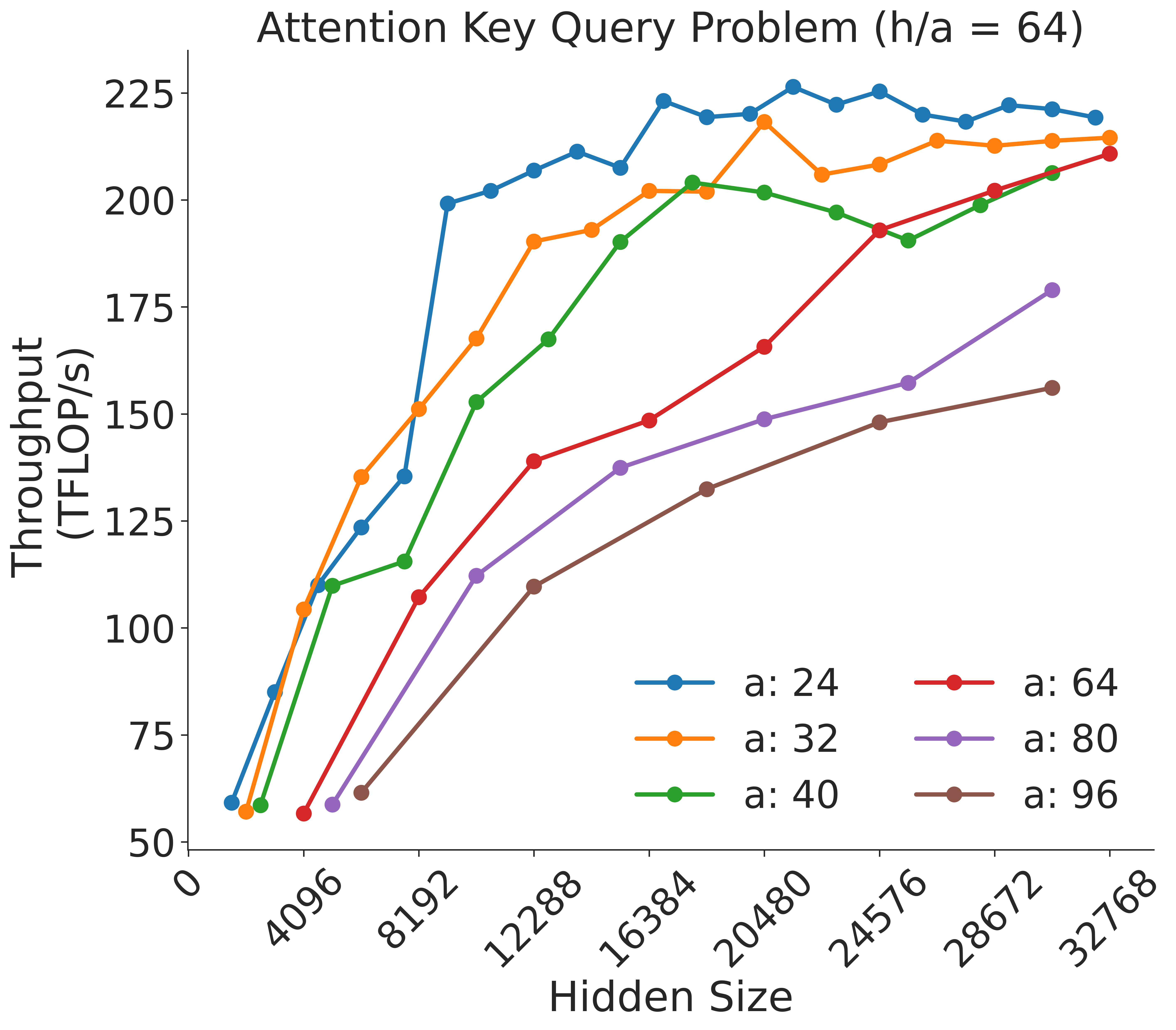
This image displays a line chart illustrating the relationship between "Hidden Size" (x-axis) and "Throughput (TFLOP/s)" (y-axis) for six different configurations of a parameter labeled "a" (ranging from 24 to 96). The chart demonstrates how throughput performance scales as the hidden size increases, with distinct performance curves for each "a" value.
### Components/Axes
* **Title:** "Attention Key Query Problem (h/a = 64)" located at the top center.
* **X-Axis:** Labeled "Hidden Size". The scale ranges from 0 to 32768, with major ticks at 4096, 8192, 12288, 16384, 20480, 24576, 28672, and 32768.
* **Y-Axis:** Labeled "Throughput (TFLOP/s)". The scale ranges from 50 to 225, with increments of 25.
* **Legend:** Located in the bottom-right quadrant. It maps colors to "a" values:
* **Blue:** a: 24
* **Orange:** a: 32
* **Green:** a: 40
* **Red:** a: 64
* **Purple:** a: 80
* **Brown:** a: 96
### Detailed Analysis
The chart plots six data series. Below is the trend verification and approximate data extraction for each:
* **Blue (a: 24):**
* *Trend:* Sharp upward slope from the origin, reaching a plateau very early (around hidden size 8192).
* *Data Points:* Starts at ~60 TFLOP/s. Reaches ~125 at 4096, ~200 at 8192, and plateaus between 200 and 225 TFLOP/s for the remainder of the x-axis.
* **Orange (a: 32):**
* *Trend:* Similar to Blue, but with a slightly lower throughput ceiling and a slightly delayed rise.
* *Data Points:* Starts at ~58 TFLOP/s. Reaches ~105 at 4096, ~150 at 8192, ~190 at 12288, and plateaus between 200 and 215 TFLOP/s.
* **Green (a: 40):**
* *Trend:* Steeper rise than Red/Purple/Brown, but slower than Blue/Orange.
* *Data Points:* Starts at ~58 TFLOP/s. Reaches ~110 at 4096, ~115 at 8192, ~168 at 12288, ~190 at 14000, and plateaus around 200-205 TFLOP/s.
* **Red (a: 64):**
* *Trend:* Steady, consistent upward slope across the entire x-axis.
* *Data Points:* Starts at ~58 TFLOP/s. Reaches ~108 at 8192, ~140 at 12288, ~165 at 20480, and ~210 at 32768.
* **Purple (a: 80):**
* *Trend:* Steady upward slope, consistently lower throughput than the Red series.
* *Data Points:* Starts at ~60 TFLOP/s. Reaches ~112 at 12288, ~150 at 20480, and ~180 at 32768.
* **Brown (a: 96):**
* *Trend:* The slowest growth rate; it has the lowest throughput across all hidden sizes.
* *Data Points:* Starts at ~62 TFLOP/s. Reaches ~110 at 12288, ~133 at 20480, and ~155 at 32768.
### Key Observations
* **Inverse Efficiency:** There is a clear inverse relationship between the value of "a" and the throughput at lower hidden sizes. Lower "a" values (24, 32) achieve high throughput much faster than higher "a" values (80, 96).
* **Saturation Point:** The "knee" of the curve (where throughput begins to plateau) shifts to the right as the value of "a" increases.
* **Throughput Ceiling:** Higher "a" values appear to have a lower maximum throughput potential within the tested hidden size range. For example, "a: 96" is still trending upward at 32768, whereas "a: 24" saturated long before that point.
### Interpretation
This chart likely represents a performance benchmark for a Transformer-based attention mechanism, where "a" represents the attention head dimension (or a related parameter like the number of heads or sequence length partitioning).
The data suggests that smaller attention head dimensions (a=24, 32) are significantly more efficient at utilizing hardware throughput at smaller hidden sizes. As the hidden size increases, the overhead associated with larger attention head dimensions (a=80, 96) becomes a bottleneck, preventing the system from reaching the high TFLOP/s throughput seen with smaller "a" configurations. This implies that for smaller models (lower hidden sizes), smaller "a" values are optimal, while larger models may require different tuning or hardware utilization strategies to overcome the performance degradation observed with higher "a" values.