## Scatter Plots: Relationships Between Variables N, D, and C
### Overview
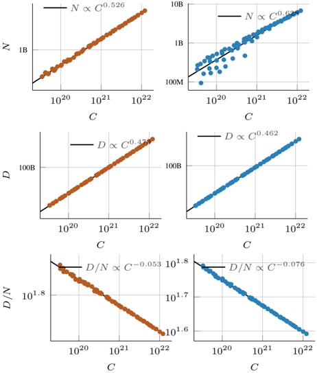
The image contains six scatter plots arranged in a 2x3 grid, comparing the relationships between variables **N**, **D**, and **C** across logarithmic scales. Each plot includes a trend line and a proportionality equation. Data points are color-coded (orange and blue), with legends indicating their corresponding equations. The x-axis (**C**) spans 10²⁰ to 10²², while y-axes vary by plot.
---
### Components/Axes
1. **X-Axis (All Plots)**:
- Label: **C**
- Scale: Logarithmic (10²⁰ to 10²²)
- Ticks: 10²⁰, 10²¹, 10²²
2. **Y-Axes**:
- **Top Row**:
- Left: **N** (log scale: 1B to 10B)
- Right: **N** (log scale: 100M to 1B)
- **Middle Row**:
- Left: **D** (log scale: 10B to 100B)
- Right: **D** (log scale: 100B to 1000B)
- **Bottom Row**:
- Left: **D/N** (log scale: 10¹.⁶ to 10¹.⁸)
- Right: **D/N** (log scale: 10¹.⁷ to 10¹.⁸)
3. **Legends**:
- **Orange**:
- Top Left: **N ∝ C⁰.⁵²⁶**
- Middle Left: **D ∝ C⁰.⁴⁷³**
- Bottom Left: **D/N ∝ C⁻⁰.⁰⁵³**
- **Blue**:
- Top Right: **N ∝ C⁰.⁶²⁸**
- Middle Right: **D ∝ C⁰.⁴⁶²**
- Bottom Right: **D/N ∝ C⁻⁰.⁰⁷⁶**
4. **Data Points**:
- Orange points align with orange trend lines.
- Blue points align with blue trend lines.
- All points follow their respective proportionality equations.
---
### Detailed Analysis
1. **Top Row (N vs. C)**:
- **Orange (N ∝ C⁰.⁵²⁶)**:
- Trend: Gradual upward slope.
- Data points cluster tightly around the line.
- **Blue (N ∝ C⁰.⁶²⁸)**:
- Trend: Steeper upward slope.
- Data points show slight scatter but follow the line closely.
2. **Middle Row (D vs. C)**:
- **Orange (D ∝ C⁰.⁴⁷³)**:
- Trend: Moderate upward slope.
- Data points are densely packed.
- **Blue (D ∝ C⁰.⁴⁶²)**:
- Trend: Slightly less steep than orange.
- Data points exhibit minor deviations at higher **C** values.
3. **Bottom Row (D/N vs. C)**:
- **Orange (D/N ∝ C⁻⁰.⁰⁵³)**:
- Trend: Very slight downward slope.
- Data points form a near-horizontal line.
- **Blue (D/N ∝ C⁻⁰.⁰⁷⁶)**:
- Trend: Steeper downward slope.
- Data points show a clear decline with increasing **C**.
---
### Key Observations
1. **Proportionality Trends**:
- **N** increases with **C** at higher rates for blue data (0.628) compared to orange (0.526).
- **D** increases with **C** at nearly identical rates for both colors (0.473 vs. 0.462).
- **D/N** decreases with **C**, with blue data showing a stronger inverse relationship (-0.076 vs. -0.053).
2. **Color Consistency**:
- Orange and blue data points strictly align with their respective trend lines, confirming accurate legend labeling.
3. **Scale Variations**:
- The top-right plot uses a compressed y-axis (100M–1B) to highlight smaller **N** values, while other plots use broader ranges (1B–10B or 100B–1000B).
---
### Interpretation
1. **Variable Relationships**:
- **N** and **D** both scale positively with **C**, but **N** exhibits stronger growth under blue conditions.
- The **D/N** ratio decreases with **C**, suggesting that **D** grows slower relative to **N** as **C** increases. This could indicate a regulatory or compensatory mechanism between the two variables.
2. **Exponent Significance**:
- The higher exponent for **N** in blue data (0.628) implies a nonlinear, accelerating dependency on **C** compared to orange data.
- The negative exponents for **D/N** (-0.053 to -0.076) suggest diminishing returns or saturation effects in the **D/N** system as **C** scales.
3. **Practical Implications**:
- If **C** represents a controllable parameter (e.g., concentration, energy input), optimizing **C** could maximize **N** (especially under blue conditions) while managing **D/N** trade-offs.
- The slight divergence in **D** trends (0.473 vs. 0.462) may reflect minor differences in experimental conditions or measurement noise.
4. **Anomalies**:
- No significant outliers are observed; all data points adhere to their trend lines within expected scatter limits.
---
### Conclusion
The plots demonstrate that **N** and **D** scale differently with **C**, with **N** showing stronger growth and **D/N** exhibiting inverse scaling. The color-coded proportionalities highlight distinct behavioral regimes, likely tied to experimental or systemic differences. These relationships could inform strategies for optimizing **C** to balance **N** and **D** in applications such as resource allocation, chemical synthesis, or ecological modeling.