## Statistical Distribution Comparison Chart: Goedel-Prover-SFT vs. ProofNet-SFT
### Overview
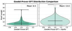
The image displays a side-by-side comparison of two probability density distributions, visualized as violin plots with embedded box plots. The chart compares the distribution of "Proof Length" for two different models or methods: "Goedel-Prover-SFT" (left) and "ProofNet-SFT" (right). The primary visual takeaway is that the ProofNet-SFT distribution is centered at a higher proof length and is more spread out than the Goedel-Prover-SFT distribution.
### Components/Axes
* **Chart Type:** Dual Violin Plot with embedded Box Plot.
* **X-Axis:** Common to both plots. Label: **"Proof Length"**. Scale: Linear, ranging from **0.0 to 3.0**, with major tick marks at 0.0, 0.5, 1.0, 1.5, 2.0, 2.5, and 3.0.
* **Y-Axis:** Represents probability density. Label: **"Probability Density"**. Scale: Linear, ranging from **0 to 60**, with major tick marks at 0, 20, 40, and 60.
* **Data Series Labels:** Positioned directly above each respective violin plot.
* Left Plot: **"Goedel-Prover-SFT"**
* Right Plot: **"ProofNet-SFT"**
* **Statistical Annotations:** The mean value for each distribution is displayed as text above its plot.
* Above Goedel-Prover-SFT: **"Mean: 6.5"**
* Above ProofNet-SFT: **"Mean: 13.0"**
* **Legend:** Not present as a separate element. The two distributions are distinguished by their spatial separation and direct labels.
* **Color:** Both violin plots are filled with the same teal/green color. The internal box plot elements (median line, quartile box, whiskers) are rendered in black.
### Detailed Analysis
1. **Goedel-Prover-SFT Distribution (Left):**
* **Shape & Trend:** The distribution is strongly right-skewed (positively skewed). The highest probability density (the widest part of the violin) is concentrated at the lower end of the proof length scale, approximately between **0.3 and 1.2**. The density tapers off sharply as proof length increases beyond ~1.5.
* **Central Tendency:** The annotated mean is **6.5**. The median (black line inside the box) appears to be located at a lower value than the mean, consistent with right-skew, visually estimated around **0.8-1.0**.
* **Spread & Quartiles:** The interquartile range (IQR, the black box) is relatively narrow, spanning roughly from **0.5 to 1.3**. The whiskers extend from approximately **0.2 to 2.0**. A few outlier points are visible beyond the upper whisker, near 2.5.
* **Peak Density:** The peak density value on the y-axis is approximately **55-58**.
2. **ProofNet-SFT Distribution (Right):**
* **Shape & Trend:** This distribution is more symmetric and platykurtic (flatter) compared to the left one, though it still shows a slight right skew. The high-density region is broader, spanning approximately from **1.0 to 2.5**.
* **Central Tendency:** The annotated mean is **13.0**. The median appears to be located around **1.7-1.9**, which is closer to the mean than in the left plot, indicating less skew.
* **Spread & Quartiles:** The IQR is wider, spanning roughly from **1.4 to 2.2**. The whiskers extend from approximately **0.8 to 2.8**. Outlier points are visible near the minimum (close to 0.5) and maximum (near 3.0).
* **Peak Density:** The peak density is lower than the left plot, reaching approximately **35-40** on the y-axis.
### Key Observations
* **Significant Mean Difference:** The mean proof length for ProofNet-SFT (13.0) is exactly double that of Goedel-Prover-SFT (6.5).
* **Distribution Shape Contrast:** Goedel-Prover-SFT produces a tight cluster of short proofs with a long tail of rare, longer proofs. ProofNet-SFT produces a much wider, more uniform spread of proof lengths across the observed range.
* **Density Concentration:** The highest concentration of data for Goedel-Prover-SFT is below a proof length of 1.5, while for ProofNet-SFT, it is between 1.0 and 2.5.
* **Overlap Region:** There is a significant overlap in the distributions between proof lengths of approximately 0.8 and 2.0, where both models have non-negligible probability density.
### Interpretation
This chart likely compares the performance of two automated theorem-proving or proof-generation systems. "Proof Length" is a common efficiency metric, where shorter proofs are generally preferred as they are more concise and often computationally cheaper to verify.
* **Goedel-Prover-SFT** demonstrates a clear tendency to generate **shorter, more efficient proofs** on average. Its right-skewed distribution suggests it is highly optimized for finding minimal proofs but occasionally produces longer ones. This could indicate a model that is good at finding direct, elegant solutions.
* **ProofNet-SFT** generates **longer proofs on average** with much higher variability. The wider, more symmetric distribution suggests less consistency in proof length optimization. This might indicate a model that is more robust or general in its approach but less focused on minimizing proof length, or it could be operating on a more complex subset of problems.
* **The Peircean Investigative Reading:** The stark difference in distributions raises questions about the underlying training or architecture. The "SFT" suffix likely stands for Supervised Fine-Tuning. The difference may stem from the quality or nature of the fine-tuning data (e.g., Goedel-Prover was fine-tuned on a corpus of minimal proofs), the model's objective function, or its inherent inductive biases. The chart doesn't show success rates, so a shorter proof length doesn't automatically mean better performance; it must be balanced against the ability to prove theorems at all. The ideal model would likely combine the short-proof tendency of Goedel-Prover with the broader coverage suggested by ProofNet's wider distribution.