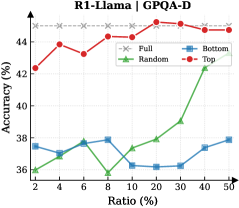
## Line Chart: R1-Llama on GPAQ-D
### Overview
This is a line chart comparing the performance (accuracy) of four different methods or data selection strategies ("Full", "Random", "Bottom", "Top") on the GPAQ-D benchmark as a function of the "Ratio (%)" of data used. The chart demonstrates how accuracy changes for each method as the percentage of data increases from 2% to 50%.
### Components/Axes
* **Chart Title:** "R1-Llama on GPAQ-D" (centered at the top).
* **Y-Axis:** Labeled "Accuracy (%)". The scale runs from 36 to 44, with major tick marks at 36, 38, 40, 42, and 44.
* **X-Axis:** Labeled "Ratio (%)". The scale is non-linear, with marked points at 2, 4, 6, 8, 10, 20, 30, 40, and 50.
* **Legend:** Positioned in the top-right corner of the plot area. It defines four data series:
* **Full:** Red line with solid circle markers (●).
* **Random:** Green line with solid triangle markers (▲).
* **Bottom:** Blue line with solid square markers (■).
* **Top:** Red line with solid diamond markers (◆).
### Detailed Analysis
**Data Series Trends and Approximate Values:**
1. **Full (Red, ●):**
* **Trend:** Starts high, shows a slight peak early, then remains relatively stable with minor fluctuations at a high accuracy level.
* **Data Points (Ratio%, Accuracy%):** (2, ~42.2), (4, ~44.0), (6, ~43.5), (8, ~43.8), (10, ~43.2), (20, ~44.0), (30, ~43.8), (40, ~43.5), (50, ~43.2).
2. **Top (Red, ◆):**
* **Trend:** Follows a very similar high-accuracy path to the "Full" series, consistently just slightly below it.
* **Data Points (Ratio%, Accuracy%):** (2, ~42.0), (4, ~43.8), (6, ~43.2), (8, ~43.5), (10, ~43.0), (20, ~43.8), (30, ~43.5), (40, ~43.2), (50, ~43.0).
3. **Random (Green, ▲):**
* **Trend:** Starts low, dips to its minimum at 10% ratio, then shows a clear and steady upward trend as the ratio increases.
* **Data Points (Ratio%, Accuracy%):** (2, ~36.0), (4, ~36.5), (6, ~37.0), (8, ~36.2), (10, ~35.8), (20, ~37.5), (30, ~38.0), (40, ~39.0), (50, ~39.5).
4. **Bottom (Blue, ■):**
* **Trend:** Fluctuates within a narrow, low-accuracy band (36-38%) with no clear upward or downward trend across the entire ratio range.
* **Data Points (Ratio%, Accuracy%):** (2, ~37.5), (4, ~36.8), (6, ~37.8), (8, ~37.5), (10, ~36.2), (20, ~36.0), (30, ~36.2), (40, ~36.8), (50, ~37.8).
### Key Observations
1. **Performance Hierarchy:** There is a clear and consistent separation between two performance tiers. "Full" and "Top" form a high-accuracy tier (~42-44%), while "Random" and "Bottom" form a lower-accuracy tier (~36-40%).
2. **"Top" vs. "Full":** The "Top" method achieves accuracy nearly identical to using the "Full" dataset, suggesting that selecting the top-performing subset of data is highly effective.
3. **"Random" Improvement:** The "Random" selection method shows a positive correlation between data ratio and accuracy, especially after the 10% mark. More random data leads to better performance.
4. **"Bottom" Stagnation:** The "Bottom" method shows no meaningful improvement with more data, indicating that this selection strategy is consistently ineffective.
5. **Critical Point for Random:** The dip for "Random" at 10% ratio is a notable anomaly before its upward trend begins.
### Interpretation
This chart provides a compelling analysis of data efficiency and selection strategies for the R1-Llama model on the GPAQ-D task.
* **Core Finding:** The data suggests that **quality trumps quantity**. Using a carefully selected high-quality subset ("Top") yields performance on par with using the entire dataset ("Full"). This has significant implications for reducing computational costs and training time without sacrificing accuracy.
* **Ineffectiveness of Poor Selection:** Conversely, selecting the "Bottom" subset is actively detrimental and provides no benefit from additional data, highlighting the risk of poor data curation.
* **Random Sampling as a Baseline:** The "Random" series acts as a crucial baseline. Its upward trend confirms that more data is generally beneficial, but its consistently lower performance compared to "Top" underscores the value of intelligent data selection over naive sampling.
* **Practical Implication:** For resource-constrained applications, employing a "Top"-like data selection strategy appears to be the most efficient path, offering near-maximal accuracy with a fraction of the data. The chart effectively argues against both using all data (if inefficient) and using poorly selected data.