\n
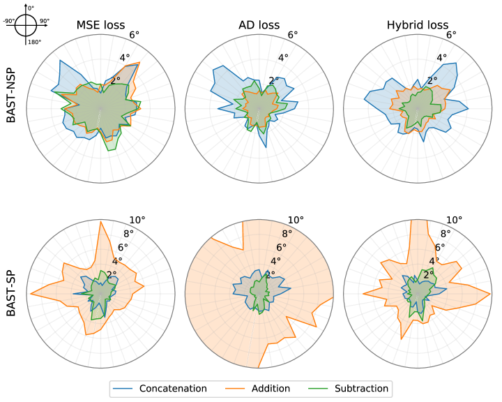
## Polar Charts: Loss Comparison for Different Methods
### Overview
The image presents a 2x3 grid of polar charts, comparing the performance of different methods (Concatenation, Addition, Subtraction) across three loss functions (MSE loss, AD loss, Hybrid loss) and two datasets (BAST-NSP, BAST-SP). Each chart visualizes the angular distribution of a metric, likely representing error or difference, with the radius indicating the magnitude of the metric.
### Components/Axes
* **Polar Coordinate System:** Each chart uses a polar coordinate system with angles ranging from -90° to 180° and radial scales ranging from 0° to 6° (top row) or 0° to 10° (bottom row).
* **Loss Functions (Titles):** The top row charts are titled "MSE loss", "AD loss", and "Hybrid loss".
* **Datasets (Y-axis Labels):** The left side of the charts are labeled "BAST-NSP" (top row) and "BAST-SP" (bottom row).
* **Methods (Legend):** A legend at the bottom of the image identifies the methods using color-coded lines:
* Concatenation (Green)
* Addition (Orange)
* Subtraction (Blue)
* **Radial Scale:** The radial axis represents a degree value, ranging from 0 to 6 or 10.
### Detailed Analysis or Content Details
**Row 1: BAST-NSP Dataset**
* **MSE Loss:**
* Concatenation (Green): The line fluctuates significantly, peaking around 120° at approximately 5.5°. It dips to around 1° at -90°.
* Addition (Orange): The line shows a more consistent shape, peaking around 0° at approximately 4.5° and dipping to around 1.5° at 90°.
* Subtraction (Blue): The line is relatively smooth, peaking around 180° at approximately 3° and dipping to around 1° at 0°.
* **AD Loss:**
* Concatenation (Green): The line peaks around 180° at approximately 4° and dips to around 1° at 90°.
* Addition (Orange): The line peaks around 0° at approximately 3° and dips to around 1° at 90°.
* Subtraction (Blue): The line is relatively smooth, peaking around 180° at approximately 2° and dipping to around 1° at 0°.
* **Hybrid Loss:**
* Concatenation (Green): The line peaks around 180° at approximately 3° and dips to around 1° at 0°.
* Addition (Orange): The line peaks around 0° at approximately 2° and dips to around 1° at 90°.
* Subtraction (Blue): The line is relatively smooth, peaking around 180° at approximately 2° and dipping to around 1° at 0°.
**Row 2: BAST-SP Dataset**
* **MSE Loss:**
* Concatenation (Green): The line peaks around 180° at approximately 9° and dips to around 2° at 0°.
* Addition (Orange): The line peaks around 0° at approximately 8° and dips to around 2° at 90°.
* Subtraction (Blue): The line is relatively smooth, peaking around 180° at approximately 4° and dipping to around 1° at 0°.
* **AD Loss:**
* Concatenation (Green): The line peaks around 180° at approximately 10° and dips to around 2° at 90°.
* Addition (Orange): The line peaks around 0° at approximately 8° and dips to around 2° at 90°.
* Subtraction (Blue): The line is relatively smooth, peaking around 180° at approximately 4° and dipping to around 1° at 0°.
* **Hybrid Loss:**
* Concatenation (Green): The line peaks around 180° at approximately 8° and dips to around 2° at 0°.
* Addition (Orange): The line peaks around 0° at approximately 6° and dips to around 2° at 90°.
* Subtraction (Blue): The line is relatively smooth, peaking around 180° at approximately 4° and dipping to around 1° at 0°.
### Key Observations
* The BAST-SP dataset consistently shows higher values (larger radii) across all loss functions and methods compared to the BAST-NSP dataset. This suggests that the methods perform worse on the BAST-SP dataset.
* Concatenation generally exhibits the most fluctuating behavior, with larger peaks and valleys, indicating potentially higher variance in its performance.
* Subtraction consistently shows the smoothest and lowest values, suggesting it might be the most stable and accurate method.
* Addition consistently performs between Concatenation and Subtraction.
### Interpretation
The charts demonstrate a comparative analysis of three methods (Concatenation, Addition, Subtraction) for handling data, evaluated using three different loss functions (MSE, AD, Hybrid) on two datasets (BAST-NSP, BAST-SP). The polar plots visualize the distribution of the loss values across different angles, providing insights into the directional bias of each method.
The consistently higher loss values for the BAST-SP dataset suggest that this dataset is more challenging for all methods. The smoother performance of the Subtraction method, indicated by lower and more consistent loss values, suggests it might be a more robust approach. The fluctuating behavior of Concatenation could indicate sensitivity to the data distribution or potential instability.
The angular distribution of the loss values could reveal specific directions where each method struggles or excels. For example, a peak at a particular angle might indicate a systematic error in that direction. The differences in the angular patterns between the loss functions suggest that each loss function captures different aspects of the error.
The choice of method and loss function should be guided by the specific characteristics of the dataset and the desired performance criteria. Further investigation is needed to understand the underlying reasons for the observed differences and to optimize the methods for specific applications.