## Line Chart: Accuracy vs. Thinking Compute
### Overview
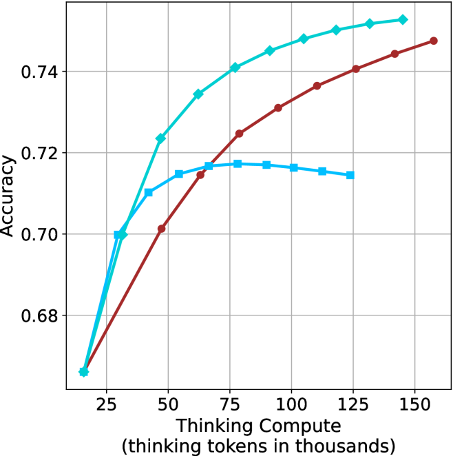
The image is a line chart illustrating the relationship between "Thinking Compute" (measured in thousands of thinking tokens) and "Accuracy." The chart displays three distinct data series, all originating from a common starting point. There is no legend provided in the image to identify the specific models or methods associated with each line color/marker style.
### Components/Axes
* **Y-Axis:** Labeled "Accuracy." The scale ranges from 0.68 to 0.74, with major grid lines at 0.02 intervals (0.68, 0.70, 0.72, 0.74).
* **X-Axis:** Labeled "Thinking Compute (thinking tokens in thousands)." The scale ranges from 25 to 150, with major grid lines at 25-unit intervals (25, 50, 75, 100, 125, 150).
* **Data Series (No Legend Provided):**
* **Cyan Line:** Marked with diamond symbols.
* **Dark Red Line:** Marked with circle symbols.
* **Medium Blue Line:** Marked with square symbols.
### Detailed Analysis
All three data series originate from a common point at approximately **(16, 0.665)**.
#### 1. Cyan Line (Diamond Markers)
* **Trend:** This line shows the steepest upward trajectory and maintains the highest accuracy across the majority of the compute range. It shows no signs of plateauing within the visible chart area.
* **Data Points (Approximate):**
* (16, 0.665) - Start
* (30, 0.700)
* (45, 0.724)
* (60, 0.735)
* (75, 0.741)
* (90, 0.745)
* (105, 0.748)
* (120, 0.750)
* (135, 0.752)
* (145, 0.753) - End
#### 2. Dark Red Line (Circle Markers)
* **Trend:** This line shows a steady, consistent upward curve. It crosses the Medium Blue line at approximately 65k tokens and continues to rise steadily without plateauing.
* **Data Points (Approximate):**
* (16, 0.665) - Start
* (45, 0.701)
* (65, 0.715)
* (80, 0.725)
* (95, 0.731)
* (110, 0.737)
* (125, 0.741)
* (140, 0.744)
* (160, 0.748) - End
#### 3. Medium Blue Line (Square Markers)
* **Trend:** This line shows an initial sharp rise, followed by a plateau, and eventually a slight decline, suggesting diminishing returns or "overthinking."
* **Data Points (Approximate):**
* (16, 0.665) - Start
* (30, 0.700)
* (40, 0.710)
* (55, 0.715)
* (80, 0.718) - Peak
* (100, 0.717)
* (115, 0.716)
* (125, 0.715) - End
### Key Observations
* **Performance Divergence:** While all models start with identical performance, they diverge significantly after ~30k tokens.
* **The "Overthinking" Phenomenon:** The Medium Blue (Square) series is the only one that exhibits a performance degradation (negative slope) after reaching a peak of ~0.718 accuracy at 80k tokens. This is a classic indicator of "overthinking" in reasoning models, where additional compute tokens introduce noise or errors rather than clarity.
* **Scaling Efficiency:** The Cyan (Diamond) series is the most efficient, achieving the highest accuracy (0.753) with the least amount of compute relative to the other lines.
### Interpretation
This chart likely represents a comparison of different Large Language Model (LLM) reasoning configurations or "Chain of Thought" prompting strategies.
* **Cyan (Diamond):** Represents a highly optimized model or strategy that scales effectively with increased compute. It is the superior configuration in this dataset.
* **Dark Red (Circle):** Represents a robust, stable configuration that continues to benefit from increased compute, though it does not reach the same peak accuracy as the Cyan series.
* **Medium Blue (Square):** Represents a configuration that is effective at low compute levels but suffers from diminishing returns. The downward trend after 80k tokens suggests that for this specific configuration, there is an optimal "thinking budget," and exceeding it is detrimental to the final output accuracy.