## Scatter Plots: Music Genre Distribution in Valid and Test Sets
### Overview
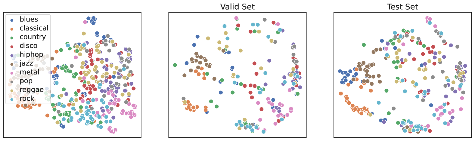
The image contains three scatter plots: a legend on the left and two plots labeled "Valid Set" and "Test Set." Each plot visualizes the distribution of music genres (e.g., blues, classical, country) using colored points. The legend maps 10 genres to distinct colors (e.g., blues = dark blue, classical = orange, country = green). No axis labels or numerical scales are visible.
### Components/Axes
- **Legend**: Positioned in the top-left corner of the first plot.
- Labels: blues, classical, country, disco, hiphop, jazz, metal, pop, reggae, rock.
- Colors: Each genre is assigned a unique color (e.g., blues = dark blue, classical = orange).
- **Plots**:
- **Valid Set**: Left plot.
- **Test Set**: Right plot.
- **Axes**: No explicit labels or scales. Points are distributed across an unlabeled 2D plane.
### Detailed Analysis
- **Valid Set**:
- Points are moderately clustered, with some genres forming tighter groups (e.g., classical/orange, blues/dark blue).
- Overlaps between genres are visible (e.g., pop/pink and hiphop/purple points intermingle).
- No single genre dominates; distribution appears balanced.
- **Test Set**:
- Points are more dispersed, with larger clusters for certain genres (e.g., blues/dark blue, classical/orange).
- Increased overlap between genres compared to the Valid Set (e.g., rock/gray and metal/brown points are more interspersed).
- Higher density of points in the lower-right quadrant.
### Key Observations
1. **Genre Distribution**:
- Blues and classical are the most frequent genres in both sets, with blues showing slightly higher density in the Test Set.
- Jazz (brown) and metal (brown) are less frequent, forming smaller clusters.
2. **Diversity**:
- The Test Set exhibits greater spatial spread, suggesting a more diverse or larger dataset.
- The Valid Set has tighter groupings, possibly indicating a curated or smaller sample.
3. **Overlap**:
- Genres like pop, hiphop, and rock show significant overlap in both sets, implying shared characteristics or similar data representations.
### Interpretation
The scatter plots likely represent embeddings or feature distributions of music data in a machine learning context. The Test Set’s broader distribution suggests it may include more varied or real-world examples, while the Valid Set’s clustering could reflect a controlled validation subset. The lack of axis labels limits quantitative analysis, but the visual separation of genres implies effective feature differentiation. Outliers (e.g., isolated points) are minimal, indicating consistent data quality.
**Note**: No numerical values or explicit trends (e.g., slopes, percentages) can be extracted due to the absence of axis labels or scales. All observations are qualitative and based on spatial distribution.