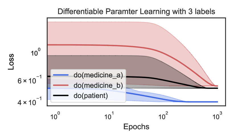
## Chart: Differentiable Parameter Learning with 3 labels
### Overview
The image is a line chart showing the loss over epochs for three different conditions: "do(medicine_a)", "do(medicine_b)", and "do(patient)". Both axes are on a logarithmic scale. The chart displays how the loss changes as the number of epochs increases, with shaded regions around each line indicating variability or uncertainty.
### Components/Axes
* **Title:** Differentiable Parameter Learning with 3 labels
* **X-axis:** Epochs (logarithmic scale from 10^0 to 10^3)
* **Y-axis:** Loss (logarithmic scale from 4 x 10^-1 to 10^0)
* **Legend:** Located in the center-left of the chart.
* Blue line: do(medicine\_a)
* Red line: do(medicine\_b)
* Black line: do(patient)
### Detailed Analysis
* **do(medicine\_a) (Blue):** The blue line starts at approximately 0.5 (5 x 10^-1) at epoch 10^0 and decreases to approximately 0.4 (4 x 10^-1) by epoch 10^2, remaining relatively constant thereafter.
* **do(medicine\_b) (Red):** The red line starts at approximately 1.5 (1.5 x 10^0) at epoch 10^0 and decreases to approximately 0.5 (5 x 10^-1) by epoch 10^3.
* **do(patient) (Black):** The black line starts at approximately 0.7 (7 x 10^-1) at epoch 10^0, decreases slightly to approximately 0.6 (6 x 10^-1) around epoch 10^1, and then remains relatively constant at approximately 0.5 (5 x 10^-1) from epoch 10^2 to 10^3.
### Key Observations
* The loss for "do(medicine\_b)" starts highest but decreases the most over the epochs.
* The loss for "do(medicine\_a)" starts lowest and remains relatively low throughout.
* The loss for "do(patient)" starts in the middle and stabilizes at a similar level to "do(medicine\_a)" and "do(medicine\_b)" by the end of the observed epoch range.
* All three lines show a decrease in loss as the number of epochs increases, indicating learning or optimization.
### Interpretation
The chart illustrates the learning curves for three different conditions, likely in a machine learning or optimization context. The "loss" metric represents the error or cost associated with the model's predictions. The decrease in loss over epochs suggests that the model is improving its performance as it is trained. The different starting points and rates of decrease indicate that the conditions have different initial states or require different amounts of training to reach a stable performance level. The shaded regions likely represent the variance or uncertainty in the loss values, which could be due to factors such as data variability or model instability.