## Line Chart: Differentiable Parameter Learning with 3 labels
### Overview
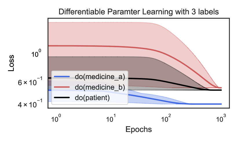
The image is a line chart titled "Differentiable Paramter Learning with 3 labels" (note: "Parameter" is misspelled as "Paramter" in the title). It displays the training loss over epochs for three different causal interventions, labeled using the `do()`-operator notation from causal inference. The chart uses a logarithmic scale on both the x-axis (Epochs) and y-axis (Loss). Each line is accompanied by a shaded region representing the confidence interval or variance around the mean loss.
### Components/Axes
* **Title:** "Differentiable Paramter Learning with 3 labels"
* **X-Axis:**
* **Label:** "Epochs"
* **Scale:** Logarithmic (base 10).
* **Major Ticks/Markers:** `10^0` (1), `10^1` (10), `10^2` (100), `10^3` (1000).
* **Y-Axis:**
* **Label:** "Loss"
* **Scale:** Logarithmic (base 10).
* **Major Ticks/Markers:** `4 x 10^-1` (0.4), `6 x 10^-1` (0.6), `10^0` (1.0).
* **Legend:** Located in the bottom-left quadrant of the chart area.
* **Blue Line:** `do(medicine_a)`
* **Red Line:** `do(medicine_b)`
* **Black Line:** `do(patient)`
### Detailed Analysis
**Trend Verification & Data Point Extraction (Approximate Values):**
1. **Series: `do(medicine_a)` (Blue Line)**
* **Trend:** The line shows a steady, monotonic decrease from the start, flattening out significantly after approximately 100 epochs.
* **Data Points:**
* Epoch 1 (`10^0`): Loss ≈ 0.52
* Epoch 10 (`10^1`): Loss ≈ 0.48
* Epoch 100 (`10^2`): Loss ≈ 0.41
* Epoch 1000 (`10^3`): Loss ≈ 0.40 (plateaued)
* **Confidence Interval (Blue Shading):** Relatively narrow throughout, suggesting low variance in the loss for this intervention.
2. **Series: `do(medicine_b)` (Red Line)**
* **Trend:** The line starts at the highest loss value, remains nearly flat for the first ~10 epochs, then begins a steep, consistent decline. It converges toward the other lines but remains the highest at the final epoch.
* **Data Points:**
* Epoch 1 (`10^0`): Loss ≈ 1.2
* Epoch 10 (`10^1`): Loss ≈ 1.15
* Epoch 100 (`10^2`): Loss ≈ 0.70
* Epoch 1000 (`10^3`): Loss ≈ 0.50
* **Confidence Interval (Red Shading):** Very wide initially (spanning from ~0.6 to ~2.0 at epoch 1), indicating high initial uncertainty or variance. The interval narrows considerably as training progresses.
3. **Series: `do(patient)` (Black Line)**
* **Trend:** The line shows a gradual, consistent decrease from an intermediate starting point. Its slope is less steep than the red line's descent but more pronounced than the blue line's initial slope.
* **Data Points:**
* Epoch 1 (`10^0`): Loss ≈ 0.62
* Epoch 10 (`10^1`): Loss ≈ 0.60
* Epoch 100 (`10^2`): Loss ≈ 0.55
* Epoch 1000 (`10^3`): Loss ≈ 0.48
* **Confidence Interval (Grey/Black Shading):** Moderate width, consistently positioned between the blue and red intervals.
### Key Observations
* **Final Performance Hierarchy:** At 1000 epochs, the final loss values are ordered: `do(medicine_a)` (lowest, ~0.40) < `do(patient)` (~0.48) < `do(medicine_b)` (highest, ~0.50).
* **Convergence Behavior:** All three loss curves are converging, but at different rates and from different starting points. The red line (`do(medicine_b)`) shows the most dramatic improvement.
* **Uncertainty Dynamics:** The uncertainty (shaded area) for `do(medicine_b)` is exceptionally high at the start of training but diminishes significantly, suggesting the model becomes more confident in its parameter estimates for this intervention over time. The other two interventions show more stable uncertainty.
* **Scale:** The use of log-log axes emphasizes the early-stage learning dynamics and allows for clear visualization of the wide range of loss values, especially for the red line.
### Interpretation
This chart visualizes the learning process of a differentiable model tasked with estimating parameters for three distinct causal interventions. The `do()`-operator notation implies the model is learning the effect of forcing a variable (medicine_a, medicine_b, or patient state) to a specific value.
* **What the data suggests:** The intervention `do(medicine_a)` appears to be the "easiest" for the model to learn, starting with a lower loss and converging quickly to the best final performance with low uncertainty. In contrast, `do(medicine_b)` is initially very challenging (high loss and high variance) but benefits the most from prolonged training. The `do(patient)` intervention represents a middle ground in terms of learning difficulty and final performance.
* **Relationship between elements:** The chart directly compares the learnability and final model fit for different causal questions. The converging trends suggest that with sufficient training (epochs), the model can reduce the error for all interventions, though inherent differences in complexity or data availability may lead to different final loss levels.
* **Notable Anomalies/Patterns:** The most striking pattern is the dramatic shift in the red line (`do(medicine_b)`). Its high initial loss and variance could indicate that the causal effect of `medicine_b` is more complex, noisier, or less supported by the initial data than the effects of `medicine_a` or the baseline `patient` state. The eventual convergence, however, shows the differentiable learning framework is effective at overcoming this initial difficulty. The chart essentially tells a story of varying learning trajectories for different causal parameters within the same model.