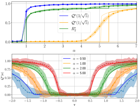
## Line Charts: Phase Transition Behavior
### Overview
The image contains two line charts that depict phase transition behavior. The top chart shows the relationship between 'α' and three different quantities: Q*(3/√5), Q*(1/√5), and R₂*. The bottom chart shows the relationship between 'v' and Q*(v) for different values of 'α'. Both charts include shaded regions around the lines, representing uncertainty or variance.
### Components/Axes
**Top Chart:**
* **X-axis:** α (alpha), ranging from 0 to 7. Axis markers are present at every integer value.
* **Y-axis:** No label, but the values range from 0 to 1.0. Axis markers are present at 0.0, 0.5, and 1.0.
* **Legend (Top-Right):**
* Blue: Q*(3/√5)
* Orange: Q*(1/√5)
* Green: R₂*
**Bottom Chart:**
* **X-axis:** v (nu), ranging from -2.0 to 2.0. Axis markers are present at every 0.5 interval.
* **Y-axis:** Q*(v), ranging from 0.00 to 1.00. Axis markers are present at 0.00, 0.25, 0.50, 0.75, and 1.00.
* **Legend (Top-Left):**
* Blue: α = 0.50
* Orange: α = 1.00
* Green: α = 2.00
* Red: α = 5.00
### Detailed Analysis
**Top Chart:**
* **Blue Line (Q*(3/√5)):** Starts near 0 at α=0, rapidly increases to approximately 0.95 around α=1, and then plateaus around 1.0 for α > 1. The line is marked with square data points.
* **Orange Line (Q*(1/√5)):** Stays near 0 until approximately α=5, then rapidly increases to approximately 0.9 around α=6, and then plateaus around 1.0 for α > 6. The line is marked with circle data points.
* **Green Line (R₂*):** Starts near 0 at α=0, rapidly increases to approximately 0.7 around α=1, and then gradually increases to approximately 0.9 for α > 1. The line is marked with triangle data points.
**Bottom Chart:**
* **Blue Line (α = 0.50):** Starts around 0.6 at v=-2.0, decreases to approximately 0 around v=0, and then increases back to approximately 0.6 at v=2.0. The line is marked with 'x' data points.
* **Orange Line (α = 1.00):** Starts around 0.9 at v=-2.0, decreases to approximately 0 around v=0, and then increases back to approximately 0.9 at v=2.0. The line is marked with '+' data points.
* **Green Line (α = 2.00):** Starts around 0.95 at v=-2.0, decreases to approximately 0 around v=0, and then increases back to approximately 0.95 at v=2.0. The line is marked with '+' data points.
* **Red Line (α = 5.00):** Starts around 1.0 at v=-2.0, decreases to approximately 0 around v=0, and then increases back to approximately 1.0 at v=2.0. The line is marked with 'x' data points.
### Key Observations
* In the top chart, Q*(3/√5) transitions much earlier (lower α) than Q*(1/√5).
* R₂* has a more gradual transition compared to Q*(3/√5).
* In the bottom chart, as α increases, the Q*(v) curves become steeper around v=0.
* The minimum value of Q*(v) is always near 0, regardless of α.
* The shaded regions indicate the variability or uncertainty in the data.
### Interpretation
The charts likely represent phase transitions in a physical or computational system. The top chart shows how different order parameters (Q*(3/√5), Q*(1/√5), and R₂*) change as a function of a control parameter α. The bottom chart shows the behavior of Q*(v) as a function of 'v' for different values of α.
The data suggests that the system undergoes a phase transition around α=1, where Q*(3/√5) and R₂* become non-zero. Another phase transition occurs around α=5, where Q*(1/√5) becomes non-zero. The bottom chart shows that as α increases, the system becomes more ordered, as indicated by the steeper Q*(v) curves. The fact that Q*(v) always reaches a minimum near 0 suggests that there is always some degree of disorder in the system.
The shaded regions around the lines indicate that there is some variability or uncertainty in the data, which could be due to finite-size effects, noise, or other factors.