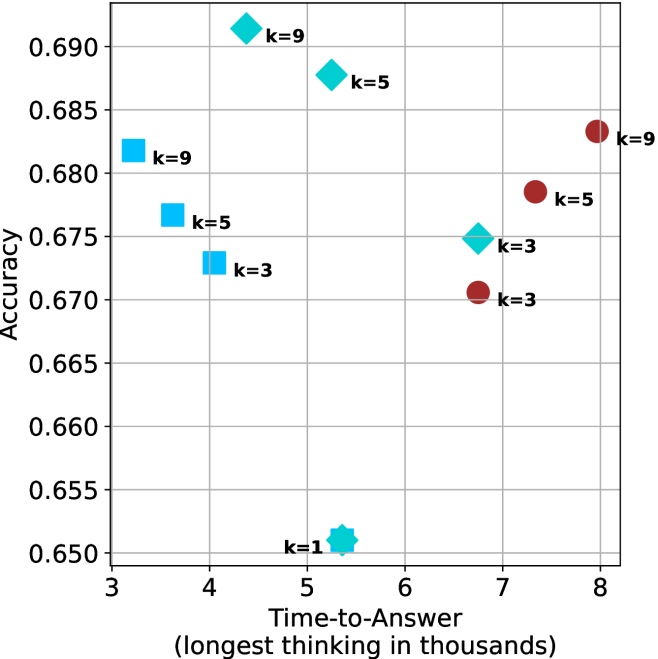
## Scatter Plot: Accuracy vs. Time-to-Answer for Different 'k' Values
### Overview
The image is a scatter plot showing the relationship between "Time-to-Answer" (in thousands) and "Accuracy" for different values of 'k'. There are three distinct data series, each represented by a different marker shape and color: light blue squares, light blue diamonds, and dark red circles. Each data point is labeled with its corresponding 'k' value.
### Components/Axes
* **X-axis:** "Time-to-Answer (longest thinking in thousands)". The axis ranges from 3 to 8, with tick marks at each integer value.
* **Y-axis:** "Accuracy". The axis ranges from 0.650 to 0.690, with tick marks at intervals of 0.005.
* **Data Series:**
* Light Blue Squares: Representing one data series.
* Light Blue Diamonds: Representing another data series.
* Dark Red Circles: Representing a third data series.
* **Labels:** Each data point is labeled with "k=[value]", where [value] is the specific 'k' value for that point (1, 3, 5, or 9).
### Detailed Analysis
* **Light Blue Squares:**
* k=9: Time-to-Answer ≈ 3.5, Accuracy ≈ 0.681
* k=5: Time-to-Answer ≈ 3.8, Accuracy ≈ 0.676
* k=3: Time-to-Answer ≈ 4.0, Accuracy ≈ 0.673
* Trend: As 'k' decreases, both Time-to-Answer and Accuracy decrease.
* **Light Blue Diamonds:**
* k=9: Time-to-Answer ≈ 4.8, Accuracy ≈ 0.691
* k=5: Time-to-Answer ≈ 5.3, Accuracy ≈ 0.688
* k=3: Time-to-Answer ≈ 6.7, Accuracy ≈ 0.675
* k=1: Time-to-Answer ≈ 5.3, Accuracy ≈ 0.651
* Trend: As 'k' decreases from 9 to 3, both Time-to-Answer and Accuracy decrease. The k=1 point is an outlier, with a low accuracy.
* **Dark Red Circles:**
* k=9: Time-to-Answer ≈ 8.0, Accuracy ≈ 0.684
* k=5: Time-to-Answer ≈ 7.8, Accuracy ≈ 0.678
* k=3: Time-to-Answer ≈ 6.8, Accuracy ≈ 0.671
* Trend: As 'k' decreases, both Time-to-Answer and Accuracy decrease.
### Key Observations
* For each data series (light blue squares, light blue diamonds, and dark red circles), there is a general trend of decreasing accuracy as the time to answer decreases.
* The light blue diamonds series has a data point for k=1, which has a significantly lower accuracy compared to the other 'k' values in that series.
* The dark red circles series generally has a higher time-to-answer compared to the other two series for similar 'k' values.
### Interpretation
The scatter plot visualizes the trade-off between accuracy and time-to-answer for different configurations (represented by 'k' values) of a system or model. The data suggests that increasing the 'k' value generally leads to higher accuracy but also requires more time to generate an answer. The outlier (k=1 for the light blue diamonds) indicates that there might be a point where decreasing 'k' too much negatively impacts accuracy. The different data series (light blue squares, light blue diamonds, and dark red circles) likely represent different methods or configurations being tested, each exhibiting a different relationship between accuracy and time. The dark red circles series, for example, consistently takes longer to answer than the other series, potentially indicating a more computationally intensive but potentially more accurate approach (at higher k values).