## Scatter Plot: Accuracy vs. Time-to-Answer
### Overview
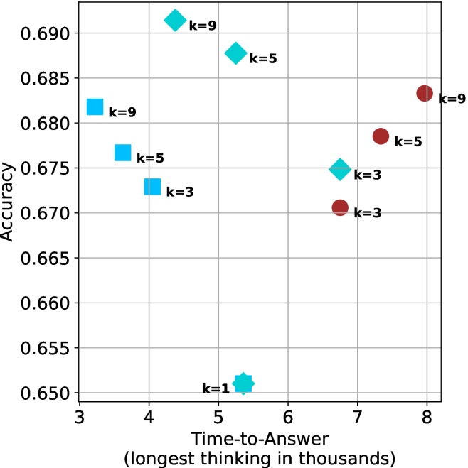
This image is a scatter plot visualizing the relationship between "Accuracy" (y-axis) and "Time-to-Answer (longest thinking in thousands)" (x-axis). The data points are categorized by shape and color, with labels indicating specific "k" values (1, 3, 5, 9), likely representing a hyperparameter or configuration setting for a machine learning model.
### Components/Axes
* **Y-Axis:** Labeled "Accuracy". The scale ranges from 0.650 to 0.690, with major grid lines at 0.005 intervals.
* **X-Axis:** Labeled "Time-to-Answer (longest thinking in thousands)". The scale ranges from 3 to 8, with major grid lines at 1.0 intervals.
* **Data Markers:**
* **Cyan Squares:** Located on the left side of the chart.
* **Cyan Diamonds:** Located in the upper-middle and middle-right sections.
* **Maroon Circles:** Located on the right side of the chart.
* **Cyan Star/Asterisk:** Located at the bottom-middle.
### Detailed Analysis
The following coordinates are approximate based on the visual grid:
| Marker Type | Label | X-Axis (Time) | Y-Axis (Accuracy) |
| :--- | :--- | :--- | :--- |
| **Cyan Square** | k=9 | ~3.2 | ~0.682 |
| **Cyan Square** | k=5 | ~3.6 | ~0.677 |
| **Cyan Square** | k=3 | ~3.8 | ~0.673 |
| **Cyan Diamond** | k=9 | ~4.2 | ~0.691 |
| **Cyan Diamond** | k=5 | ~4.8 | ~0.688 |
| **Cyan Diamond** | k=3 | ~6.7 | ~0.675 |
| **Cyan Star** | k=1 | ~5.4 | ~0.651 |
| **Maroon Circle** | k=3 | ~6.7 | ~0.671 |
| **Maroon Circle** | k=5 | ~7.3 | ~0.679 |
| **Maroon Circle** | k=9 | ~8.0 | ~0.683 |
**Visual Trends:**
* **Cyan Squares:** Show a negative correlation between time and accuracy; as k increases (3 to 9), the time-to-answer decreases while accuracy increases.
* **Cyan Diamonds:** Show a negative correlation between time and accuracy; as k increases (3 to 9), time-to-answer decreases while accuracy increases.
* **Maroon Circles:** Show a positive correlation between time and accuracy; as k increases (3 to 9), both time-to-answer and accuracy increase.
### Key Observations
* **Performance Outlier:** The "k=1" data point (Cyan Star) is a significant outlier, possessing the lowest accuracy (~0.651) and a moderate time-to-answer (~5.4).
* **Clustering:** The data is clearly segmented into three distinct groups based on marker type/color, suggesting these represent different model architectures, prompting strategies, or decoding methods.
* **Efficiency:** The Cyan Squares and Diamonds represent more efficient configurations (lower time-to-answer) compared to the Maroon Circles, which require significantly more time to achieve similar accuracy levels.
* **Overlap:** There is a vertical alignment at X ≈ 6.7, where a Cyan Diamond (k=3) and a Maroon Circle (k=3) exist. The Cyan Diamond achieves higher accuracy (~0.675) than the Maroon Circle (~0.671) at the exact same time-to-answer.
### Interpretation
This chart likely illustrates the performance trade-offs of an AI model (such as an LLM) under different "thinking" or "reasoning" configurations.
The "k" values likely represent a parameter like "top-k" sampling, number of reasoning steps, or a similar constraint. The distinct clusters suggest that the underlying model architecture or prompting method significantly alters the efficiency frontier.
The **Cyan group** (Squares and Diamonds) appears to be the most desirable, as they achieve higher accuracy with lower time-to-answer. Specifically, the Cyan Diamond at k=9 represents the highest accuracy on the chart (~0.691) while maintaining a relatively low time-to-answer (~4.2). Conversely, the **Maroon group** represents a "slower" regime where increasing the "k" parameter yields diminishing returns in accuracy at the cost of significantly higher latency. The k=1 configuration is clearly suboptimal, suggesting that a minimum amount of "thinking" (k > 1) is required for baseline performance.