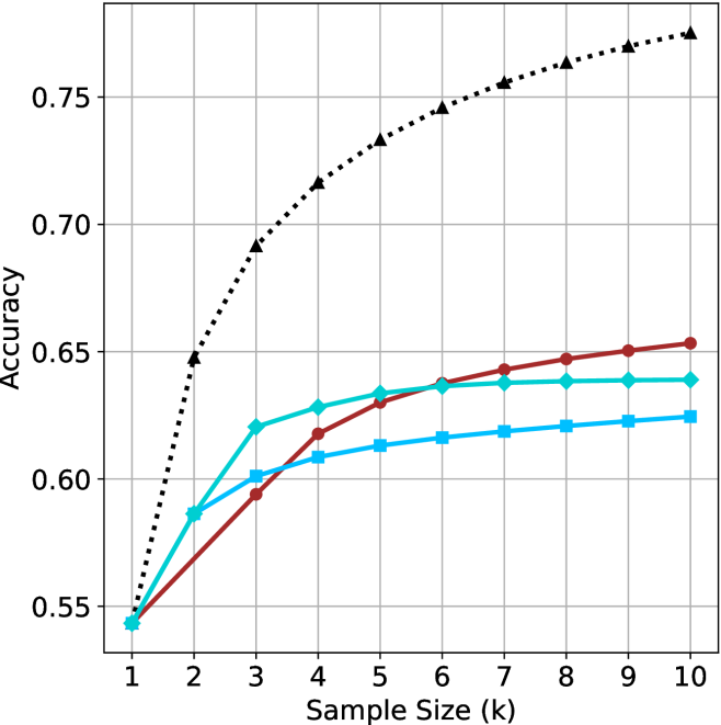
## Line Chart: Accuracy vs. Sample Size
### Overview
The image is a line chart comparing the accuracy of different models as a function of sample size. The x-axis represents the sample size (k), ranging from 1 to 10. The y-axis represents the accuracy, ranging from 0.55 to 0.75. There are three distinct data series represented by different colored lines with different markers.
### Components/Axes
* **X-axis:** Sample Size (k), ranging from 1 to 10 in integer increments.
* **Y-axis:** Accuracy, ranging from 0.55 to 0.75 in increments of 0.05.
* **Gridlines:** Present on the chart for both x and y axes.
* **Data Series:**
* Black dotted line with triangle markers.
* Teal line with diamond markers.
* Brown line with circle markers.
* Light Blue line with square markers.
### Detailed Analysis
* **Black dotted line with triangle markers:** This line shows a steep upward trend initially, then plateaus as the sample size increases.
* k=1, Accuracy ≈ 0.54
* k=2, Accuracy ≈ 0.65
* k=3, Accuracy ≈ 0.69
* k=4, Accuracy ≈ 0.72
* k=5, Accuracy ≈ 0.73
* k=6, Accuracy ≈ 0.74
* k=7, Accuracy ≈ 0.75
* k=8, Accuracy ≈ 0.76
* k=9, Accuracy ≈ 0.77
* k=10, Accuracy ≈ 0.78
* **Teal line with diamond markers:** This line shows a gradual upward trend, with a slight plateau towards the end.
* k=1, Accuracy ≈ 0.54
* k=2, Accuracy ≈ 0.58
* k=3, Accuracy ≈ 0.62
* k=4, Accuracy ≈ 0.63
* k=5, Accuracy ≈ 0.635
* k=6, Accuracy ≈ 0.64
* k=7, Accuracy ≈ 0.64
* k=8, Accuracy ≈ 0.64
* k=9, Accuracy ≈ 0.64
* k=10, Accuracy ≈ 0.64
* **Brown line with circle markers:** This line also shows an upward trend, similar to the teal line, but with slightly lower accuracy values.
* k=1, Accuracy ≈ 0.54
* k=2, Accuracy ≈ 0.57
* k=3, Accuracy ≈ 0.59
* k=4, Accuracy ≈ 0.61
* k=5, Accuracy ≈ 0.63
* k=6, Accuracy ≈ 0.64
* k=7, Accuracy ≈ 0.645
* k=8, Accuracy ≈ 0.648
* k=9, Accuracy ≈ 0.65
* k=10, Accuracy ≈ 0.653
* **Light Blue line with square markers:** This line shows a gradual upward trend, with a slight plateau towards the end.
* k=1, Accuracy ≈ 0.54
* k=2, Accuracy ≈ 0.57
* k=3, Accuracy ≈ 0.60
* k=4, Accuracy ≈ 0.61
* k=5, Accuracy ≈ 0.615
* k=6, Accuracy ≈ 0.62
* k=7, Accuracy ≈ 0.62
* k=8, Accuracy ≈ 0.62
* k=9, Accuracy ≈ 0.623
* k=10, Accuracy ≈ 0.625
### Key Observations
* The black dotted line (triangle markers) consistently outperforms the other models across all sample sizes.
* The accuracy of all models generally increases with sample size, but the rate of increase diminishes as the sample size grows.
* The teal and brown lines are very close in accuracy, with the brown line slightly lower.
* The light blue line has the lowest accuracy of the four.
### Interpretation
The chart suggests that increasing the sample size generally improves the accuracy of the models. However, the diminishing returns indicate that there is a point beyond which increasing the sample size provides only marginal improvements in accuracy. The black dotted line represents the most effective model, as it achieves the highest accuracy with the smallest sample size. The other models (teal, brown, and light blue) are less effective, as they require larger sample sizes to achieve comparable accuracy. The choice of model and sample size would depend on the specific application and the trade-off between accuracy and computational cost.