## Line Chart: Accuracy vs. Sample Size (k)
### Overview
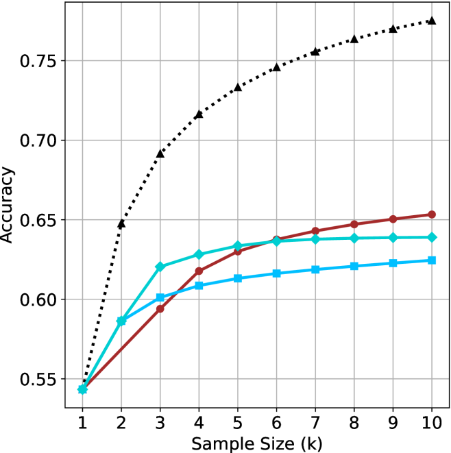
This image is a line chart illustrating the relationship between "Sample Size (k)" and "Accuracy." The chart contains four distinct data series, each represented by a unique color and marker shape.
**CRITICAL OBSERVATION:** There is no legend provided in the image. Consequently, it is impossible to identify what specific models, algorithms, or datasets each line represents. The analysis below refers to the lines by their visual characteristics (color and marker).
### Components/Axes
* **Y-Axis:** Labeled "Accuracy." The scale ranges from 0.55 to 0.75, with grid lines at 0.55, 0.60, 0.65, 0.70, and 0.75.
* **X-Axis:** Labeled "Sample Size (k)." The scale ranges from 1 to 10, with vertical grid lines at each integer interval.
* **Data Series:**
* **Series A (Black):** Dotted line with triangle markers.
* **Series B (Dark Red):** Solid line with circle markers.
* **Series C (Cyan/Light Blue):** Solid line with diamond markers.
* **Series D (Medium Blue):** Solid line with square markers.
### Detailed Analysis
All four series originate from a common starting point at Sample Size = 1, with an Accuracy of approximately 0.545.
#### Series A (Black, Dotted, Triangle)
* **Trend:** This series exhibits the steepest upward slope and maintains the highest accuracy throughout the range. It shows a rapid increase between k=1 and k=3, then continues to rise at a slightly slower, but consistent, rate.
* **Data Points (Approximate):**
* k=1: ~0.545
* k=2: ~0.645
* k=3: ~0.690
* k=4: ~0.715
* k=5: ~0.730
* k=10: ~0.775
#### Series B (Dark Red, Solid, Circle)
* **Trend:** This series shows a steady, consistent upward slope. It starts at the bottom with the others but eventually overtakes Series C and Series D. It does not show signs of flattening out as aggressively as the other solid lines.
* **Data Points (Approximate):**
* k=1: ~0.545
* k=3: ~0.595
* k=5: ~0.630
* k=10: ~0.653
#### Series C (Cyan, Solid, Diamond)
* **Trend:** This series rises sharply between k=1 and k=3, then begins to flatten significantly (diminishing returns) after k=4. It crosses Series B around k=4.5 and remains relatively flat from k=6 to k=10.
* **Data Points (Approximate):**
* k=1: ~0.545
* k=3: ~0.620
* k=5: ~0.635
* k=10: ~0.640
#### Series D (Medium Blue, Solid, Square)
* **Trend:** This series rises steadily but at a lower rate than the others. It flattens out the earliest, showing the least improvement as the sample size increases beyond k=4.
* **Data Points (Approximate):**
* k=1: ~0.545
* k=3: ~0.600
* k=5: ~0.615
* k=10: ~0.625
### Key Observations
* **Dominance:** The Black series (triangles) is the clear outlier in terms of performance, significantly outperforming the other three models as the sample size increases.
* **Convergence/Crossover:**
* At k=2, the Cyan (diamond) and Medium Blue (square) lines are clustered together, while the Red (circle) line is lower.
* By k=4, the Red (circle) line overtakes the Cyan (diamond) line.
* The Cyan (diamond) line appears to plateau at approximately 0.64 accuracy.
* **Diminishing Returns:** The three solid-line series (Red, Cyan, Medium Blue) all exhibit signs of diminishing returns, where increasing the sample size yields progressively smaller gains in accuracy. The Black series, while also curving, maintains a much stronger growth trajectory.
### Interpretation
This chart is characteristic of a **Machine Learning Model Learning Curve** analysis.
* **What the data demonstrates:** It compares the performance of four different models (or configurations) as the amount of training data (Sample Size) increases.
* **Why it matters:**
* The **Black series** represents a model that scales effectively with more data, suggesting it has higher capacity or better generalization capabilities.
* The **Cyan and Medium Blue series** appear to hit a "performance ceiling" or saturation point relatively early (around k=4 or k=5). Adding more data beyond this point provides negligible accuracy improvements, suggesting these models may be limited by their architecture or hyperparameters rather than data scarcity.
* The **Red series** represents a model that is slower to learn initially but eventually surpasses the other solid-line models, suggesting it might be a more complex model that requires more data to converge but ultimately achieves a higher performance ceiling than the Cyan or Medium Blue models.